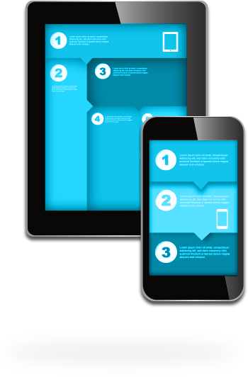
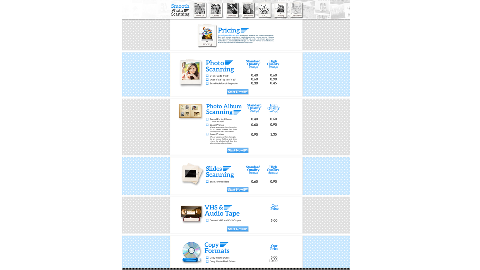
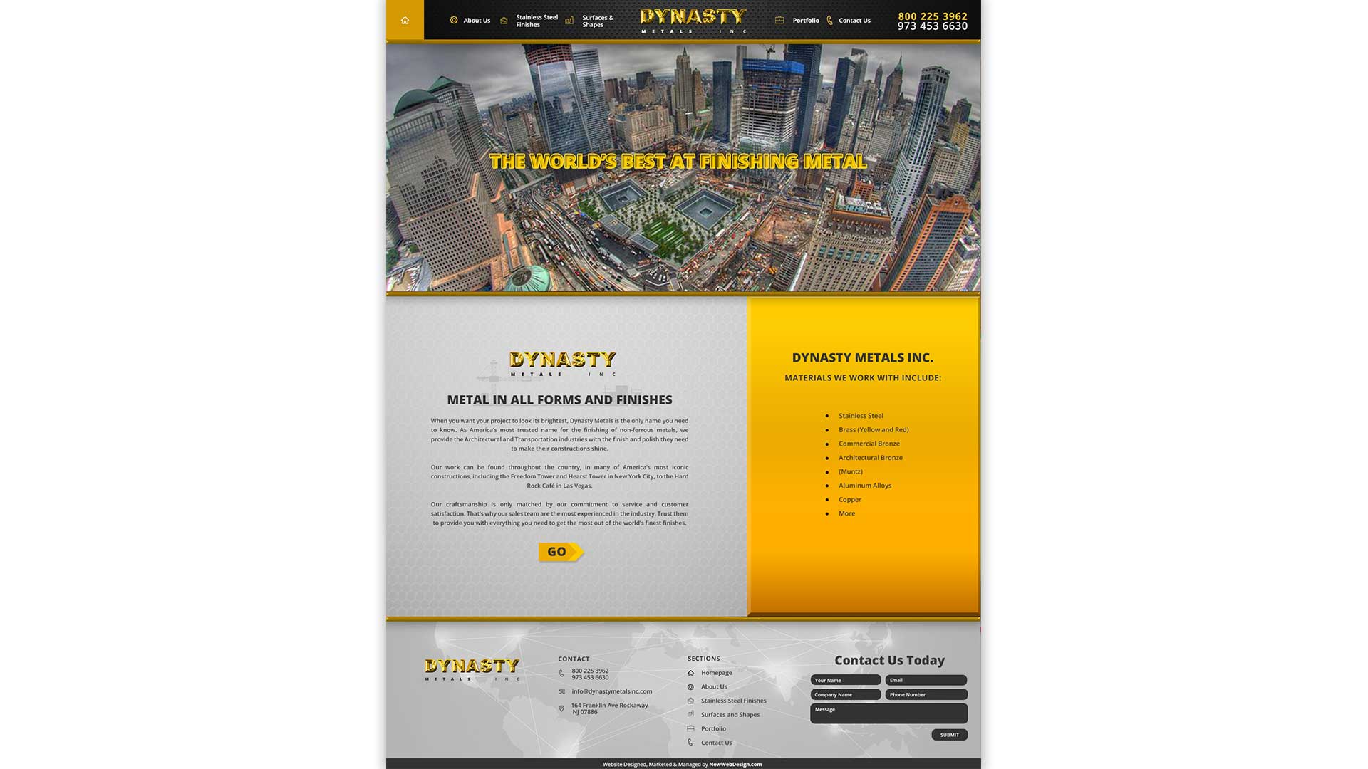
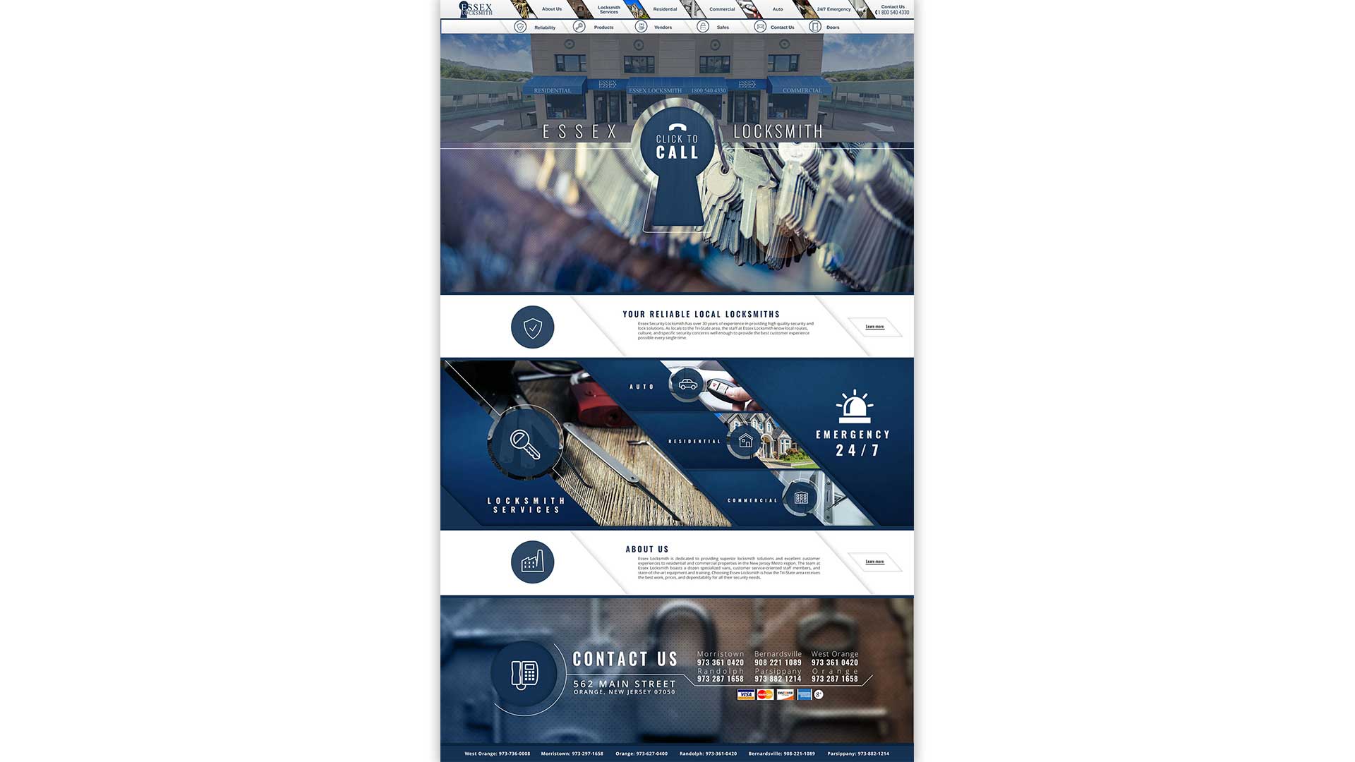
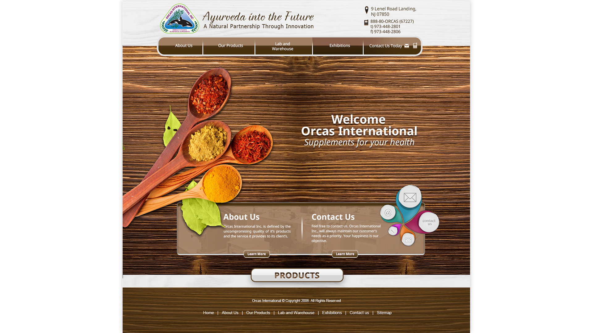
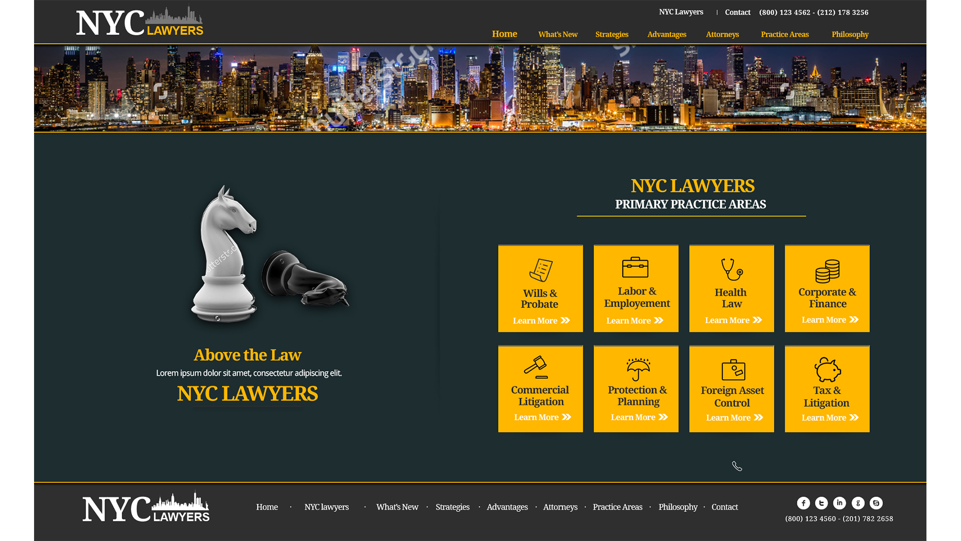
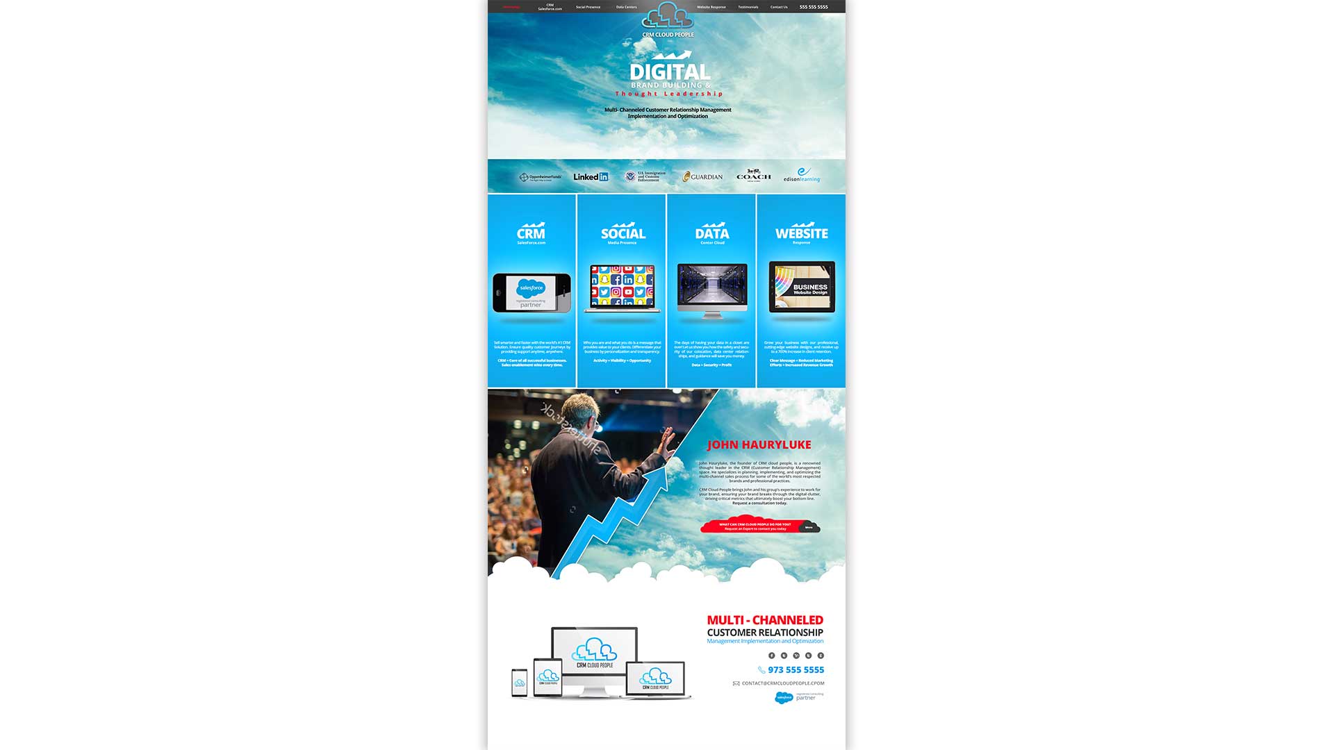
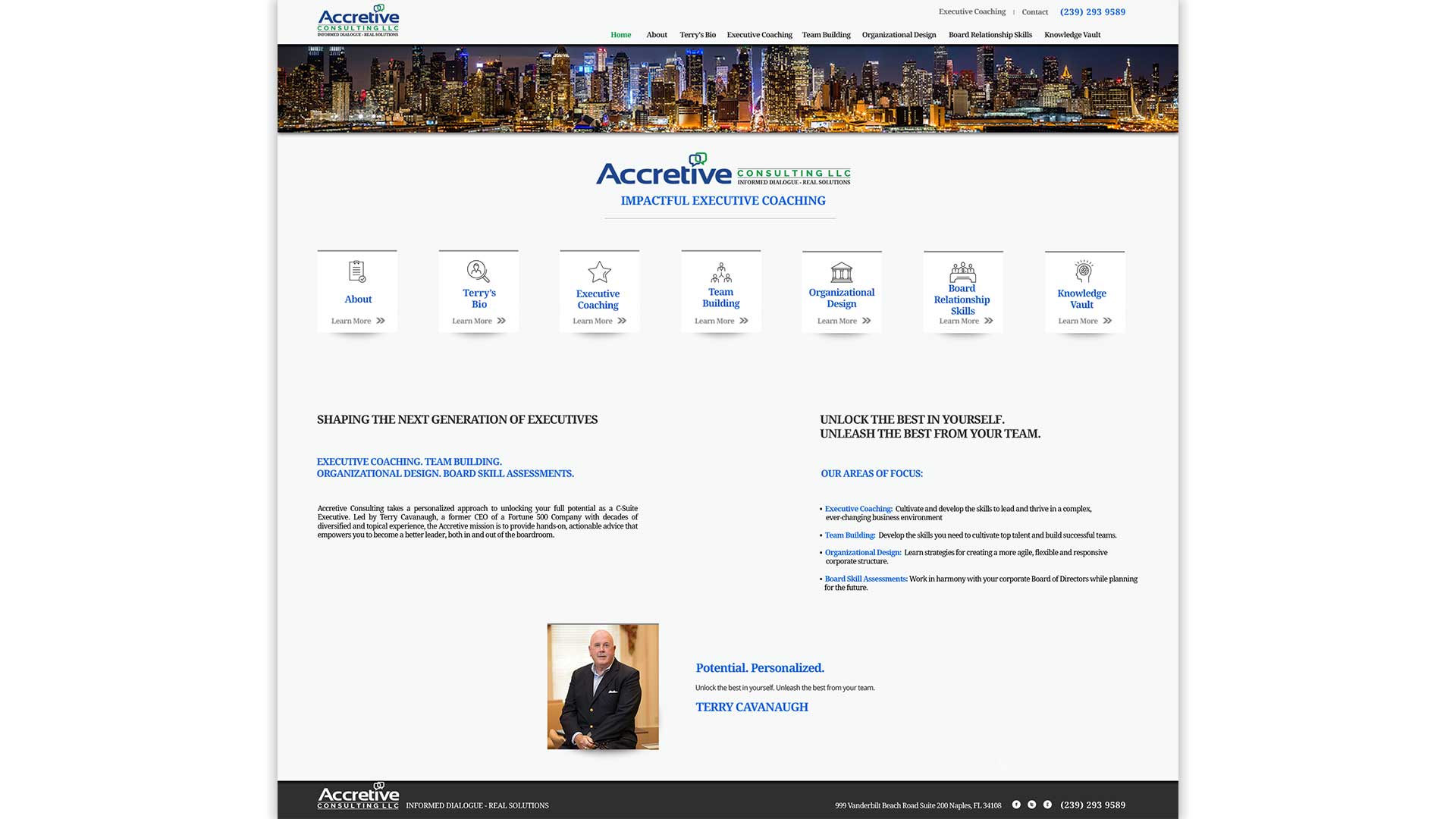
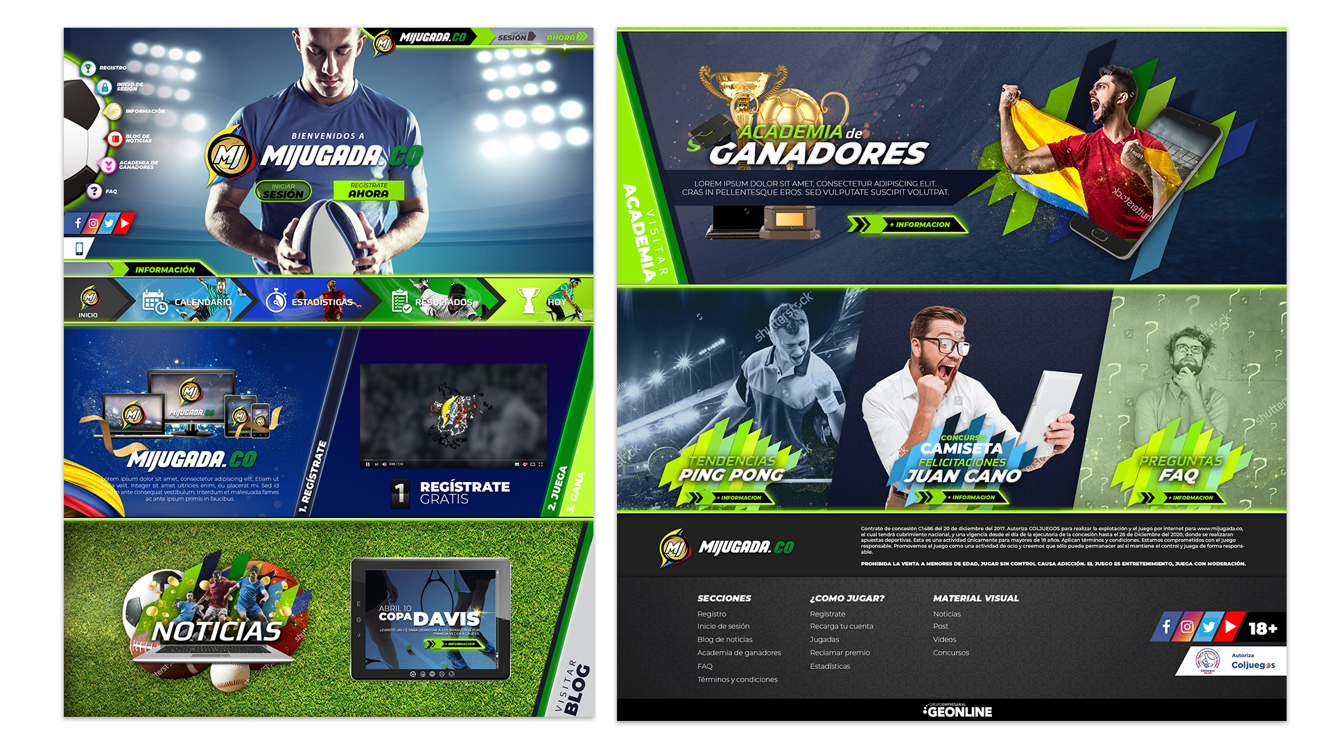
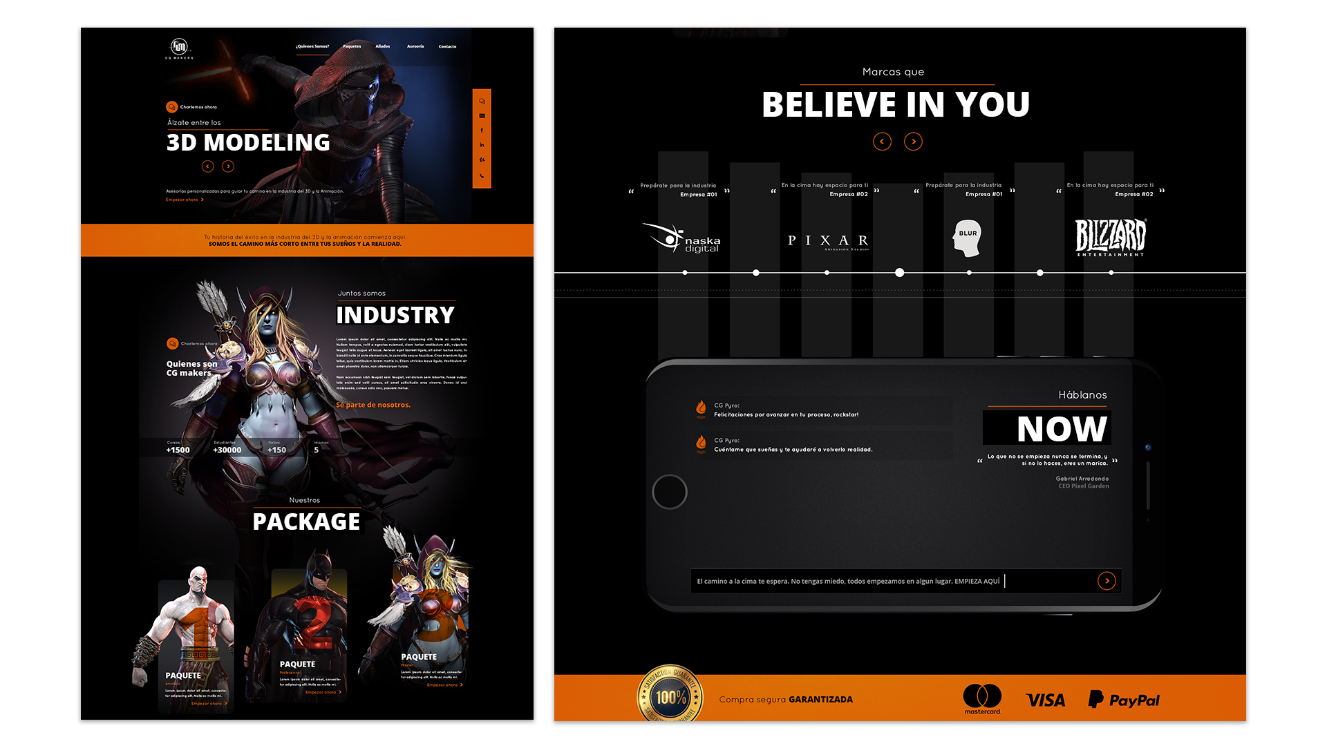
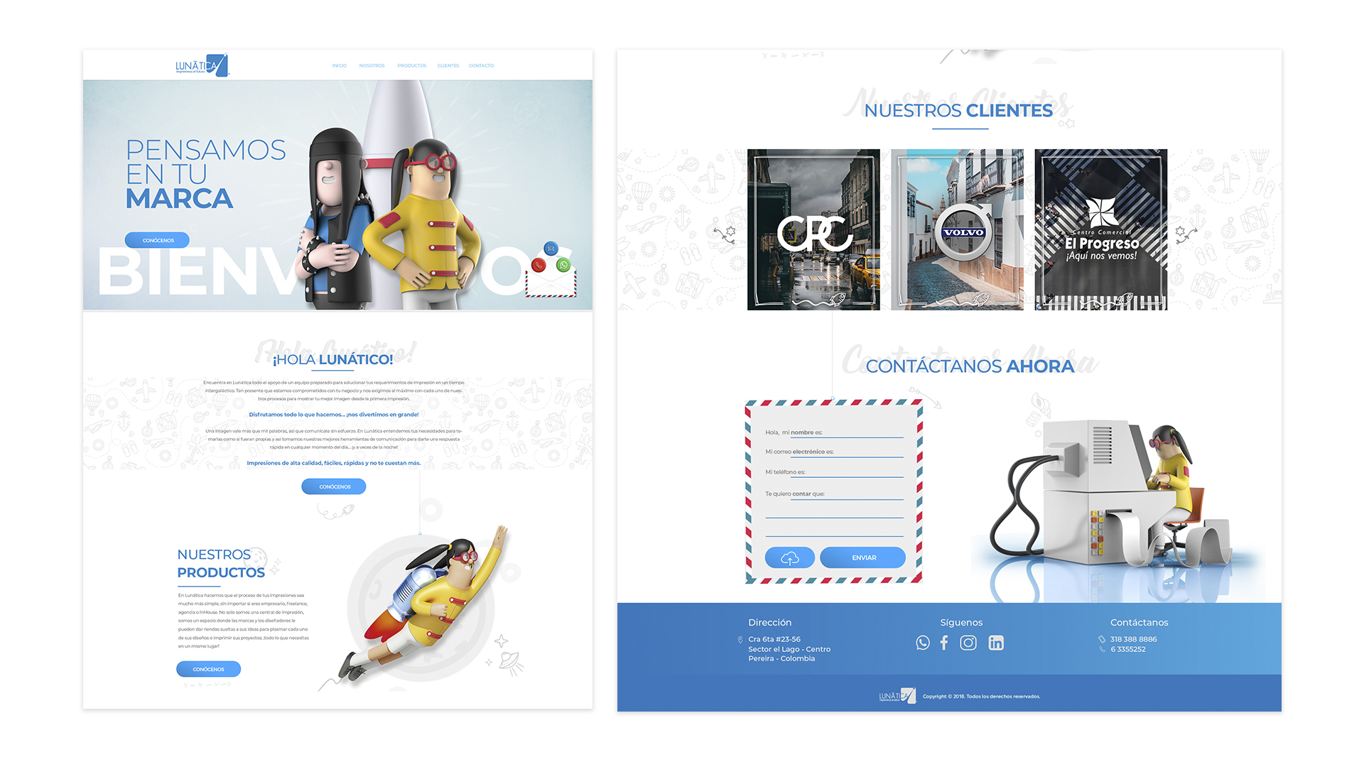
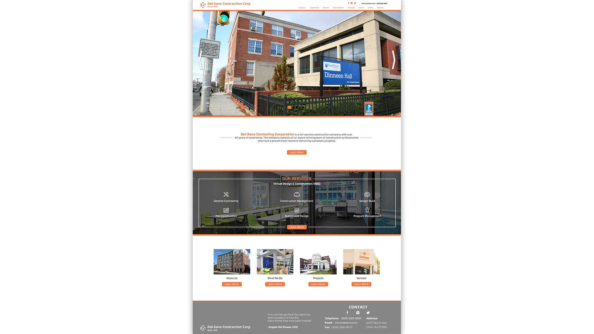
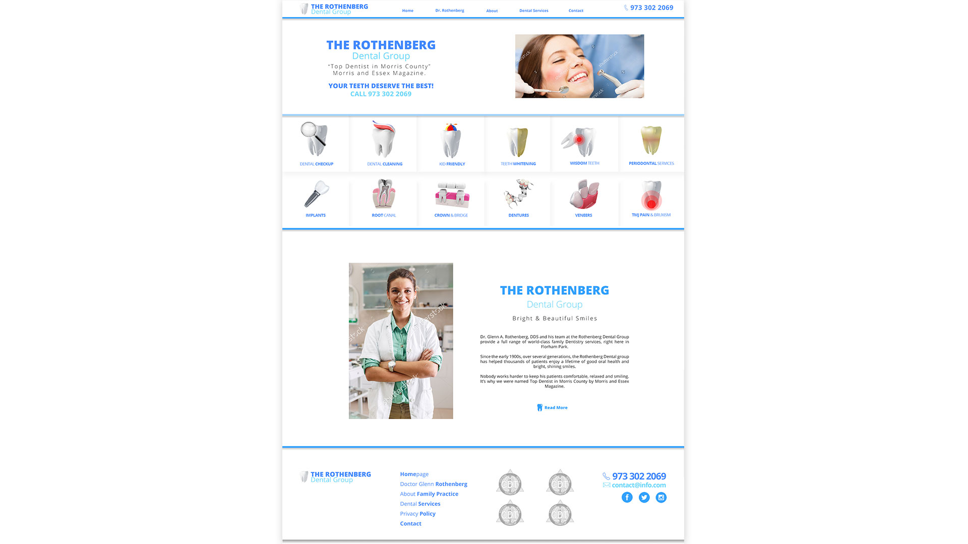
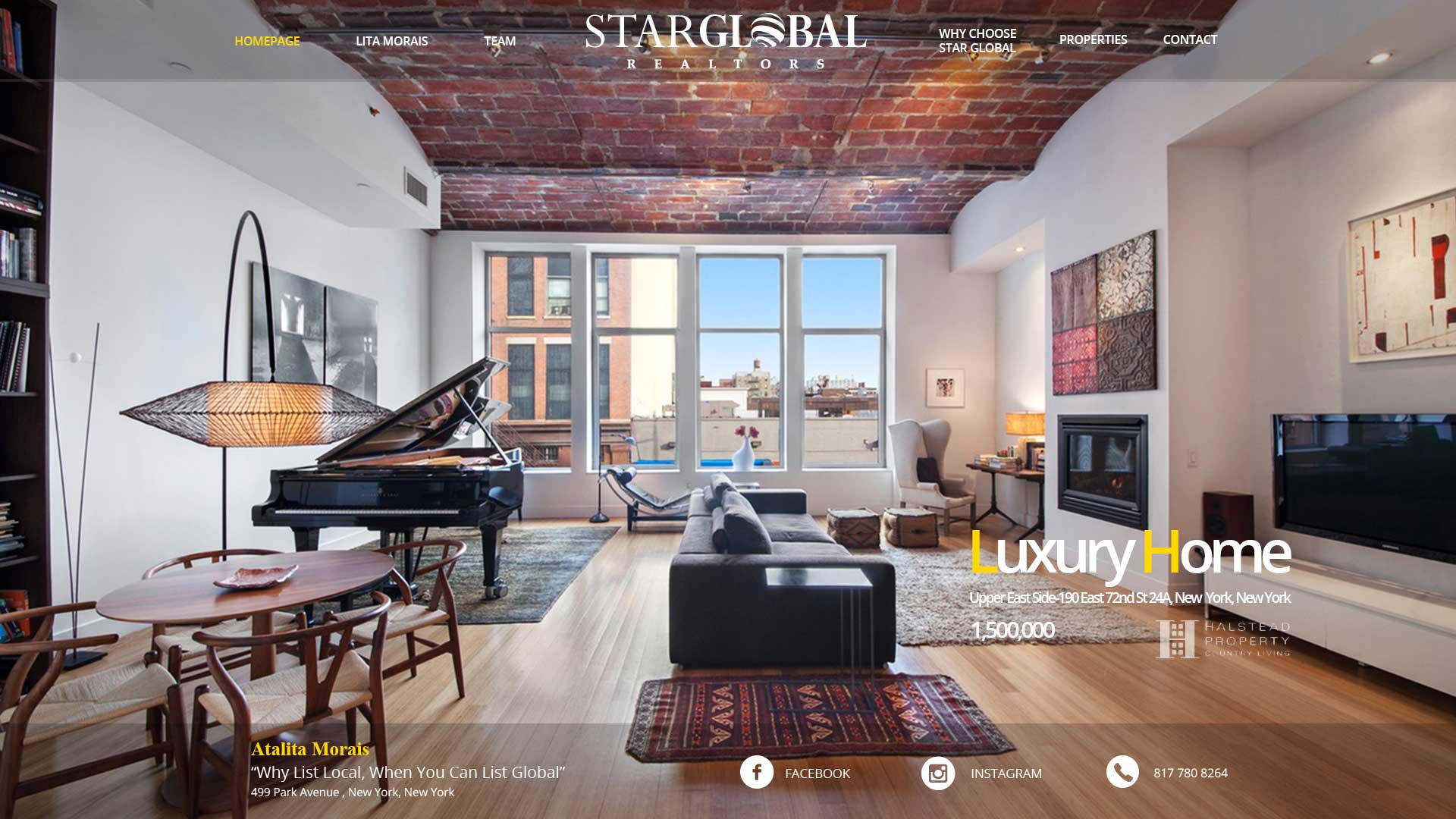
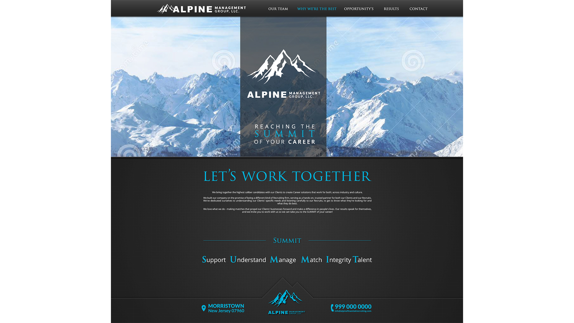
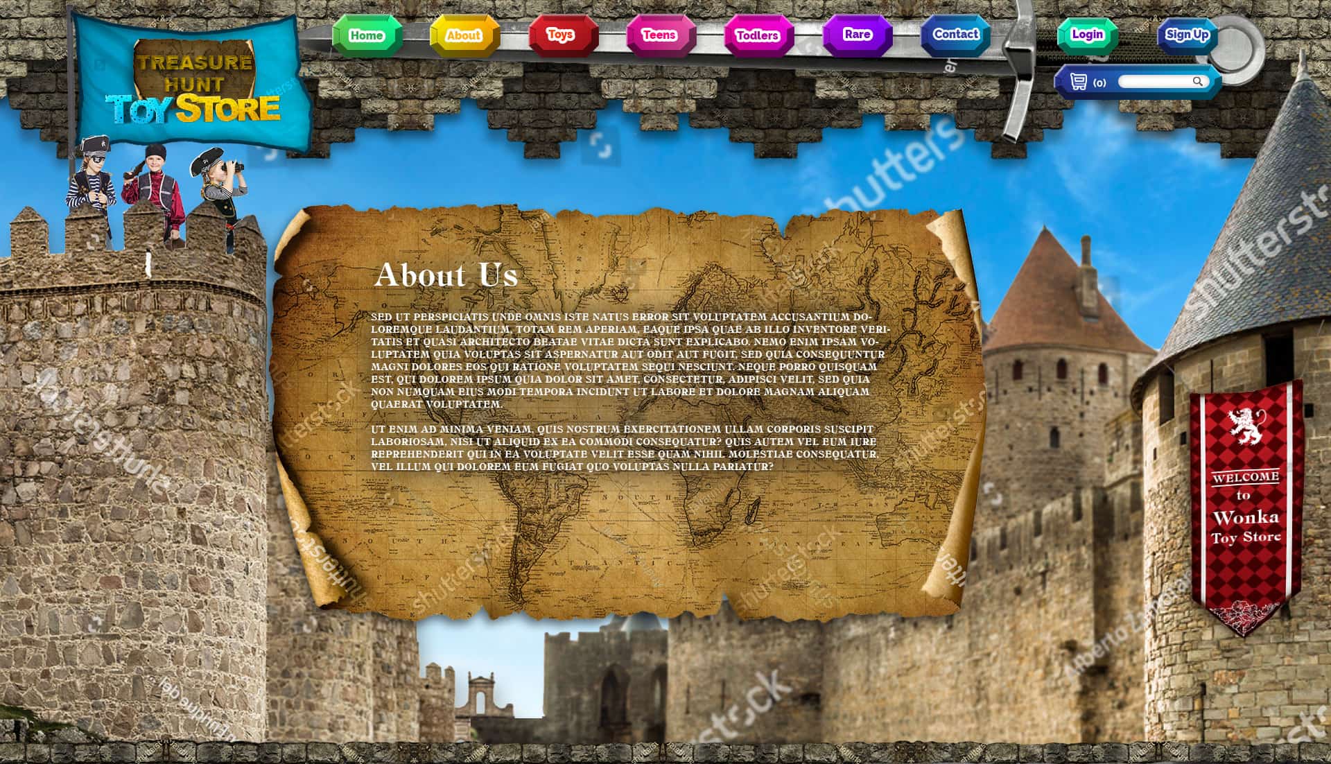
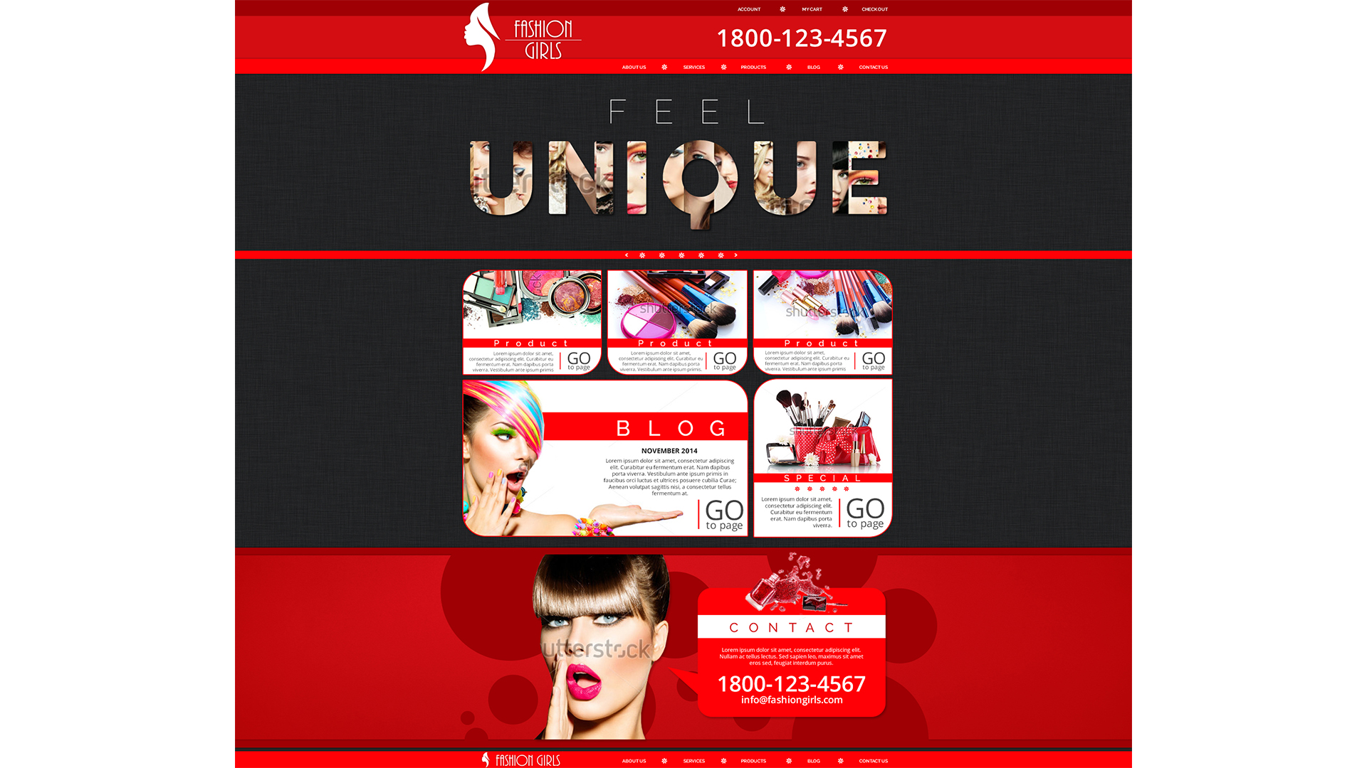
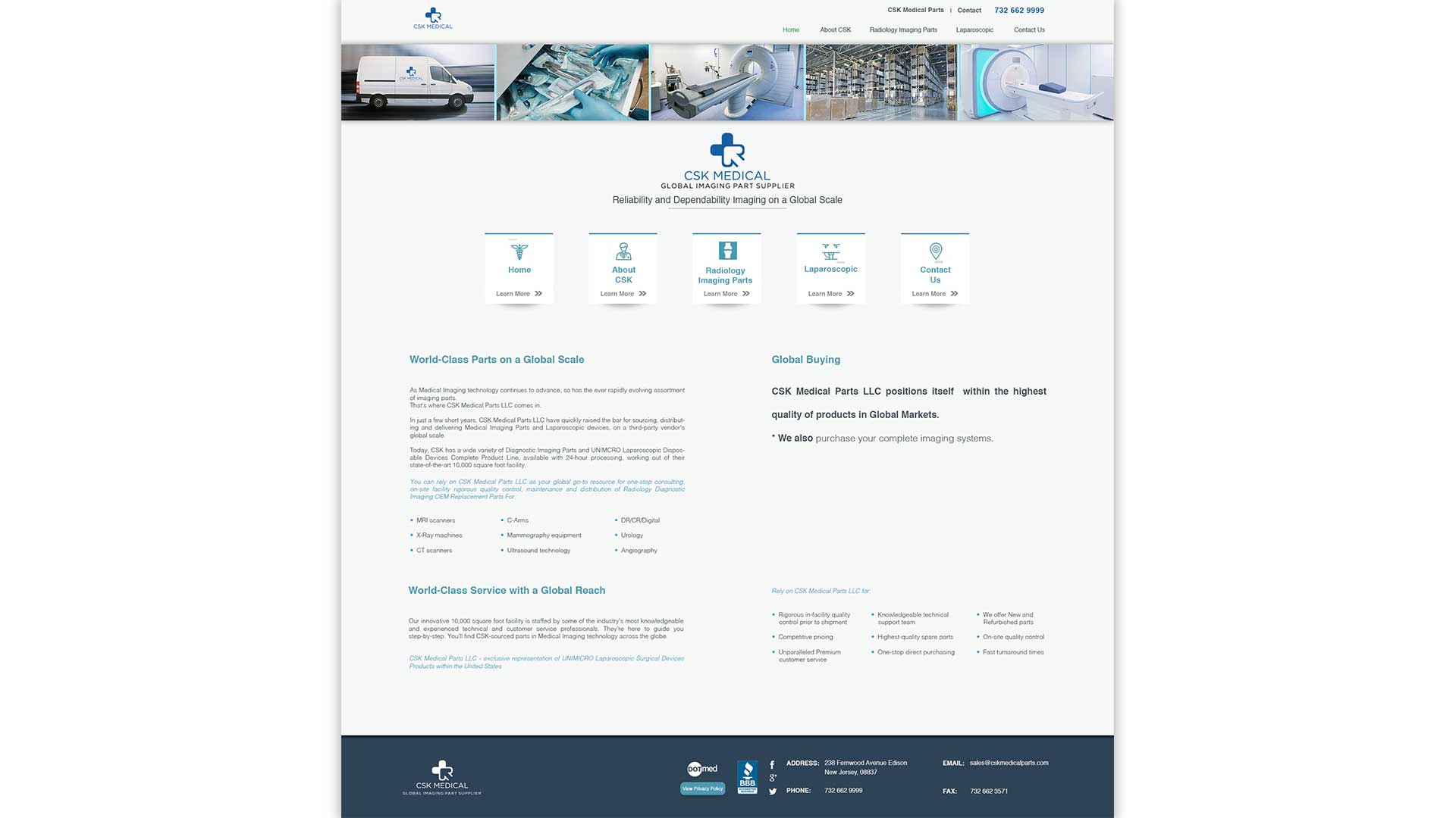
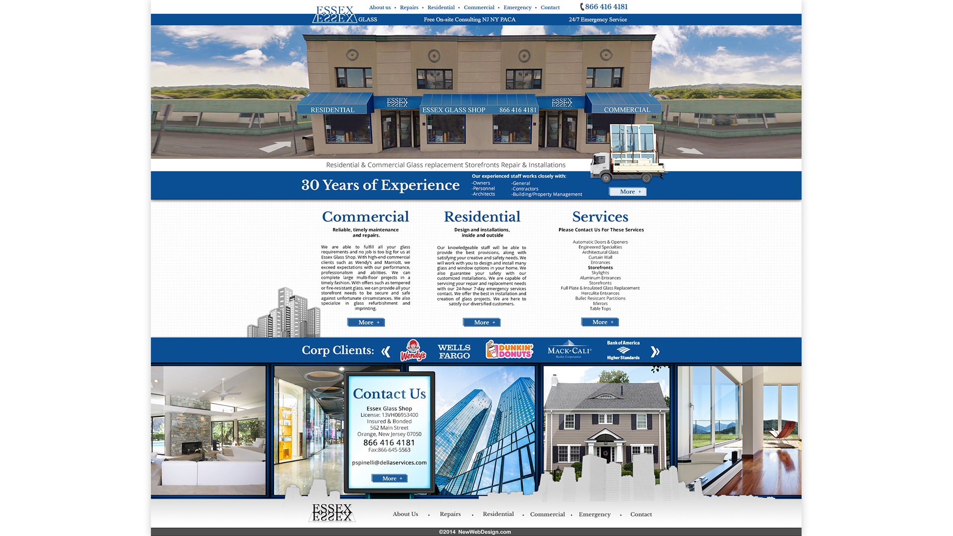
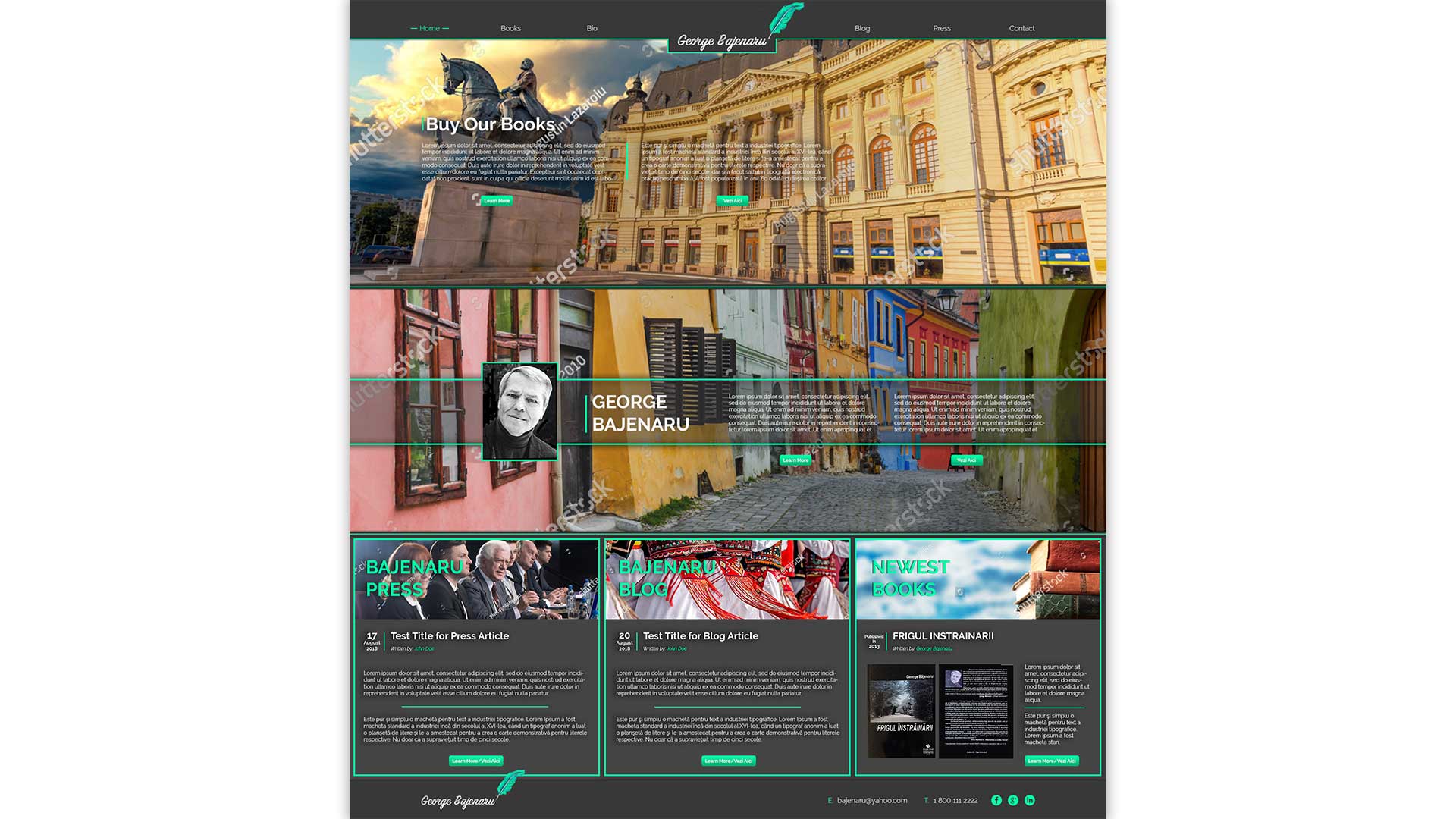
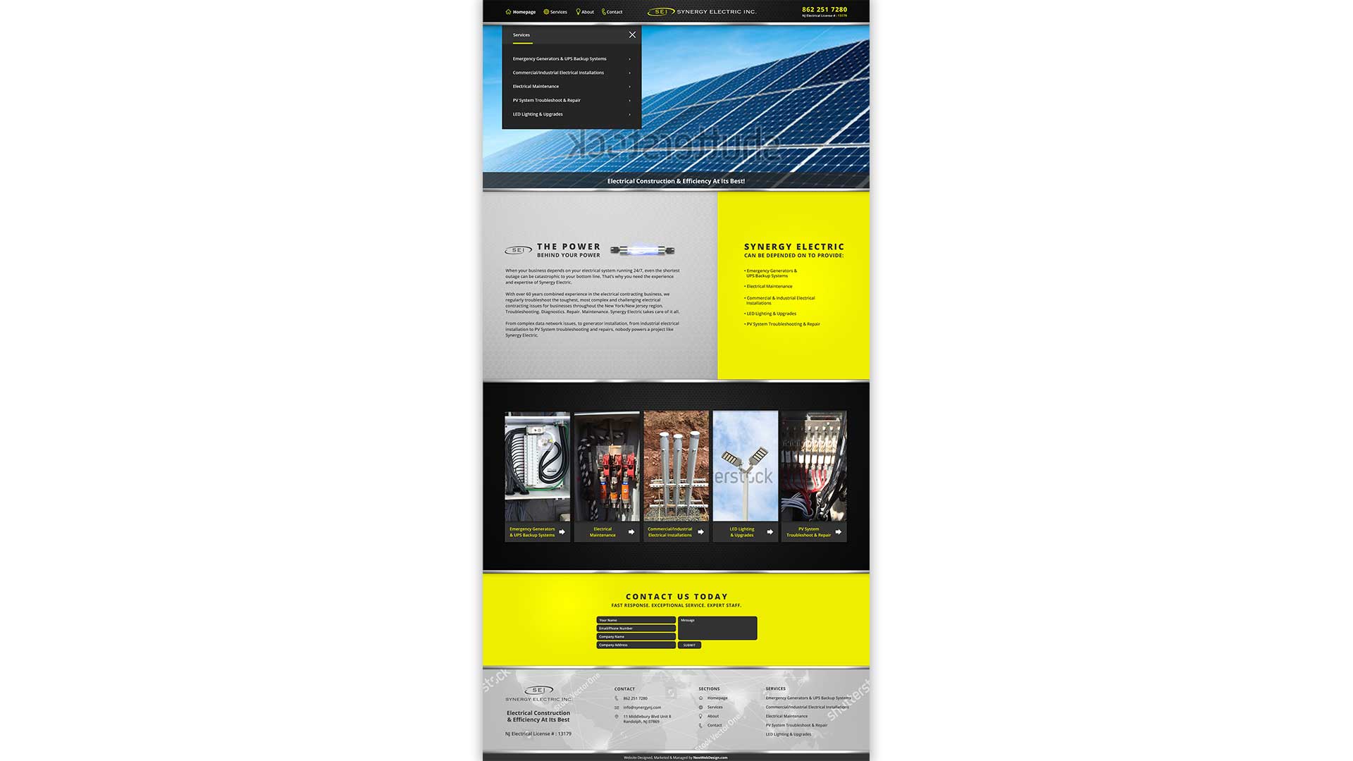
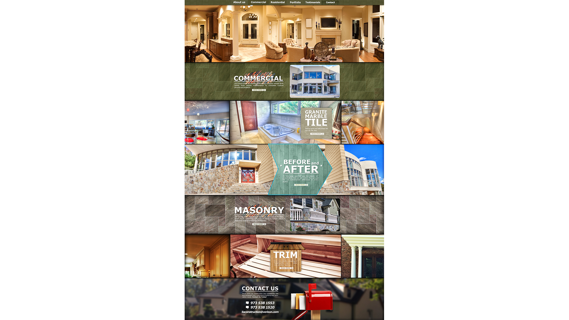
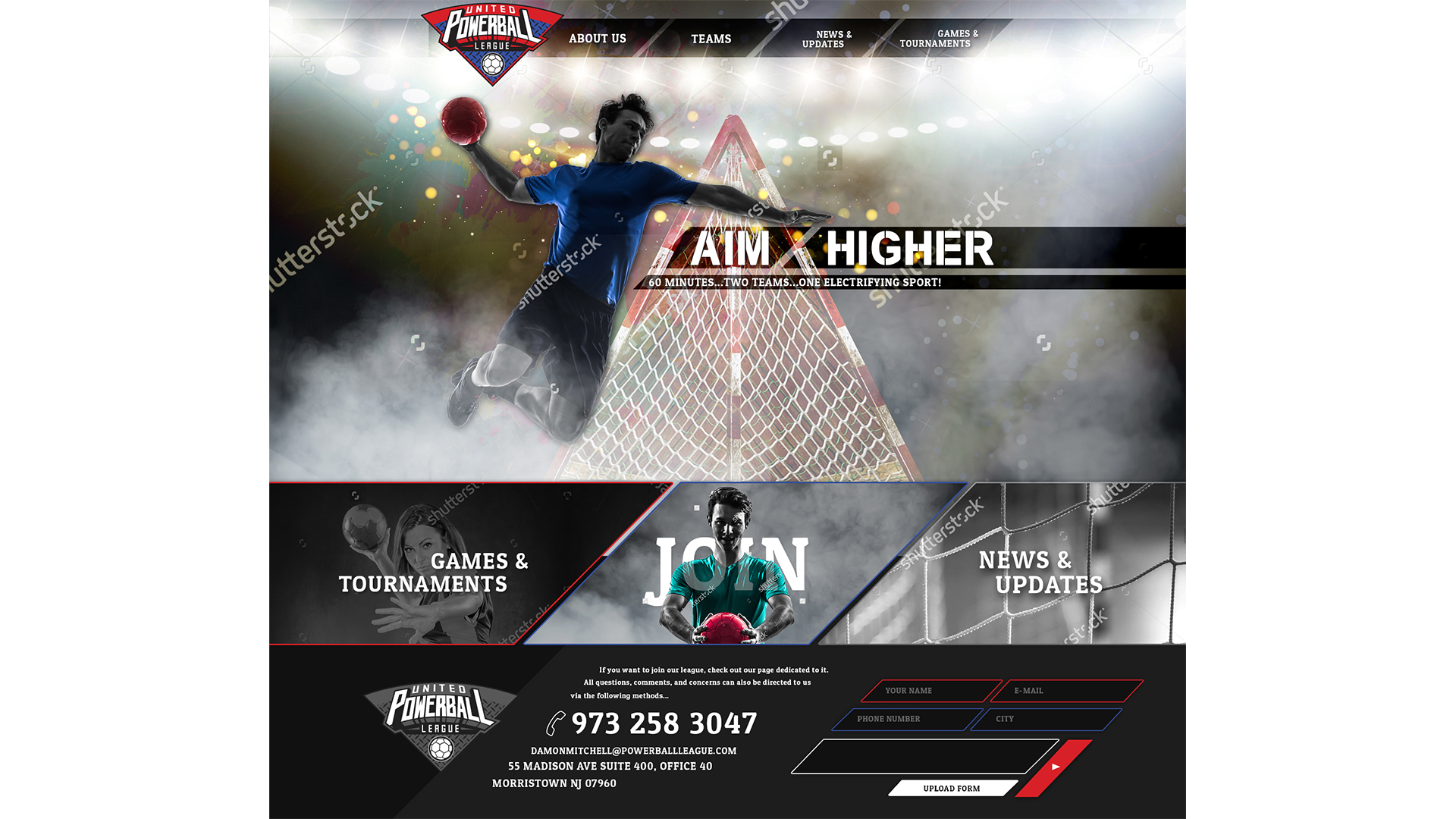
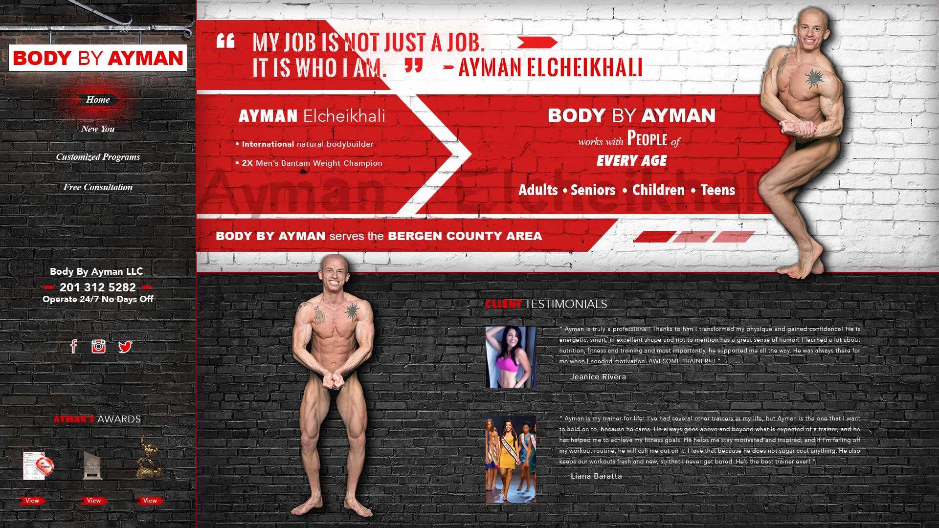
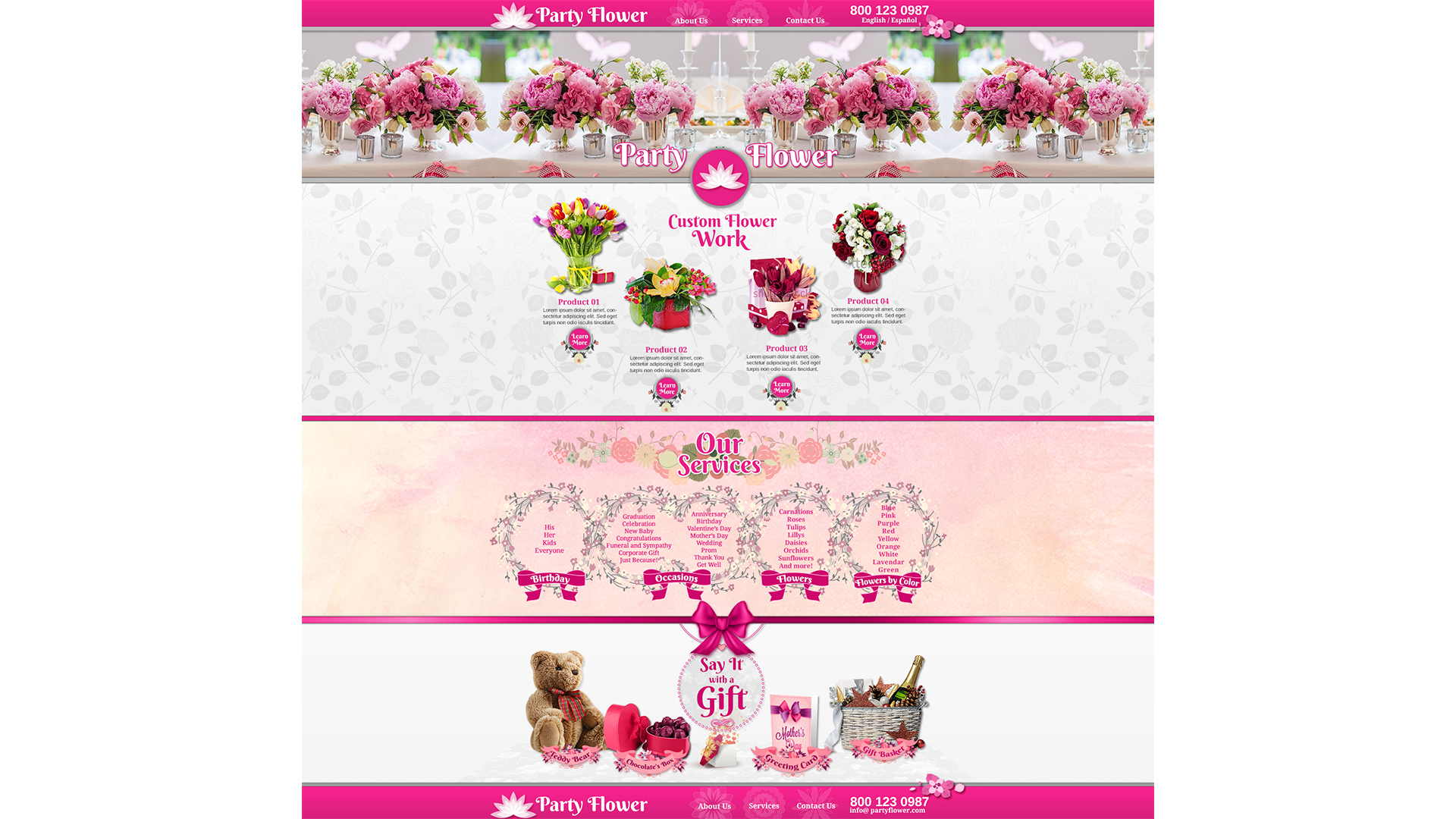
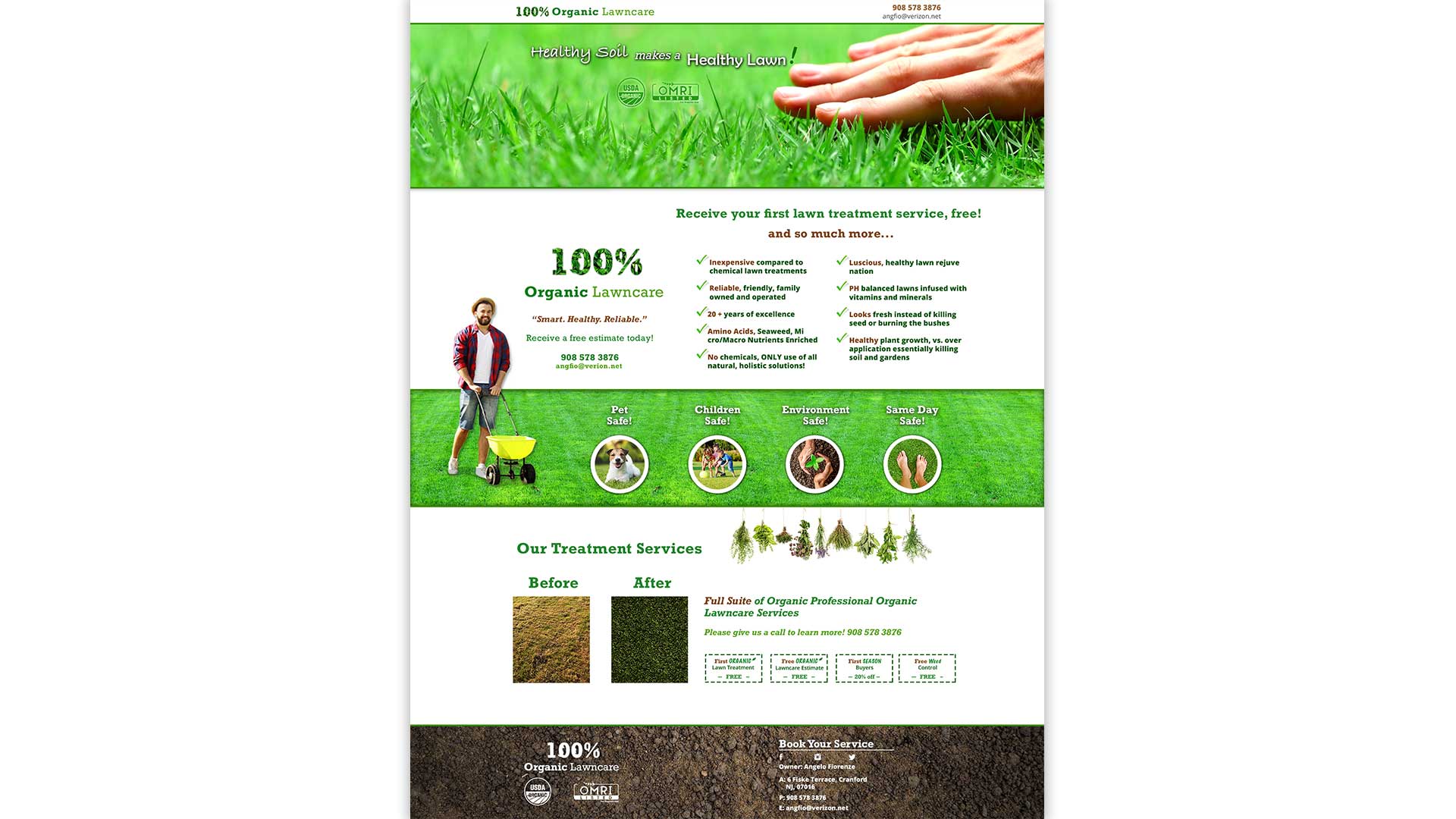
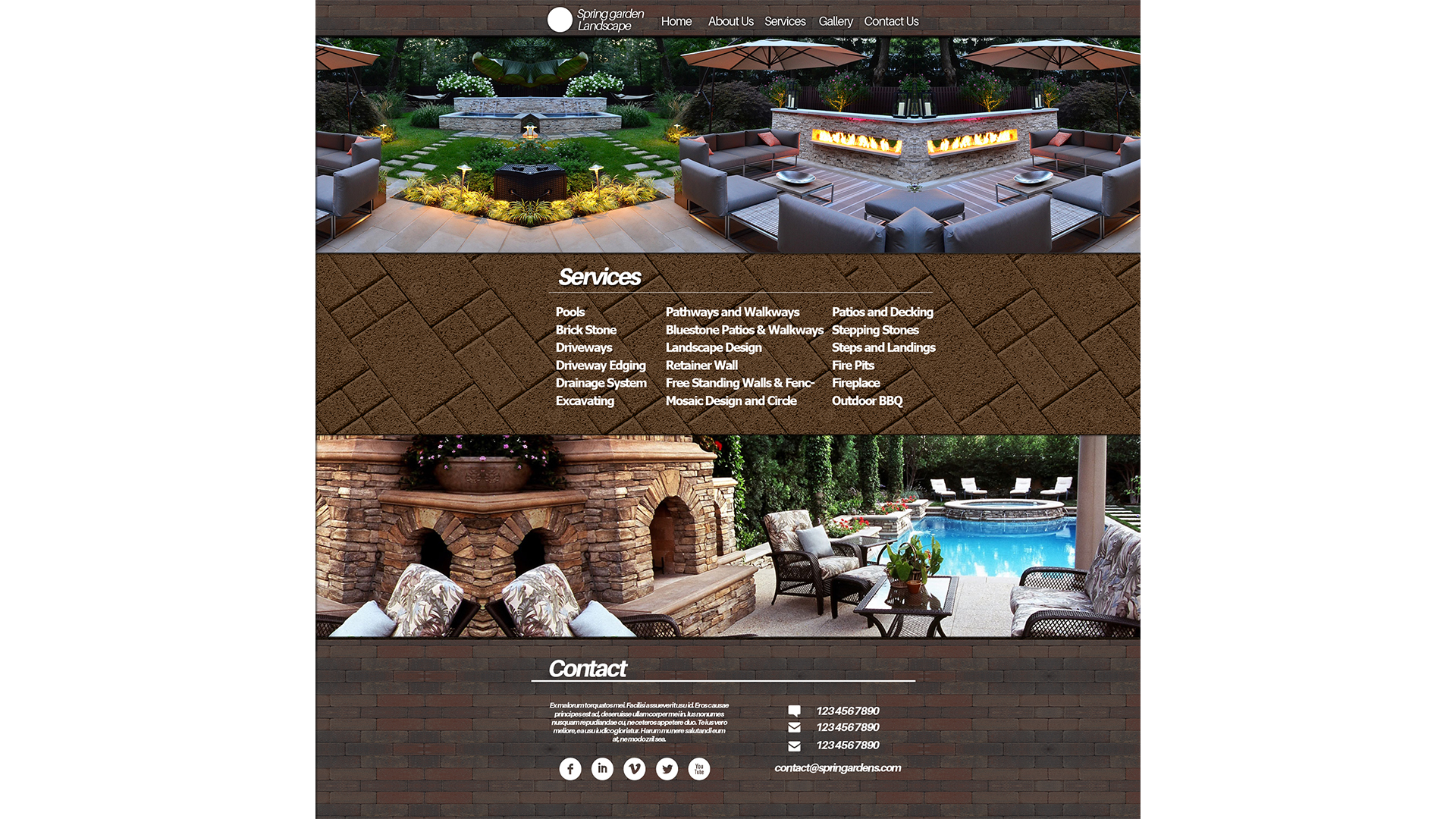
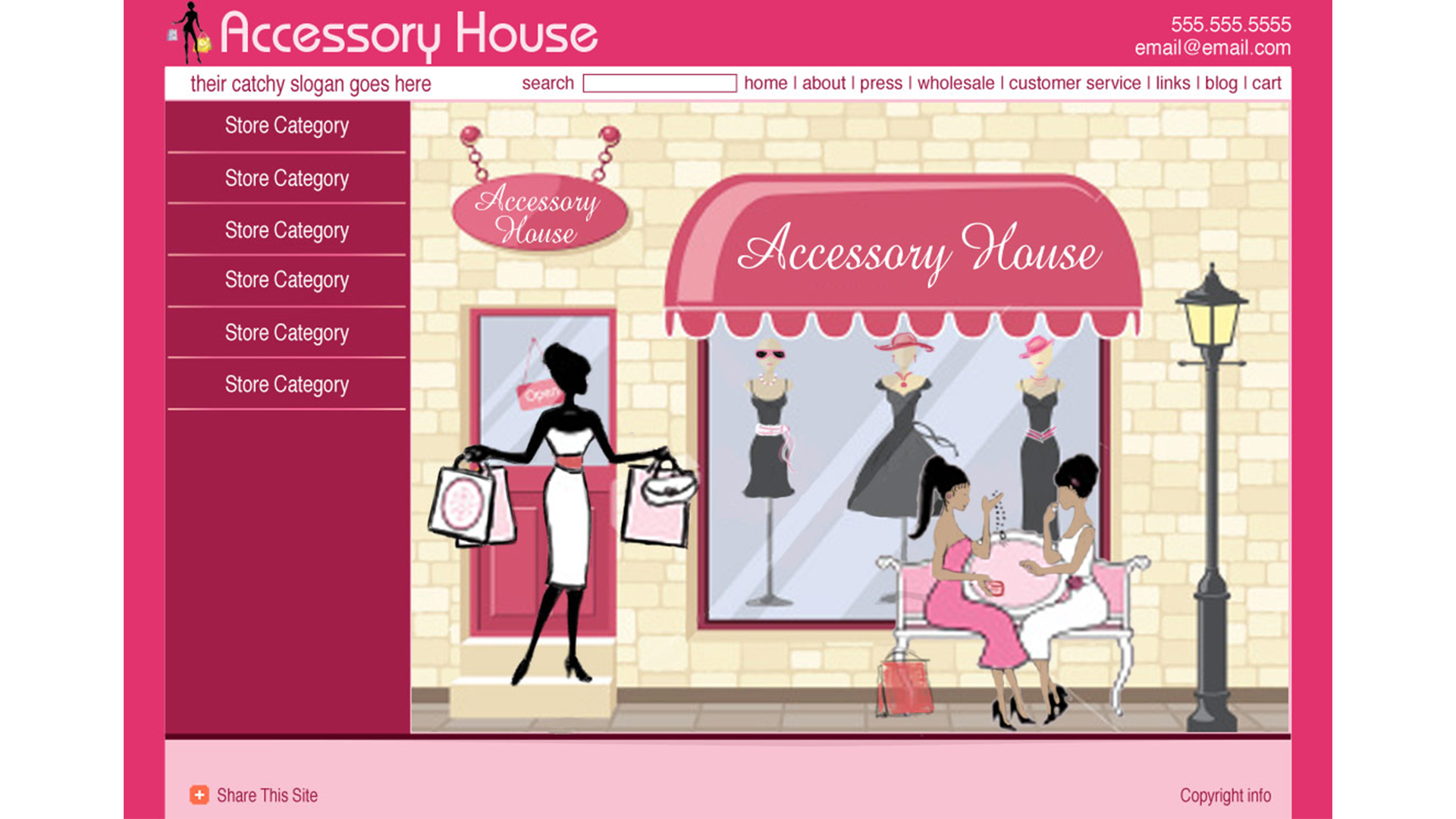
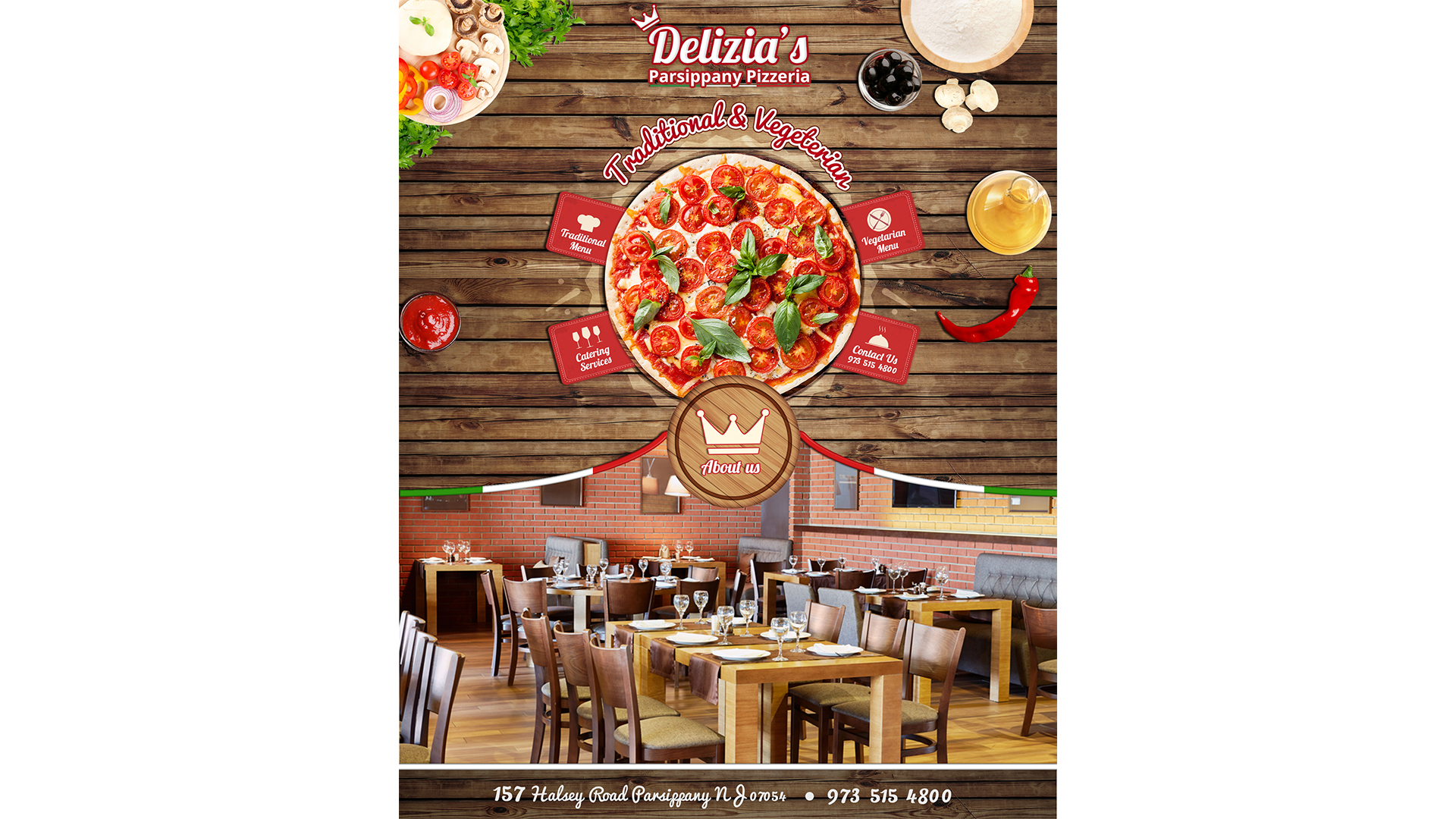
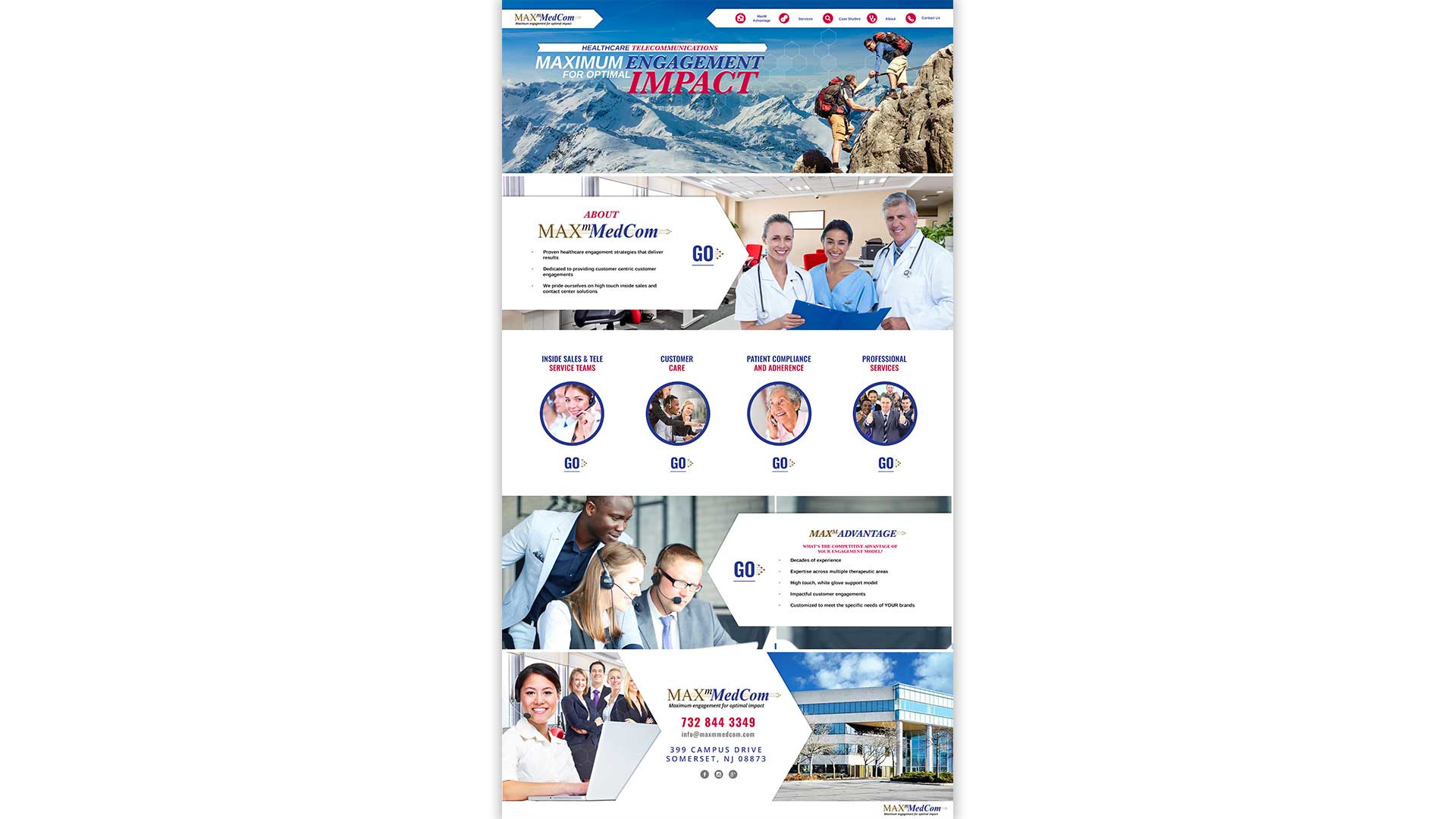
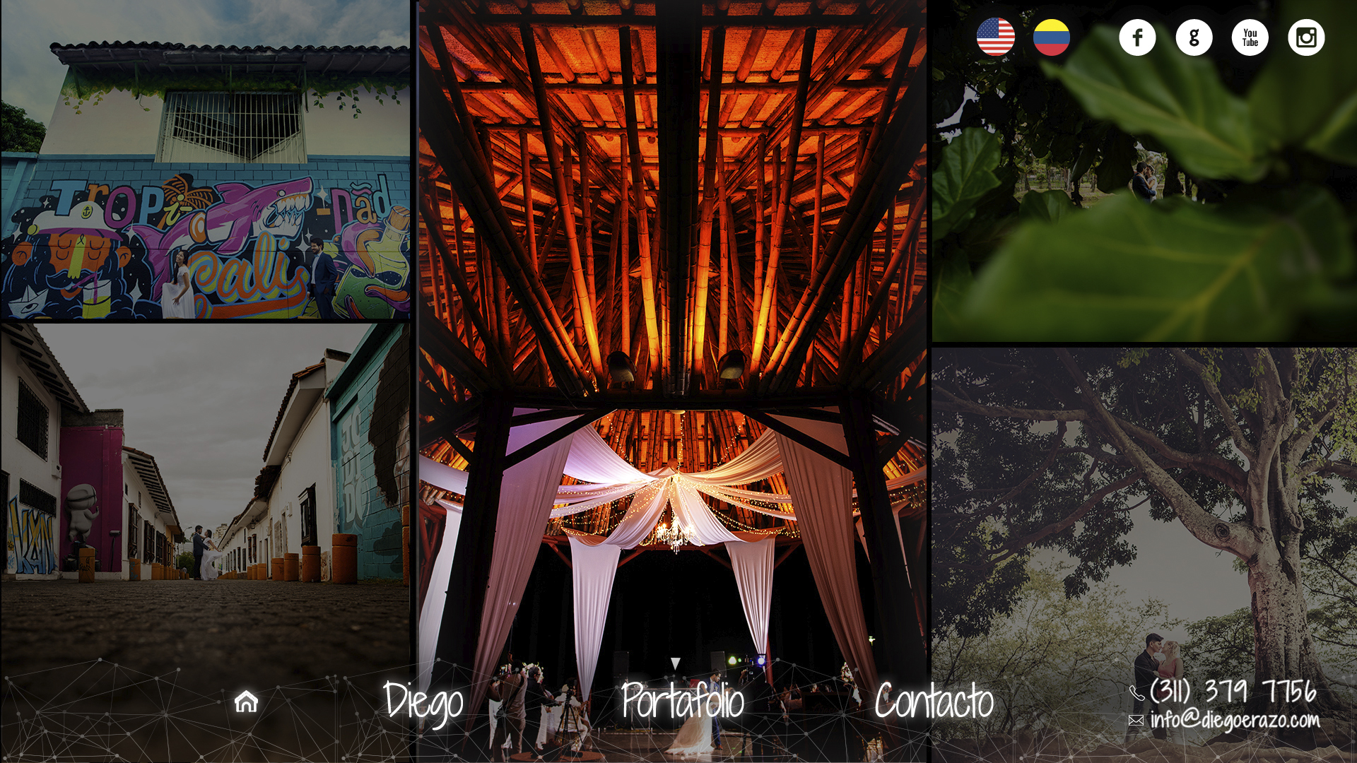
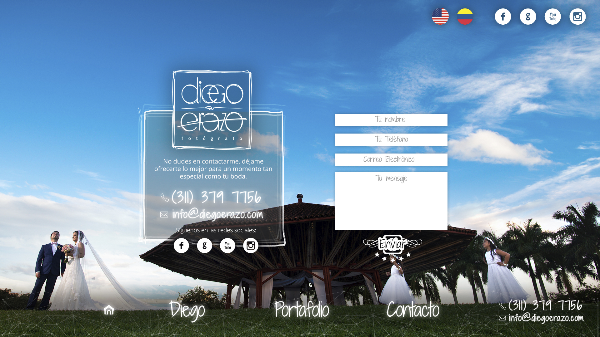
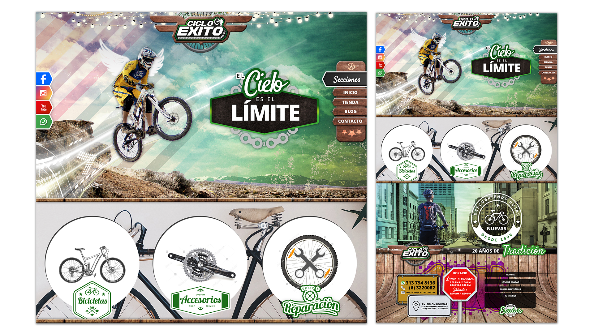
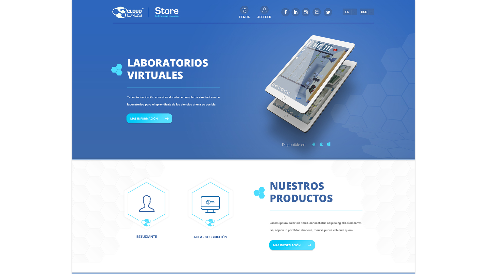
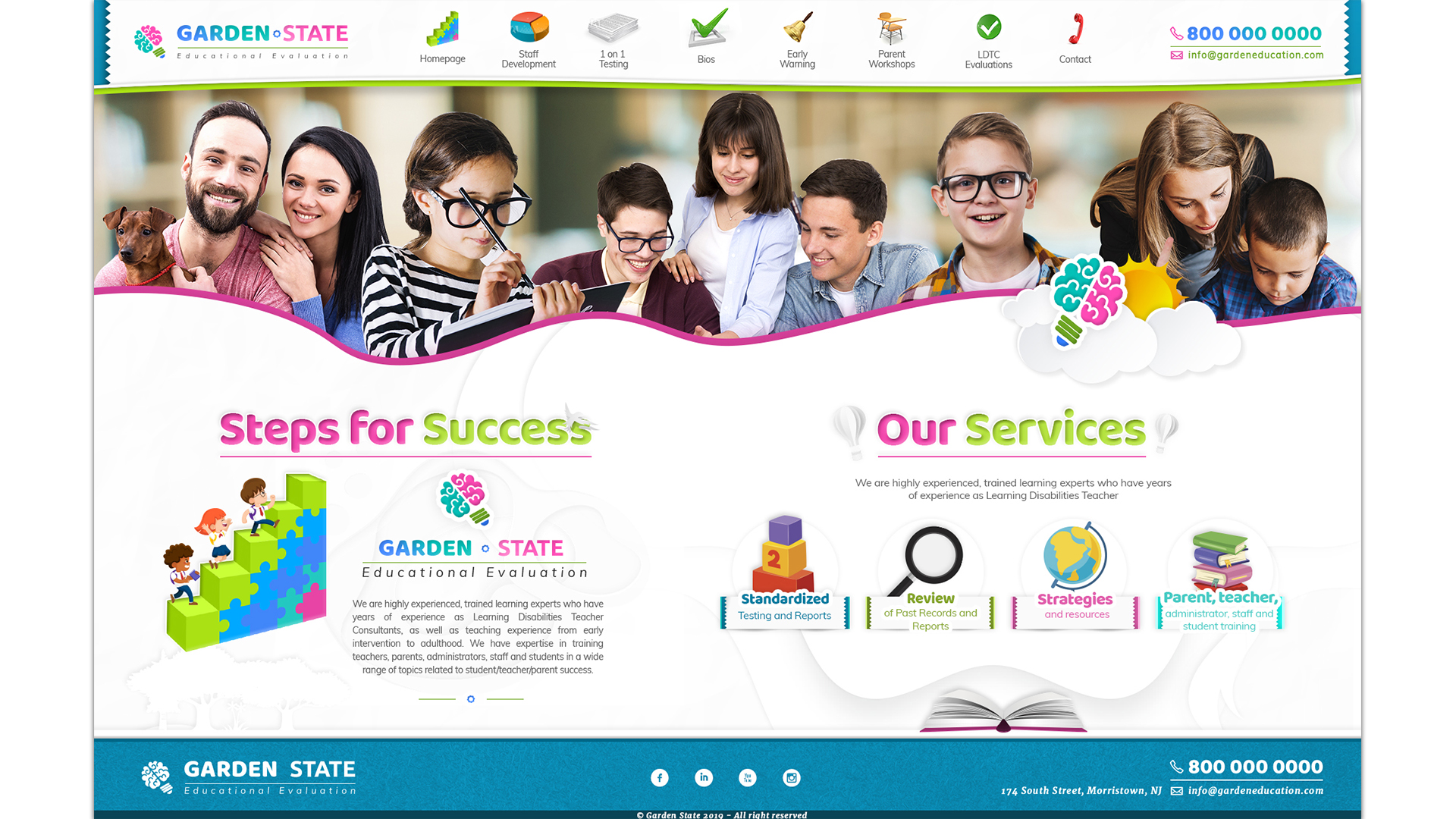
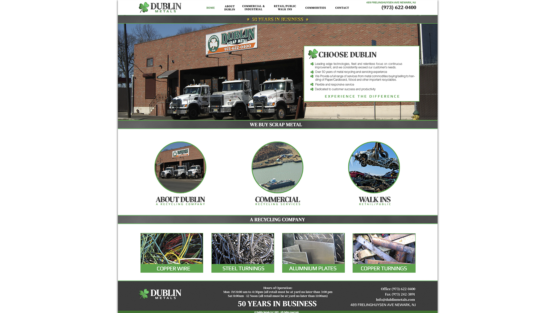
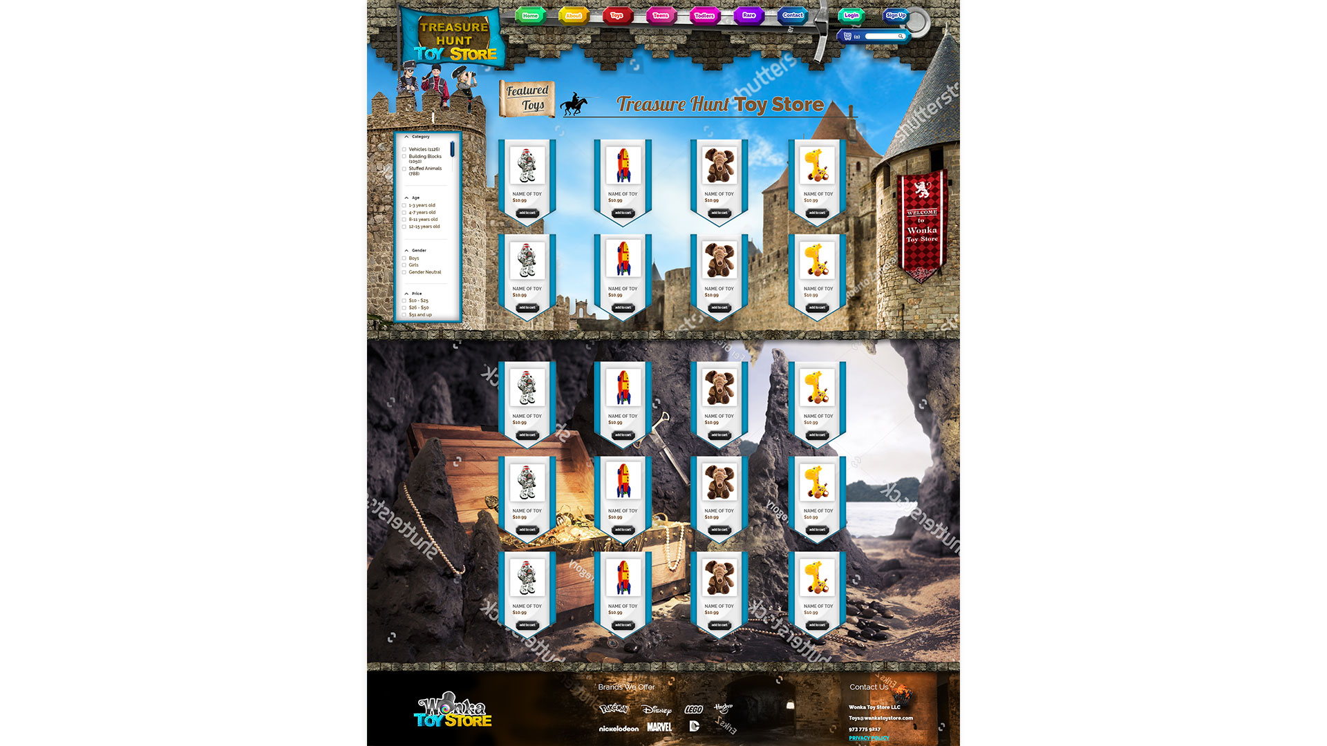
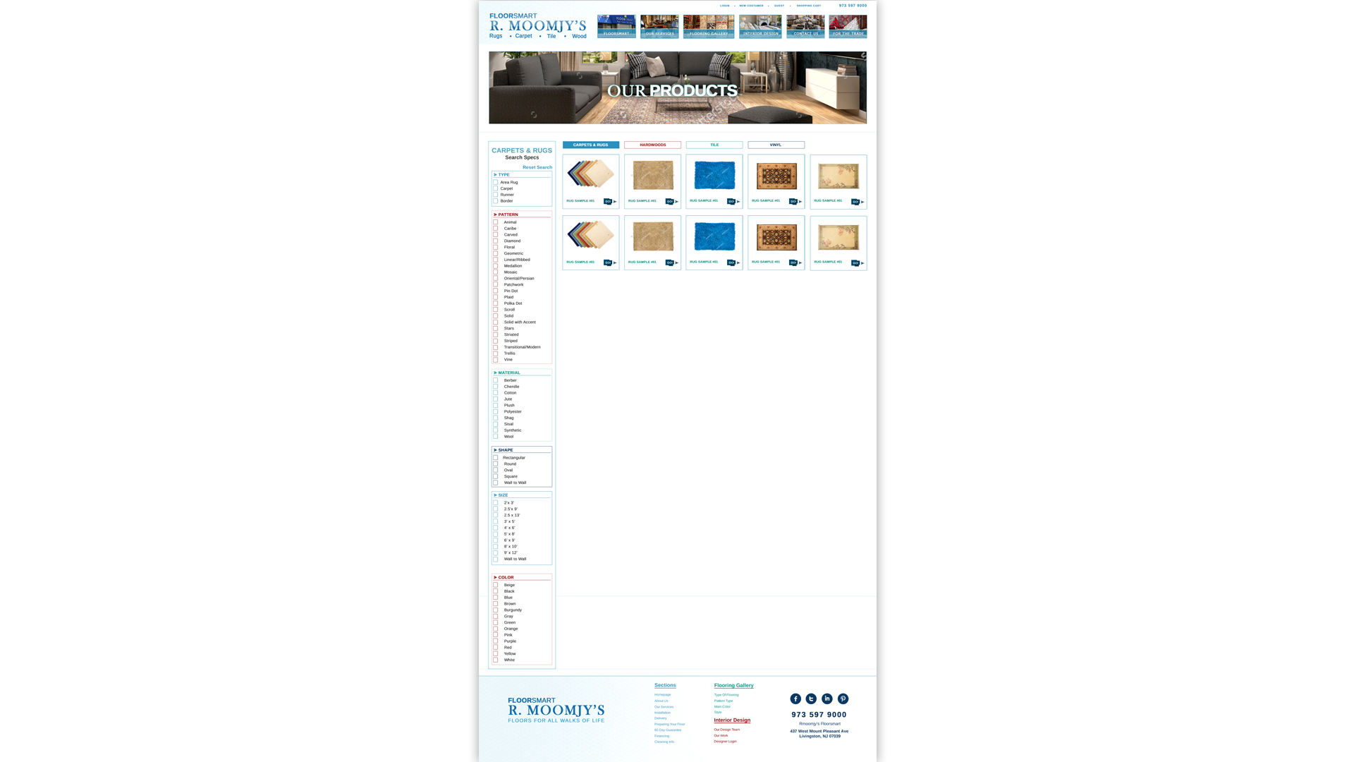
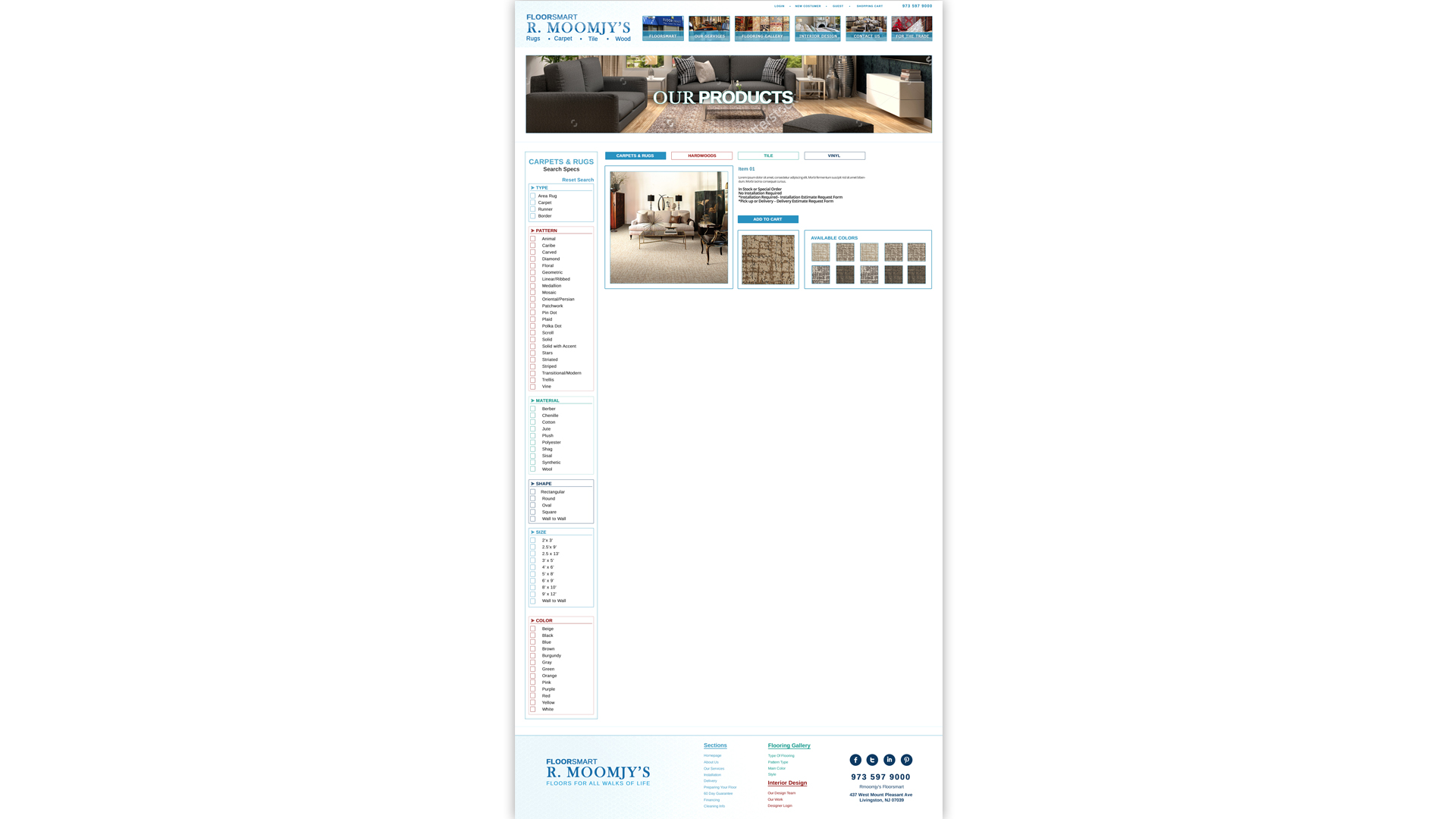
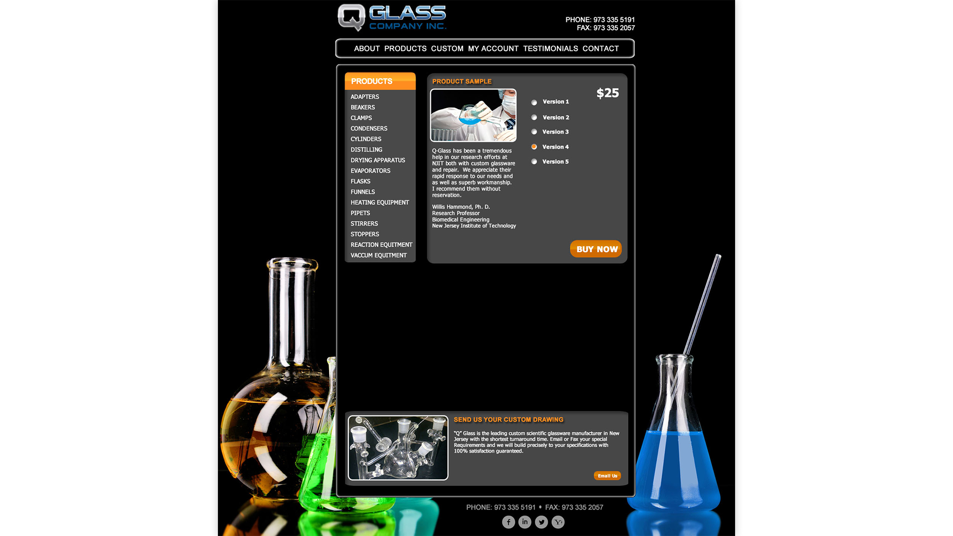
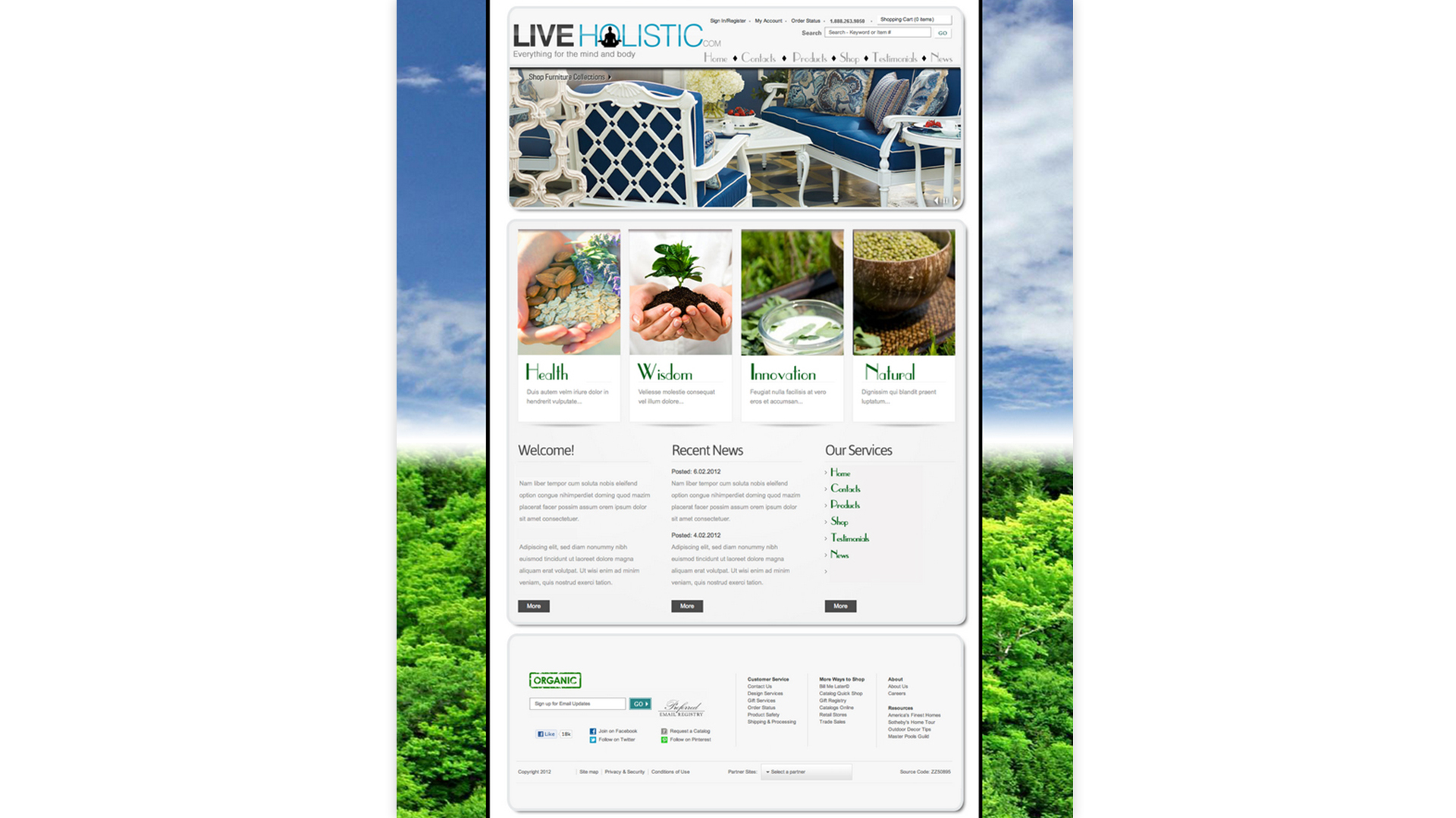
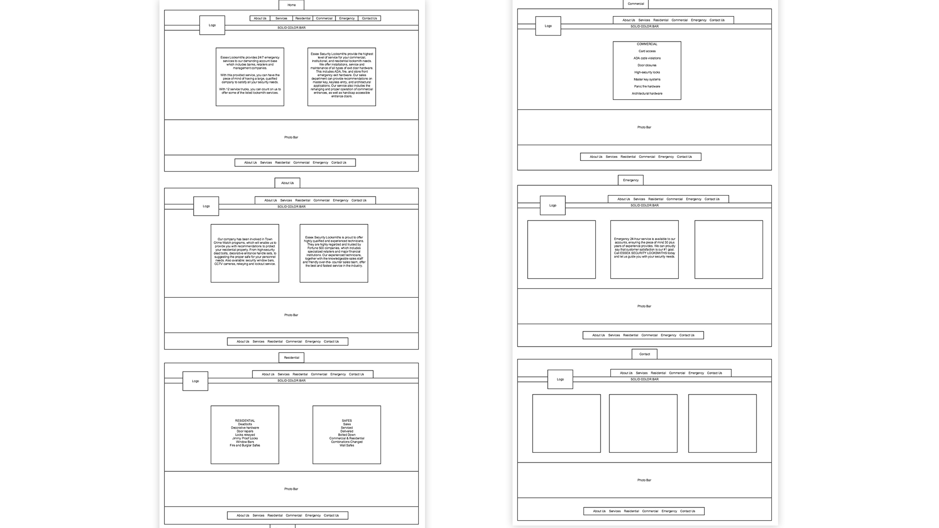
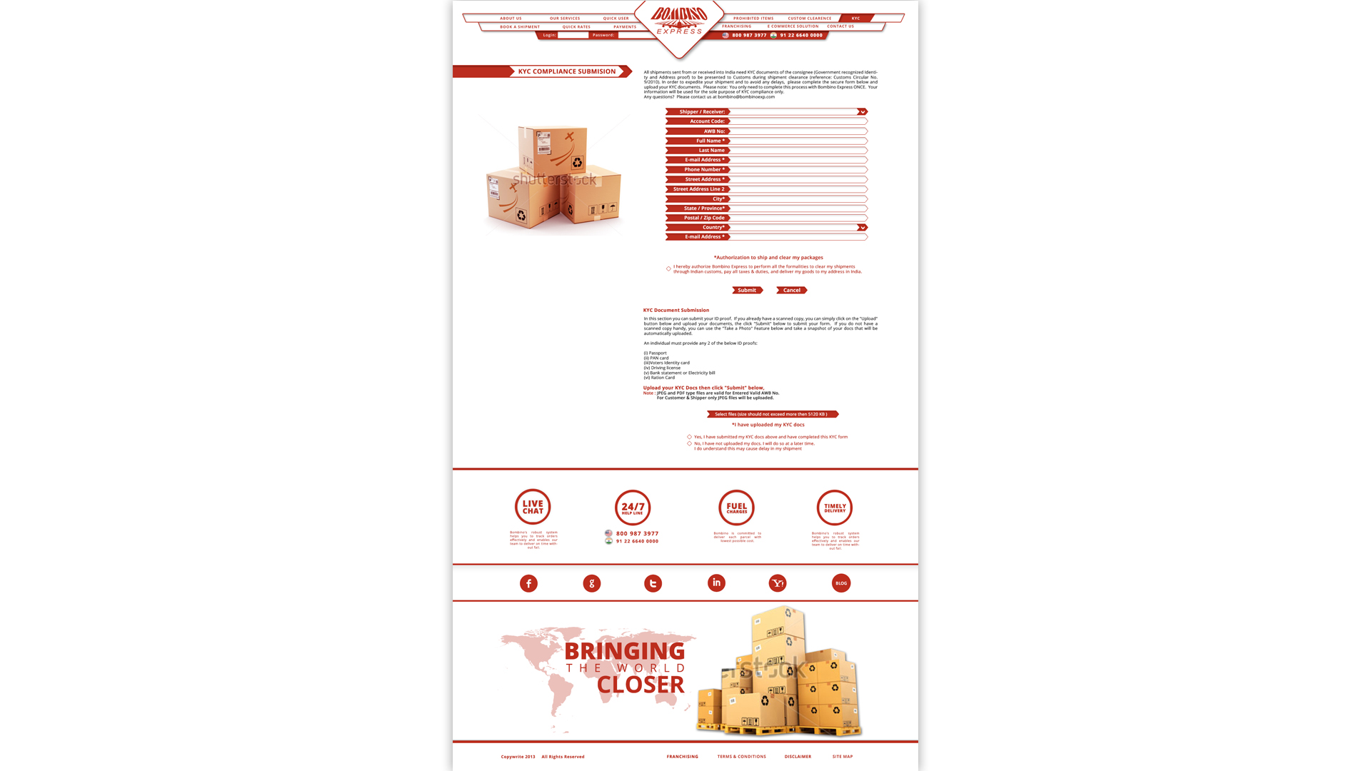
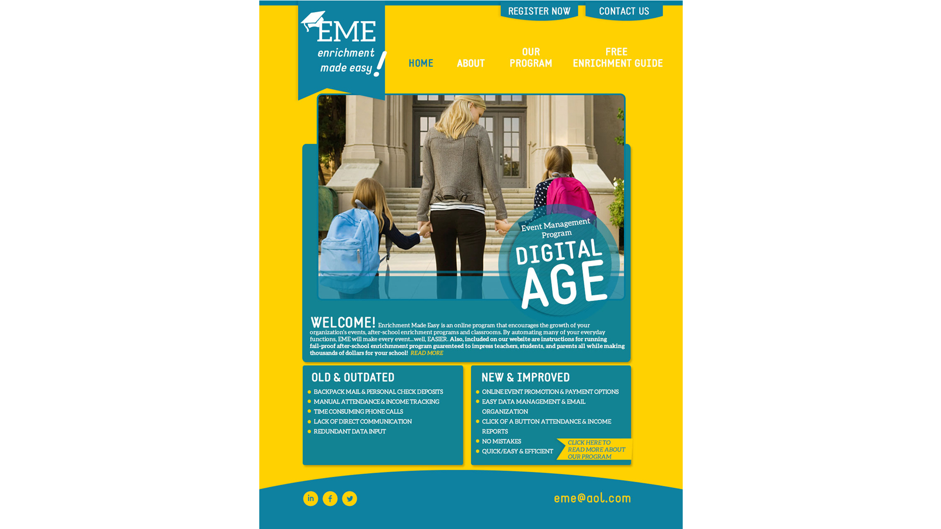
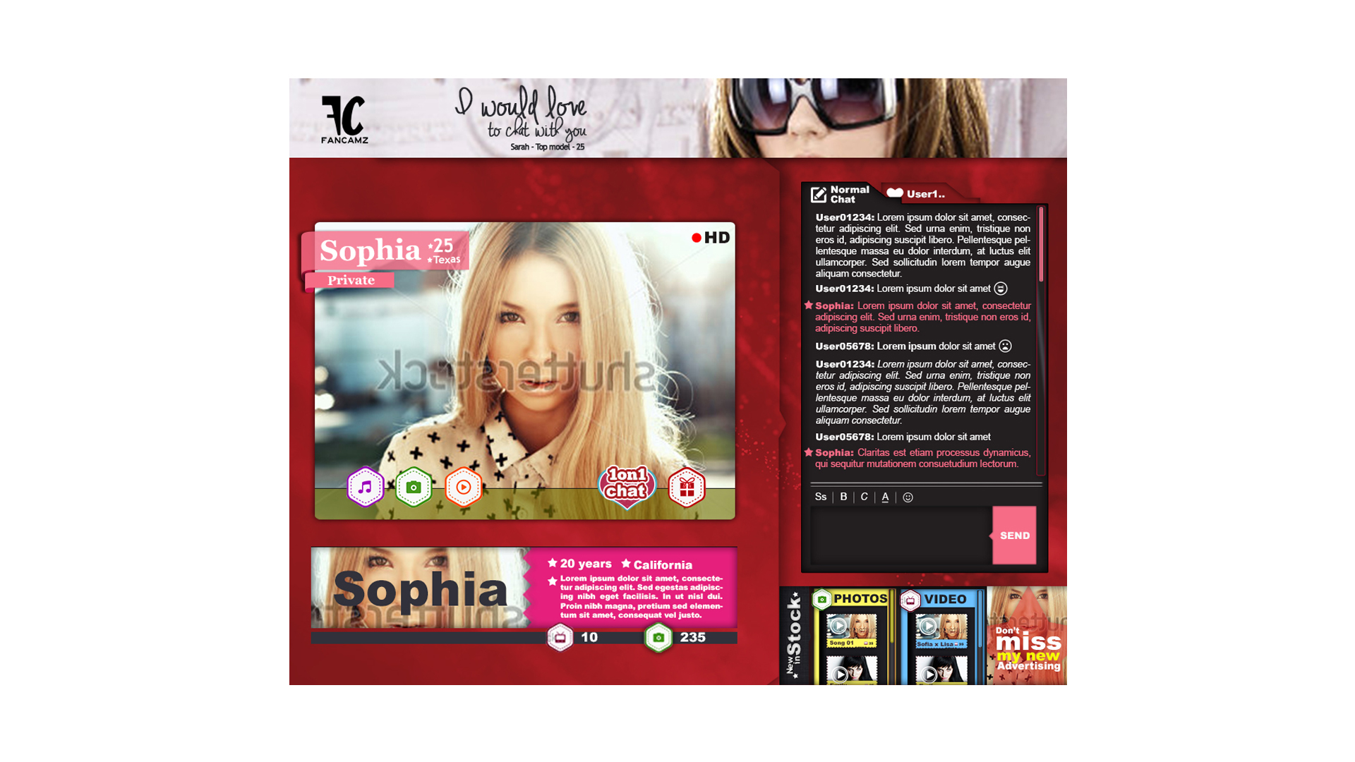
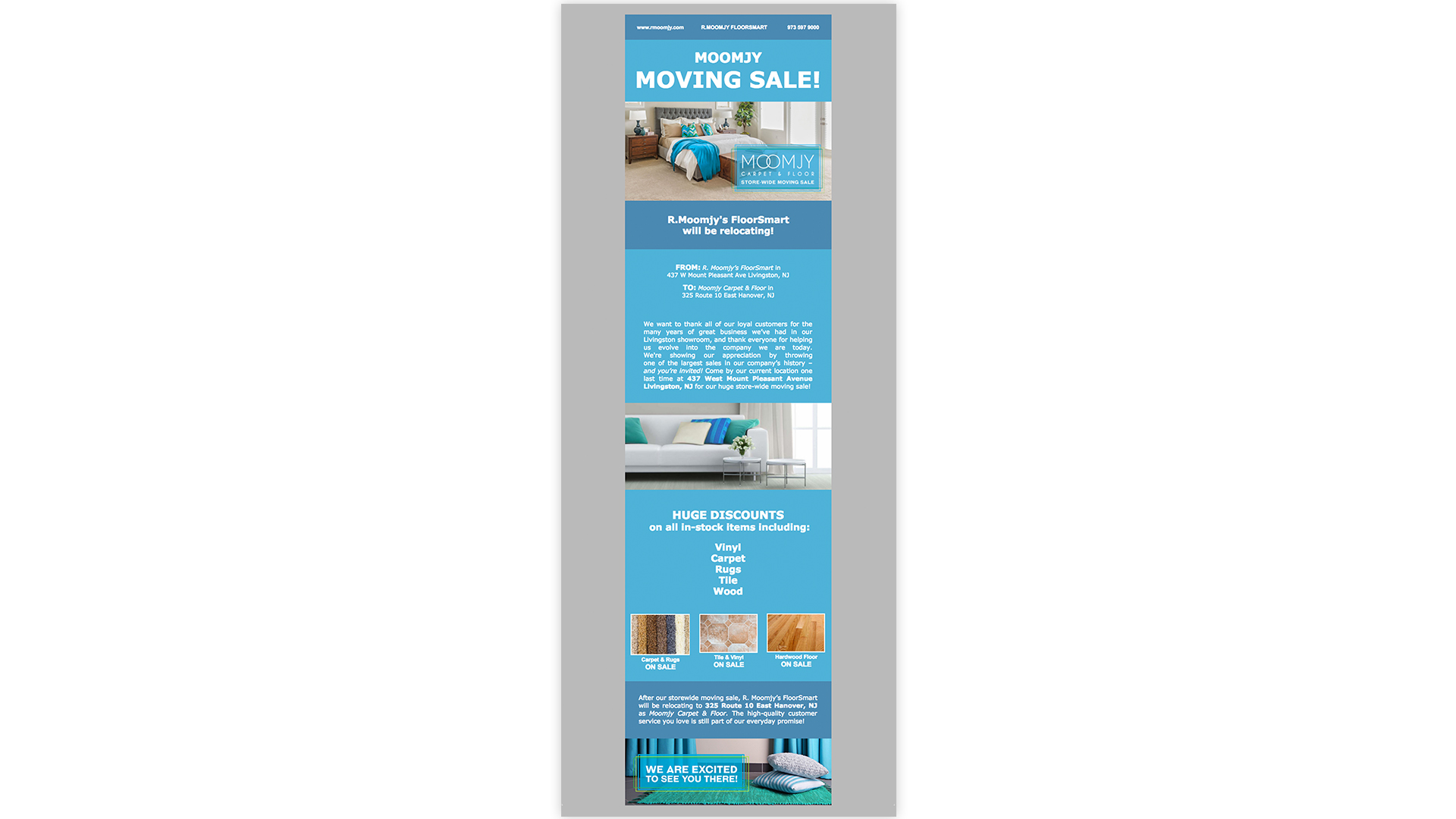
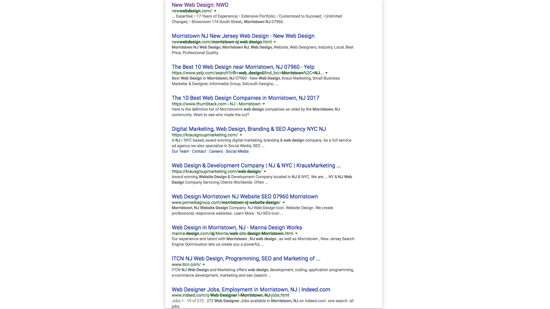
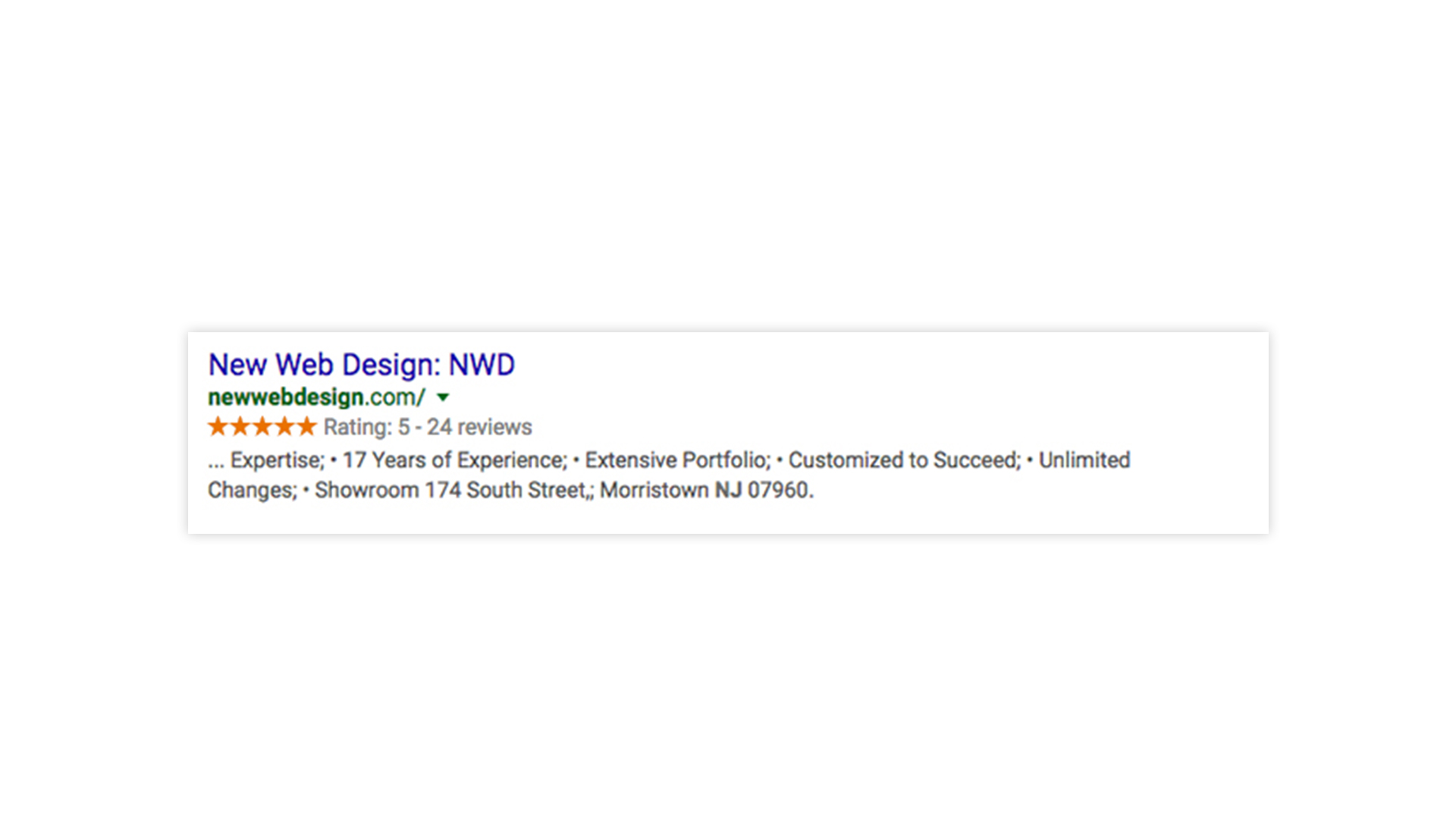
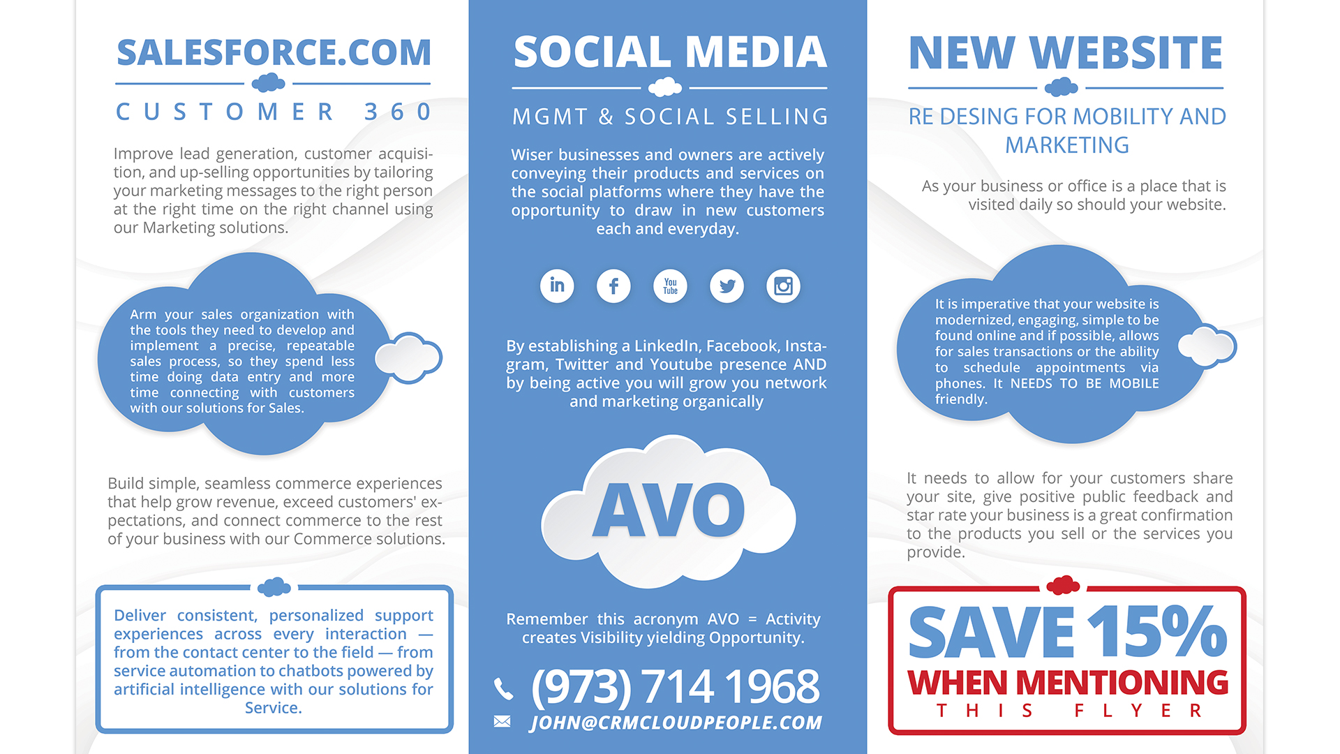
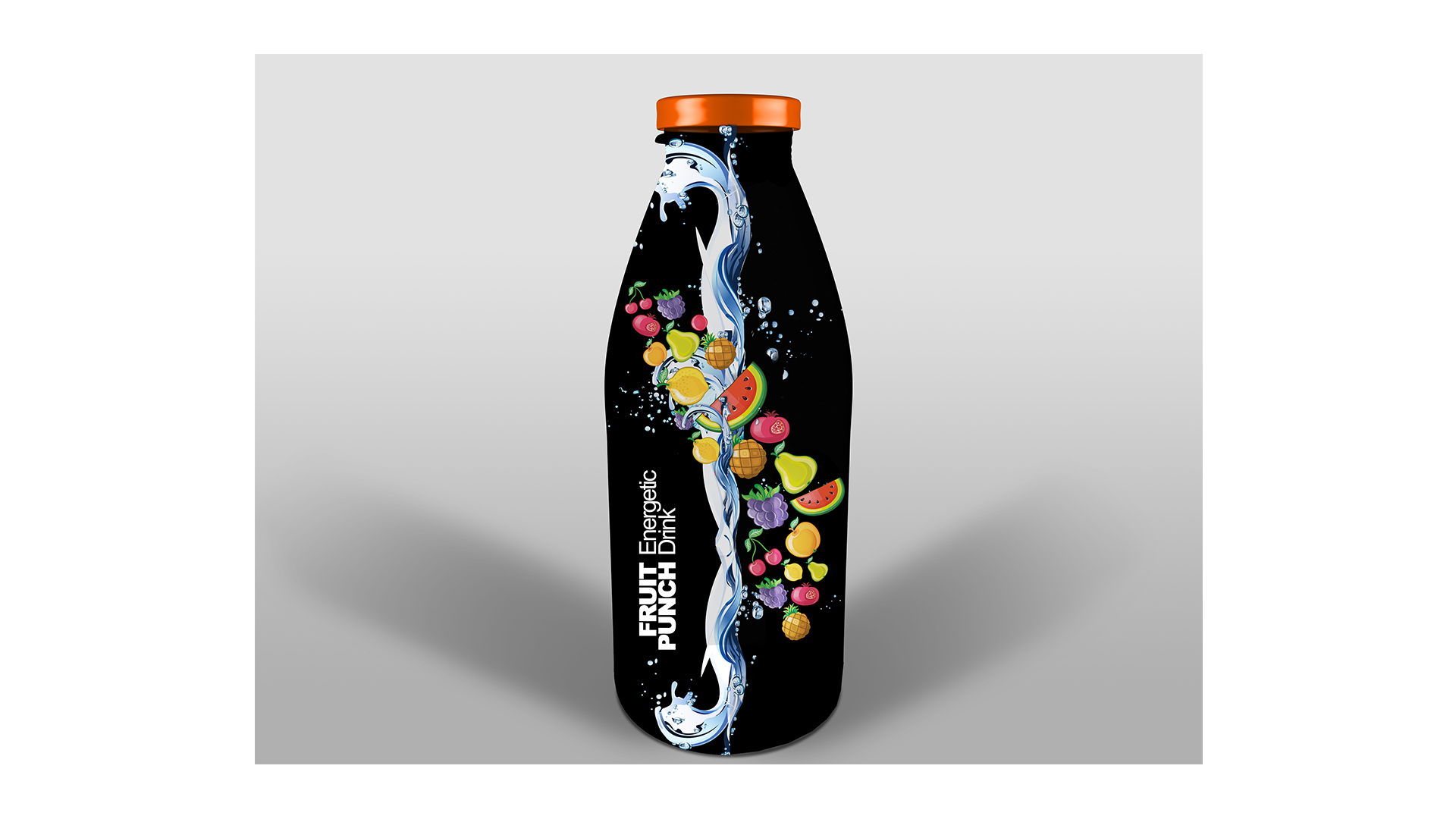
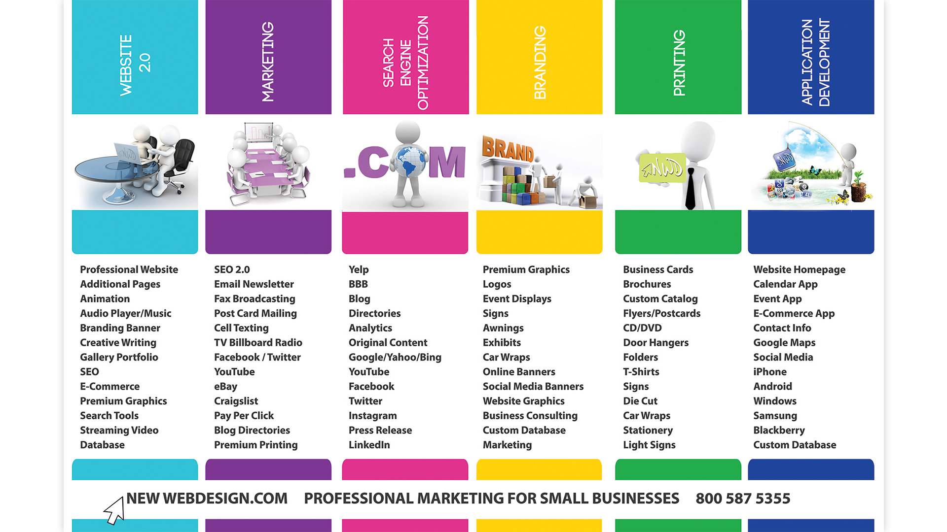
Mobile
Responsive
Website
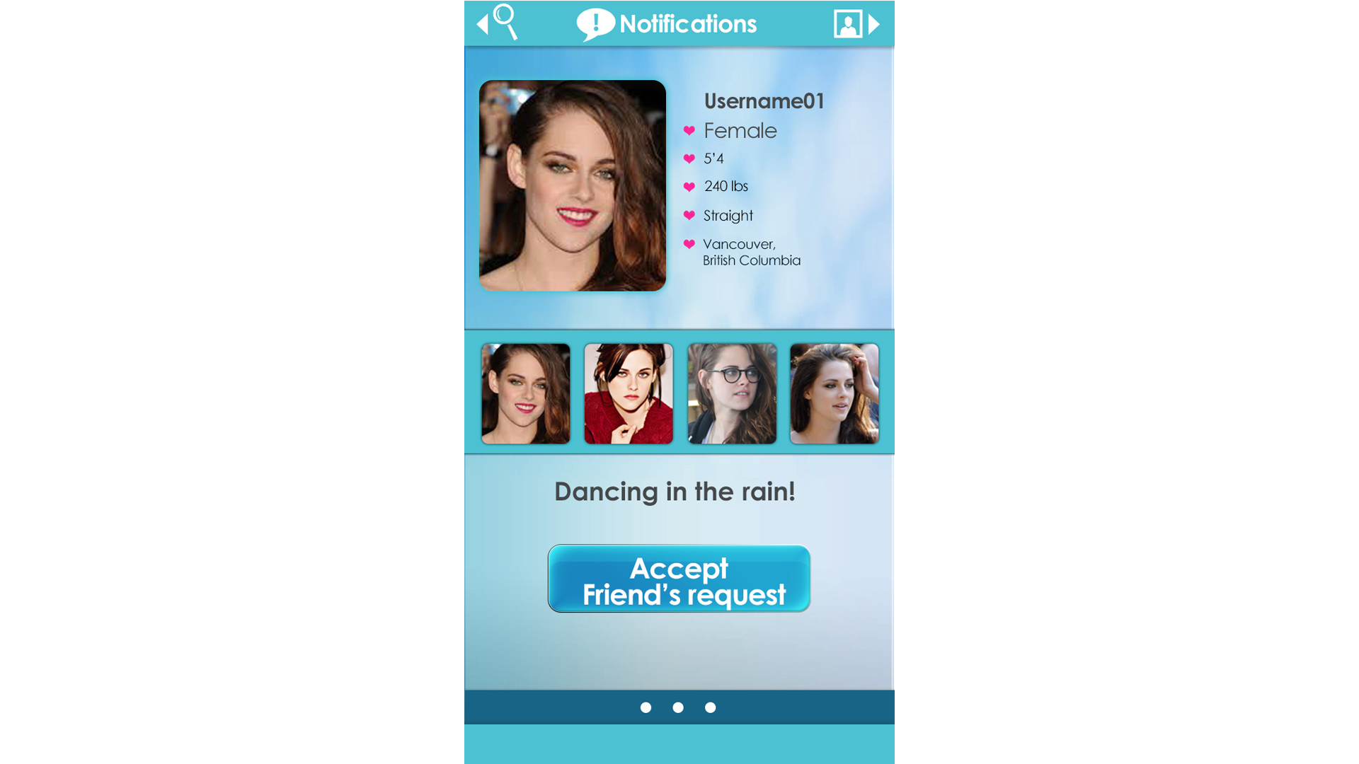
With the extreme increase of smartphones as the primary device utilized to search the web, mobile responsive web design is one of the most beneficial upgrades available. Responsive web design allows your site to be automatically resized to provide optimal viewing and a more user-friendly experience to viewers using tablets or mobile devices. Multi-column layouts become a single stackable column while text, buttons, and images automatically adjust to fit the device being used.
Once the site has been custom- coded with mobile responsive capabilities, New Web Design has a team of specialists that will test every site on all browsers, tablets, and mobile devices to ensure consistency in sizing and layout.
Mobile Responsive Benefits
What Sets NWD Apart
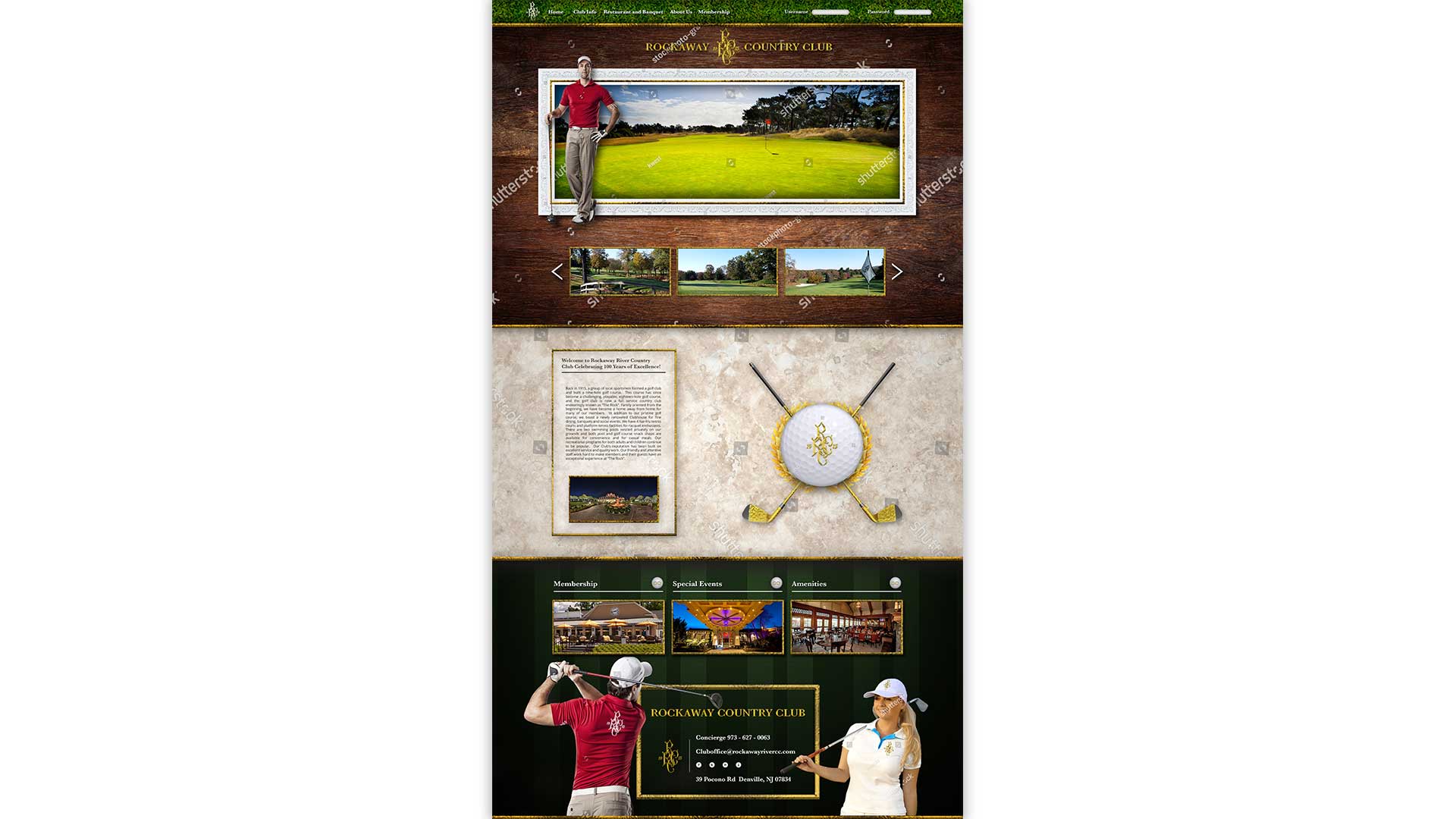
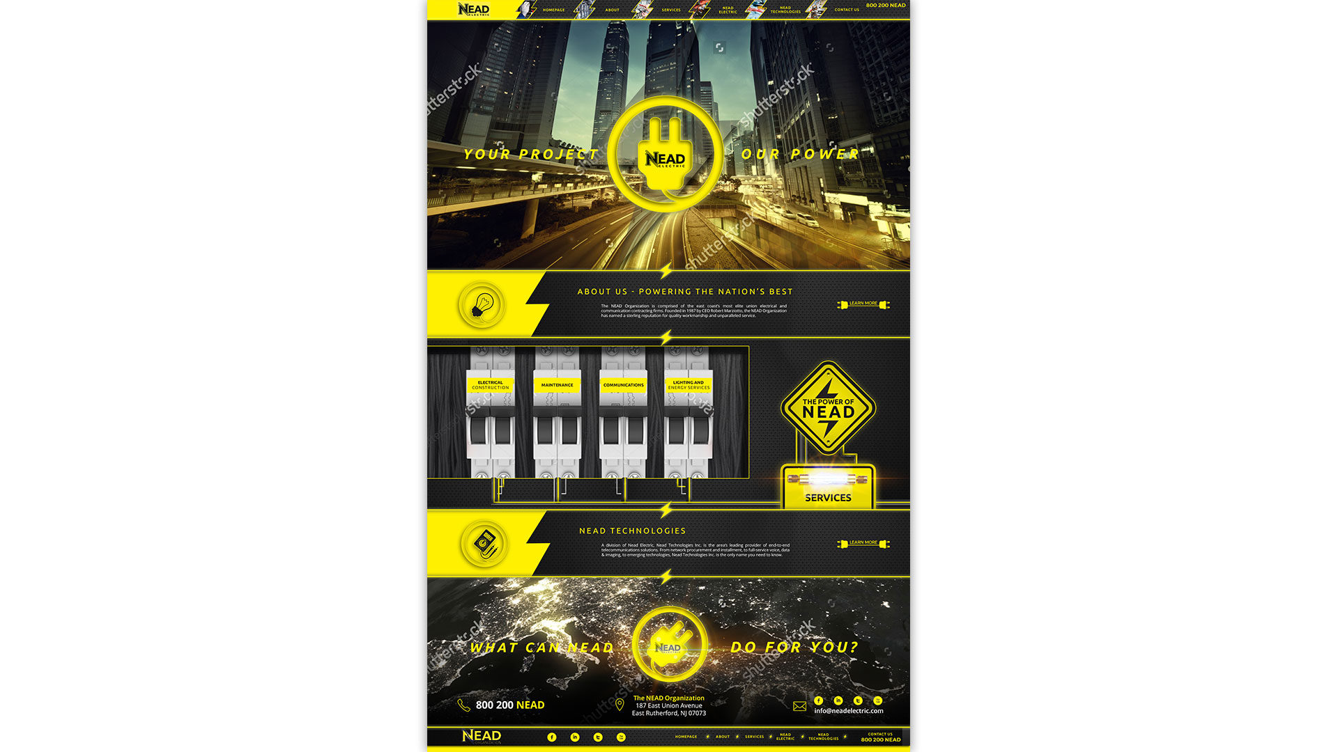
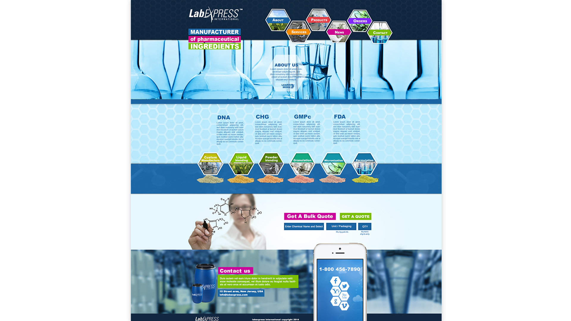
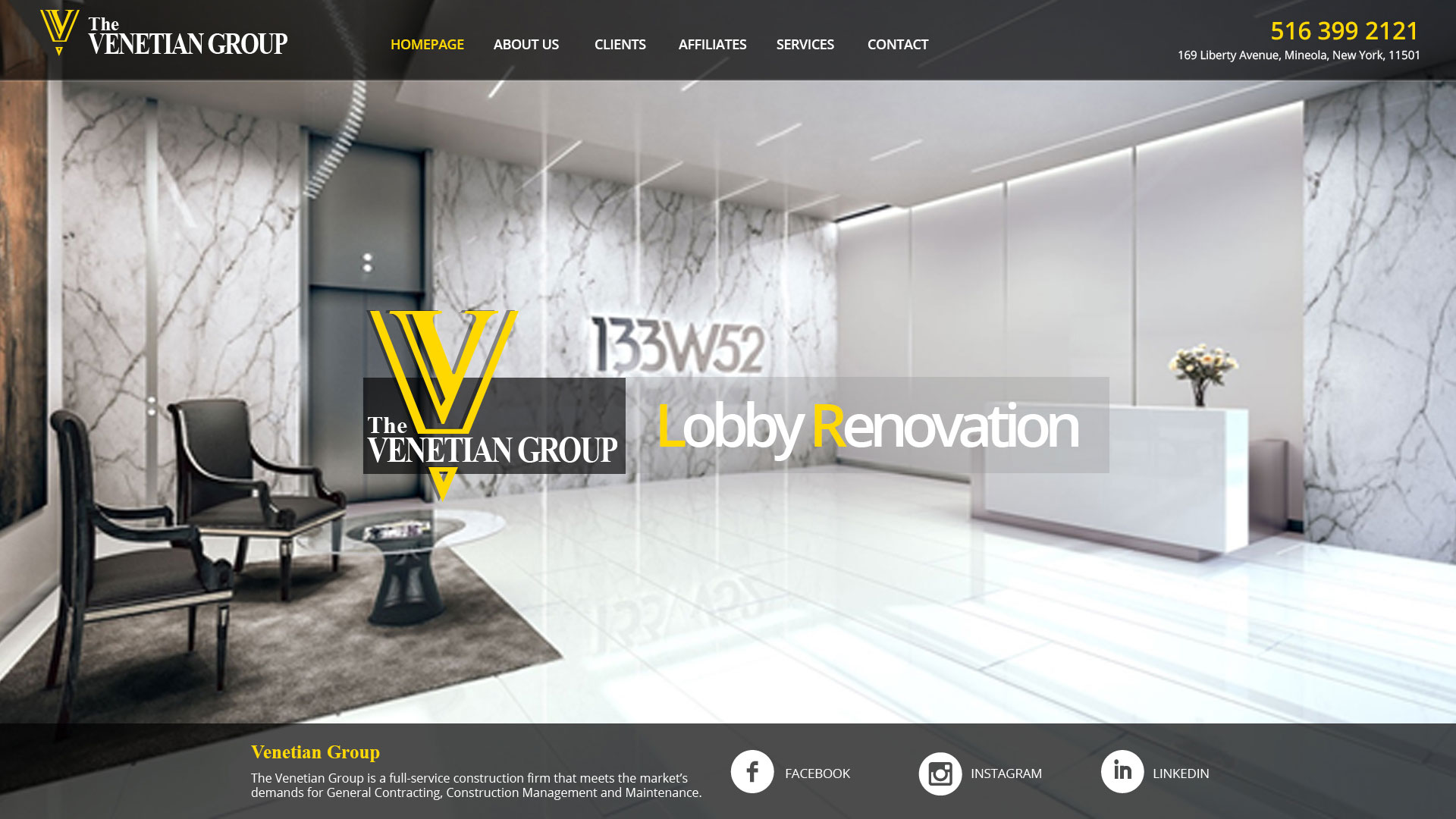
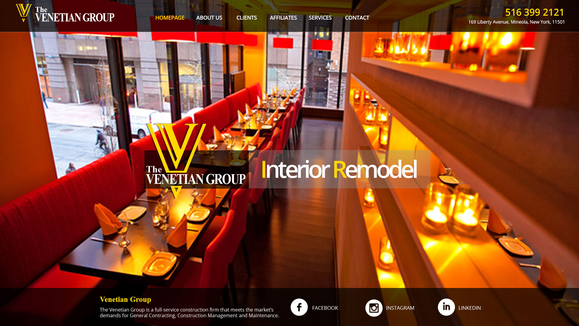
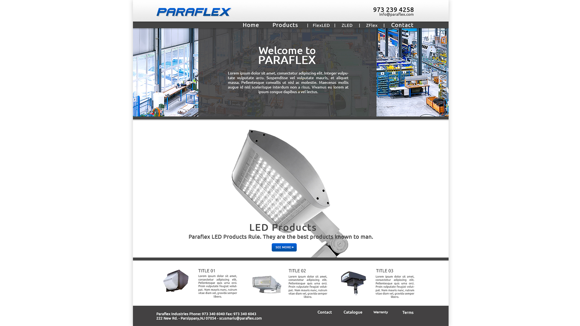
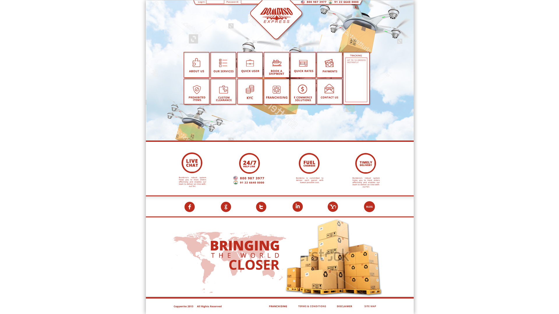
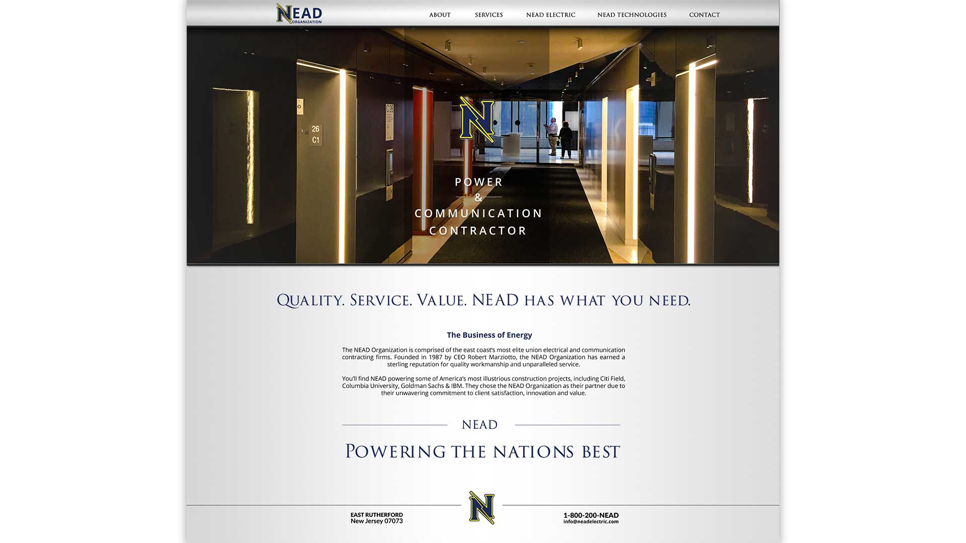
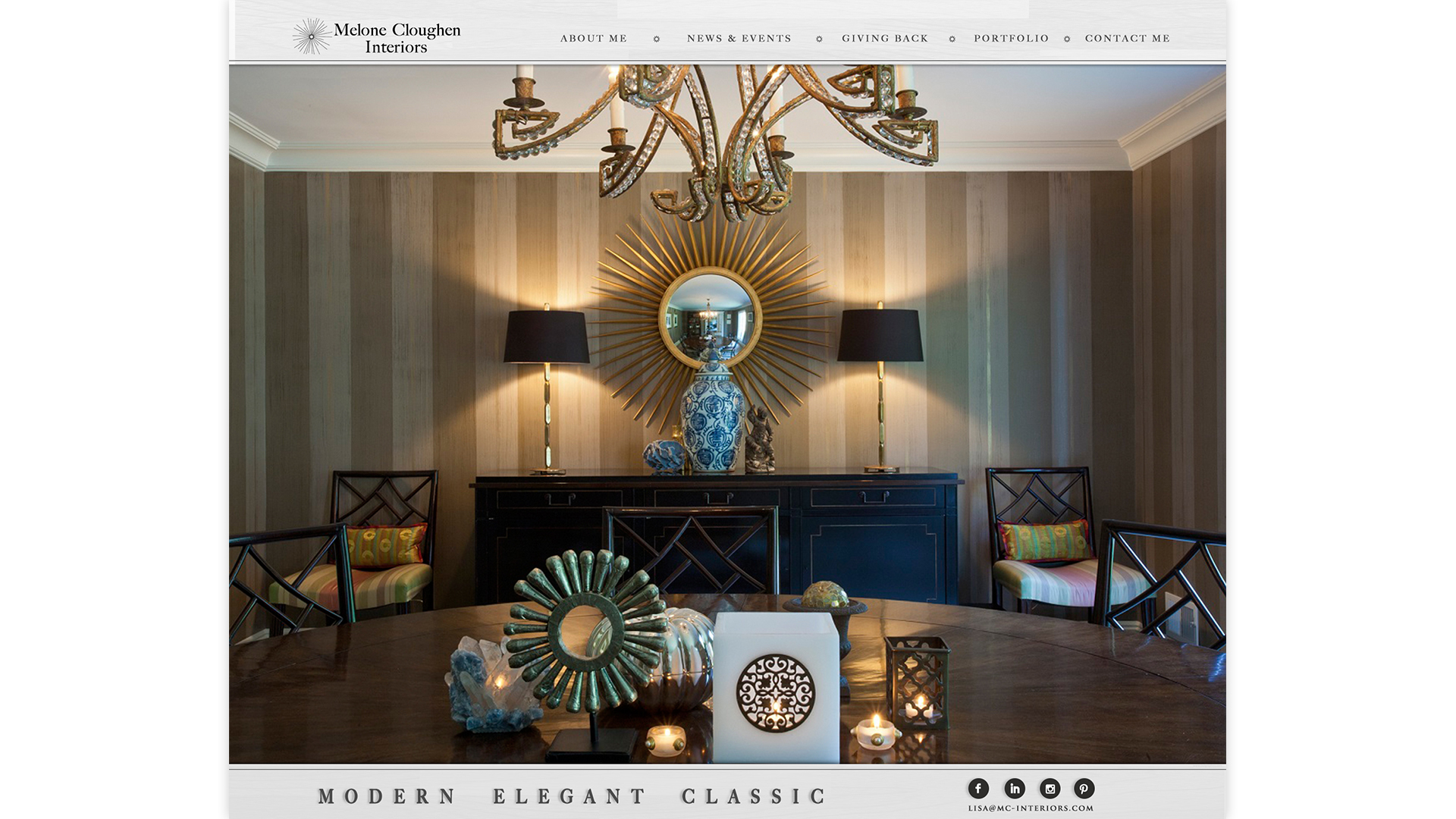
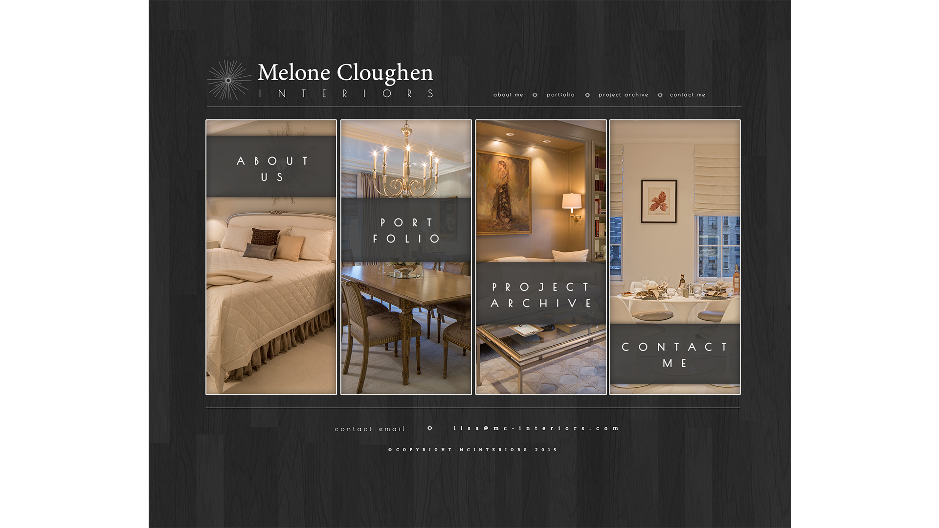
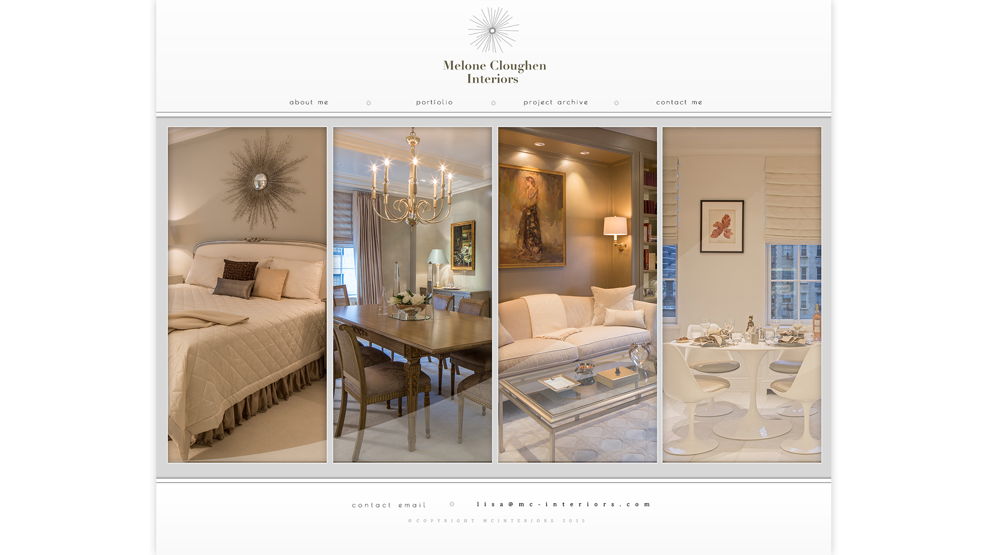
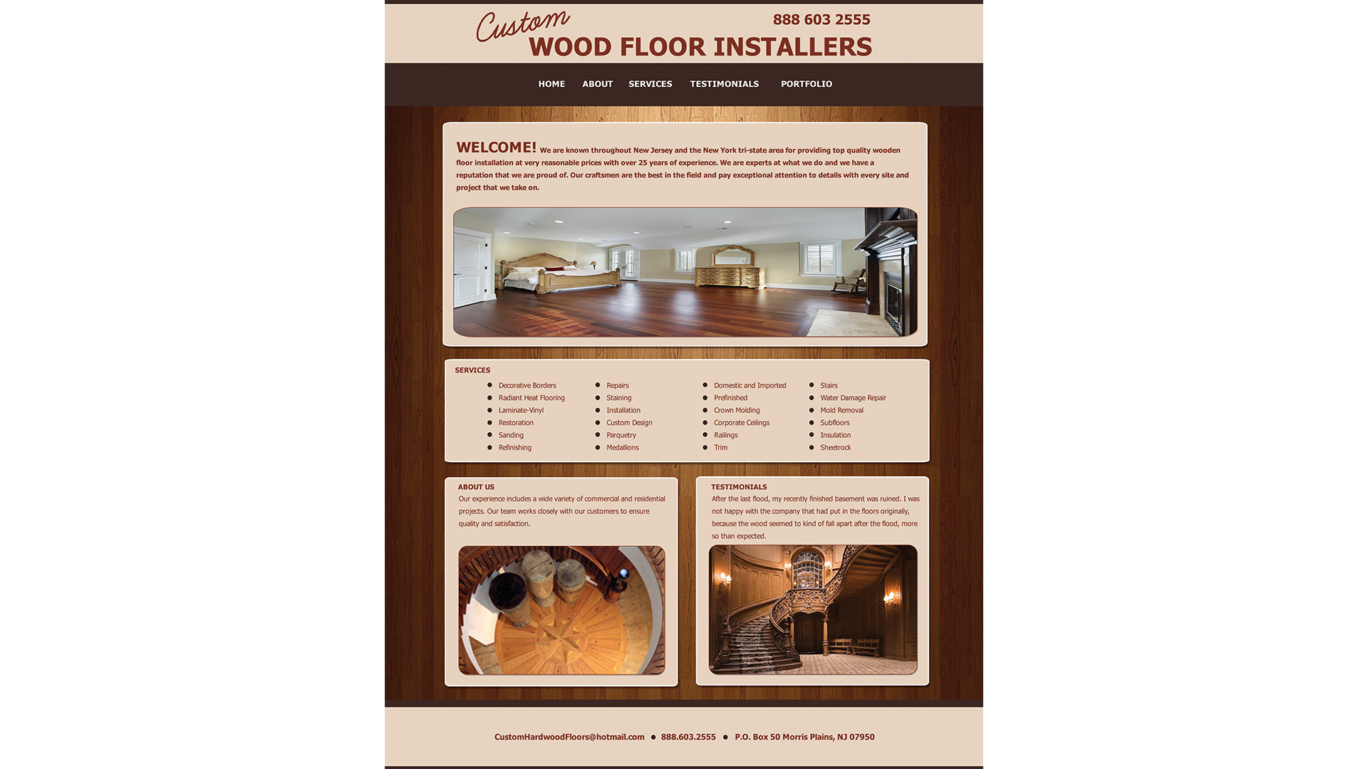
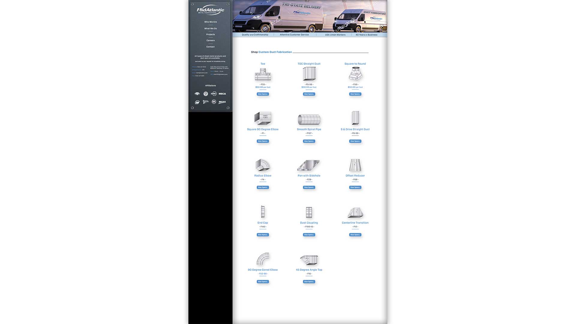
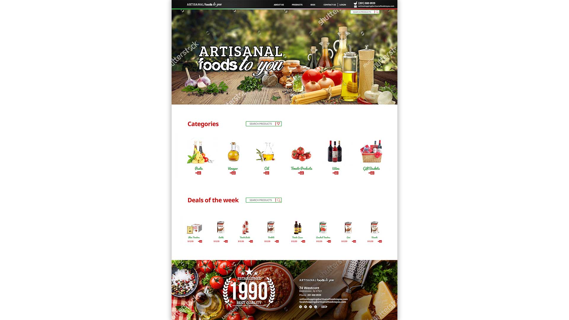
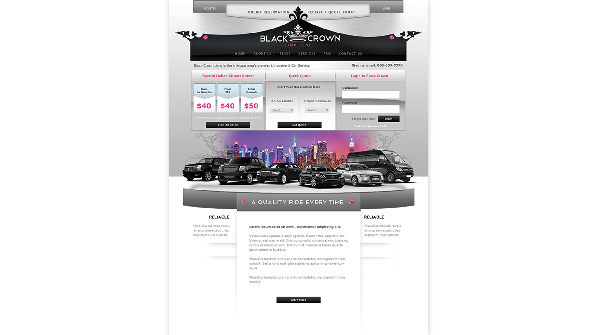
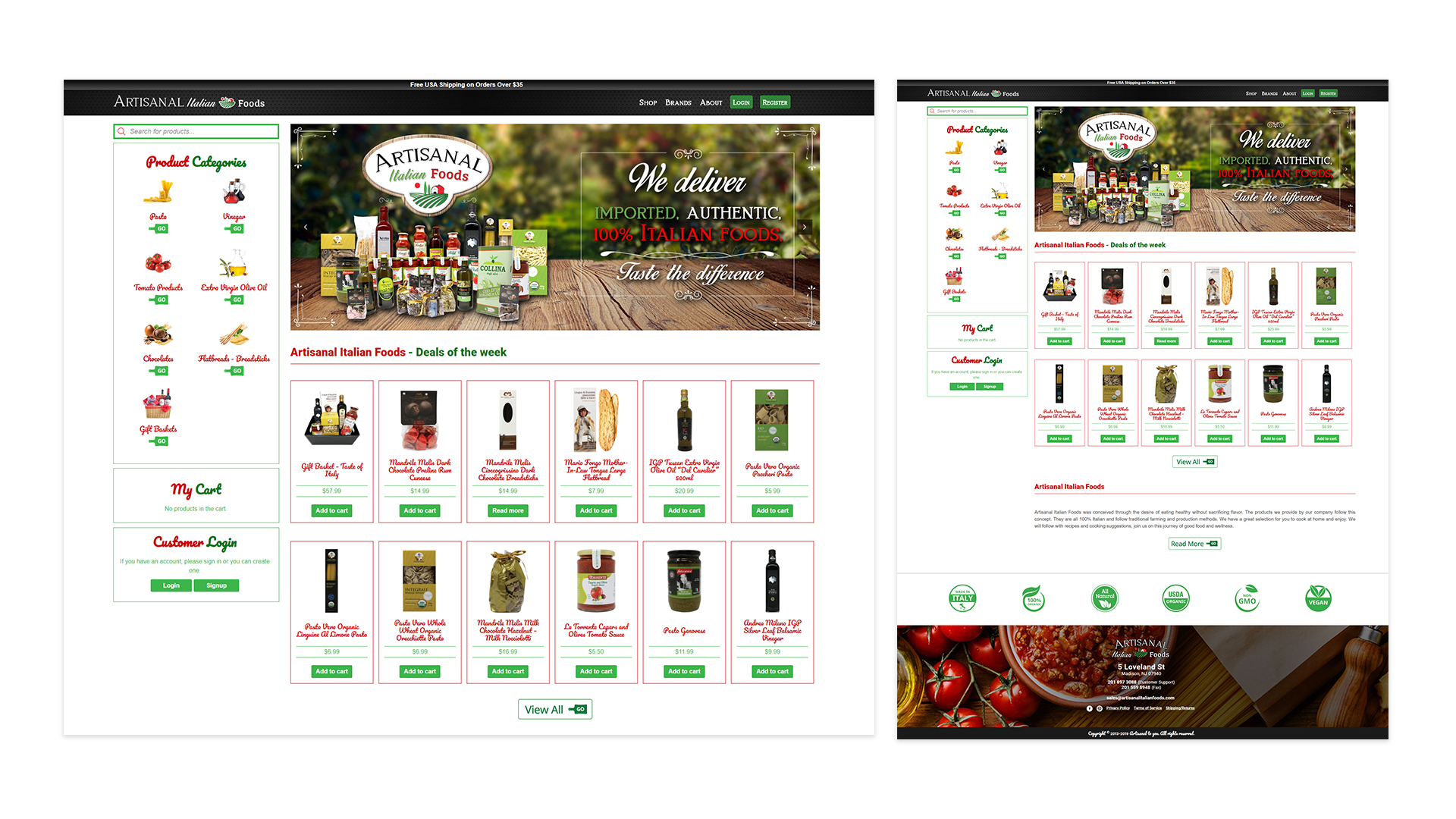
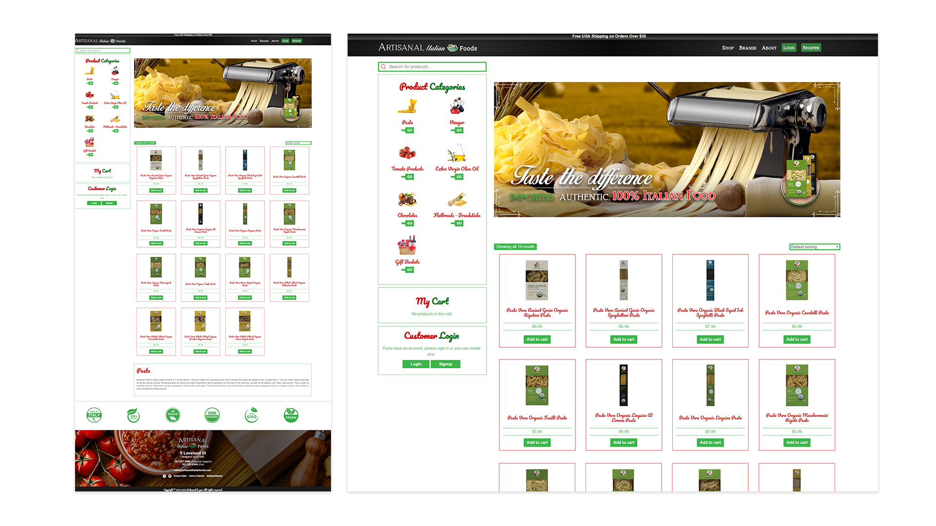
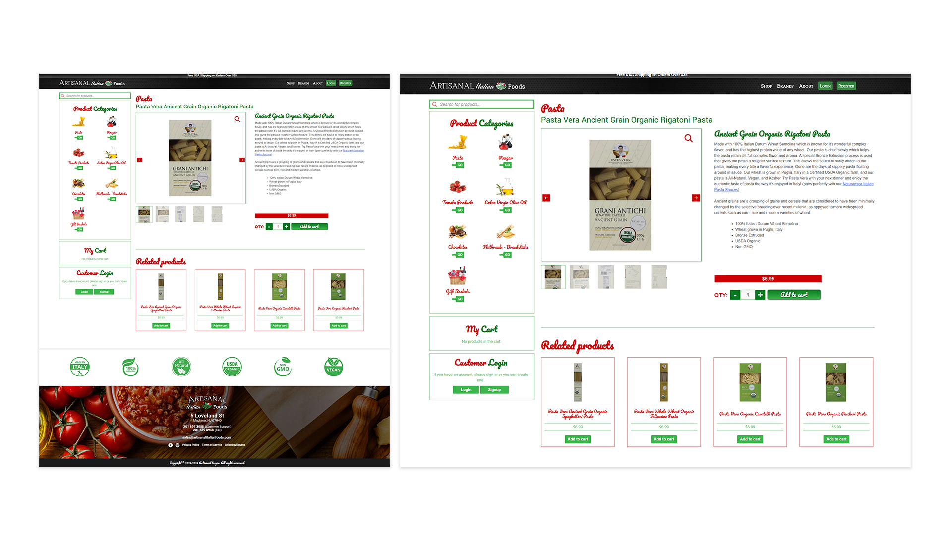
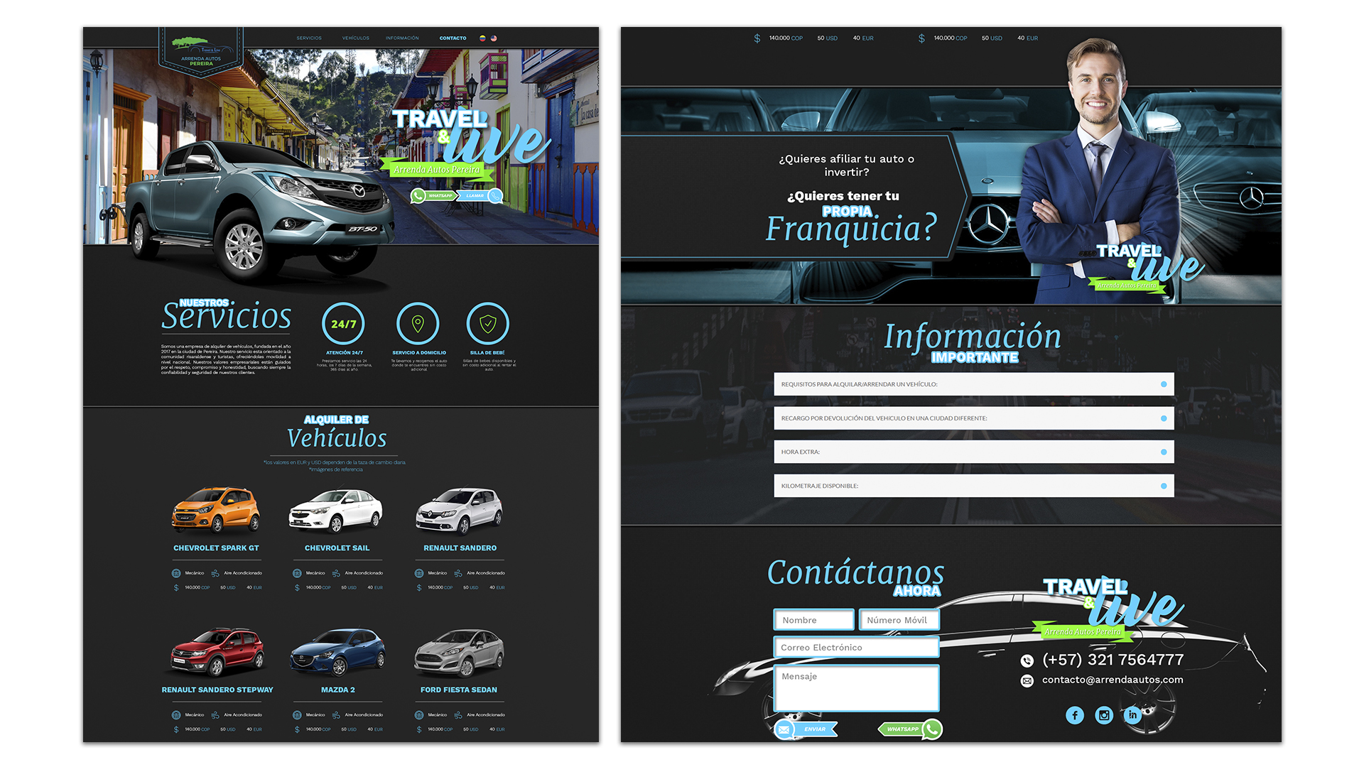
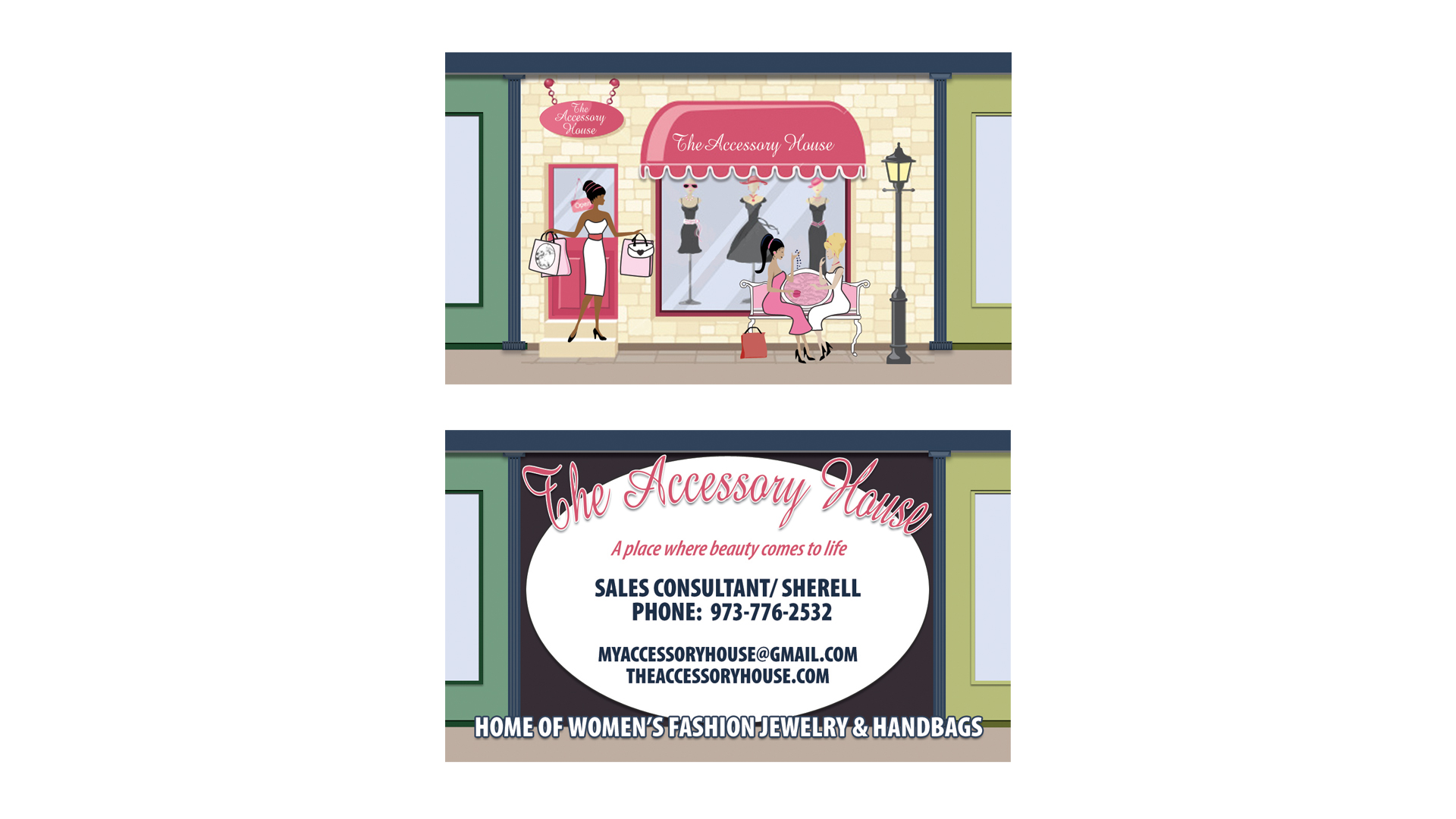
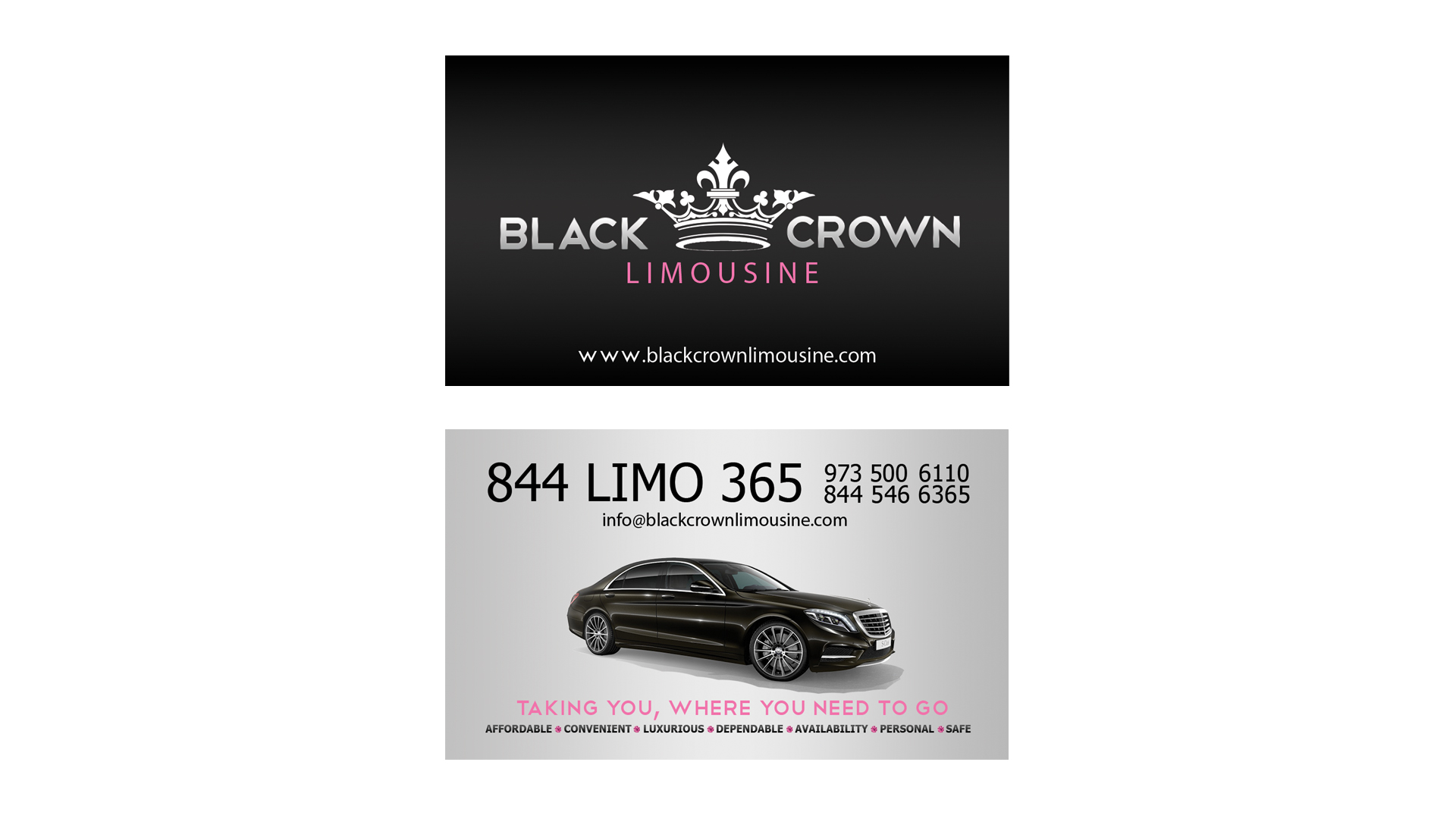
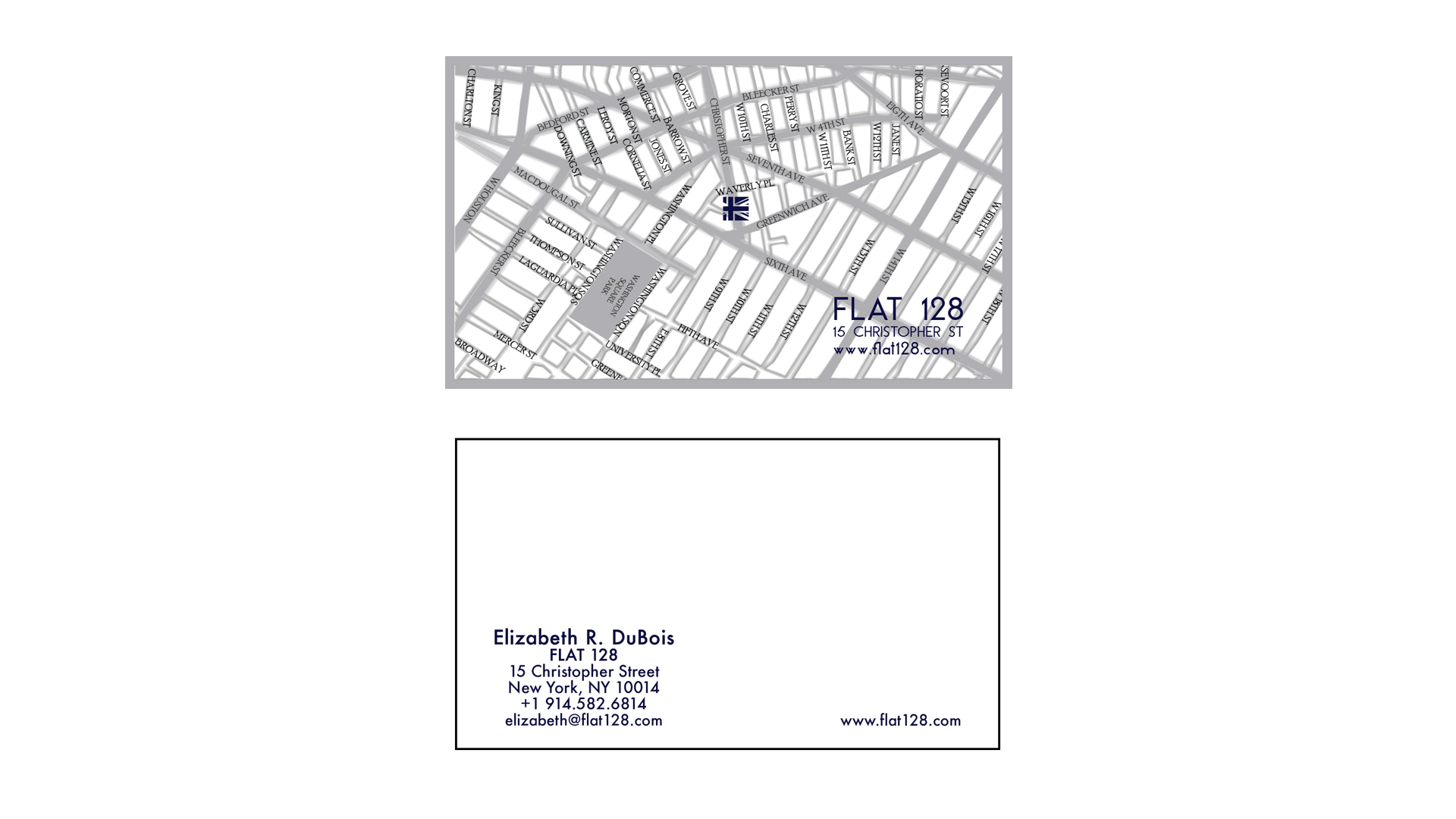
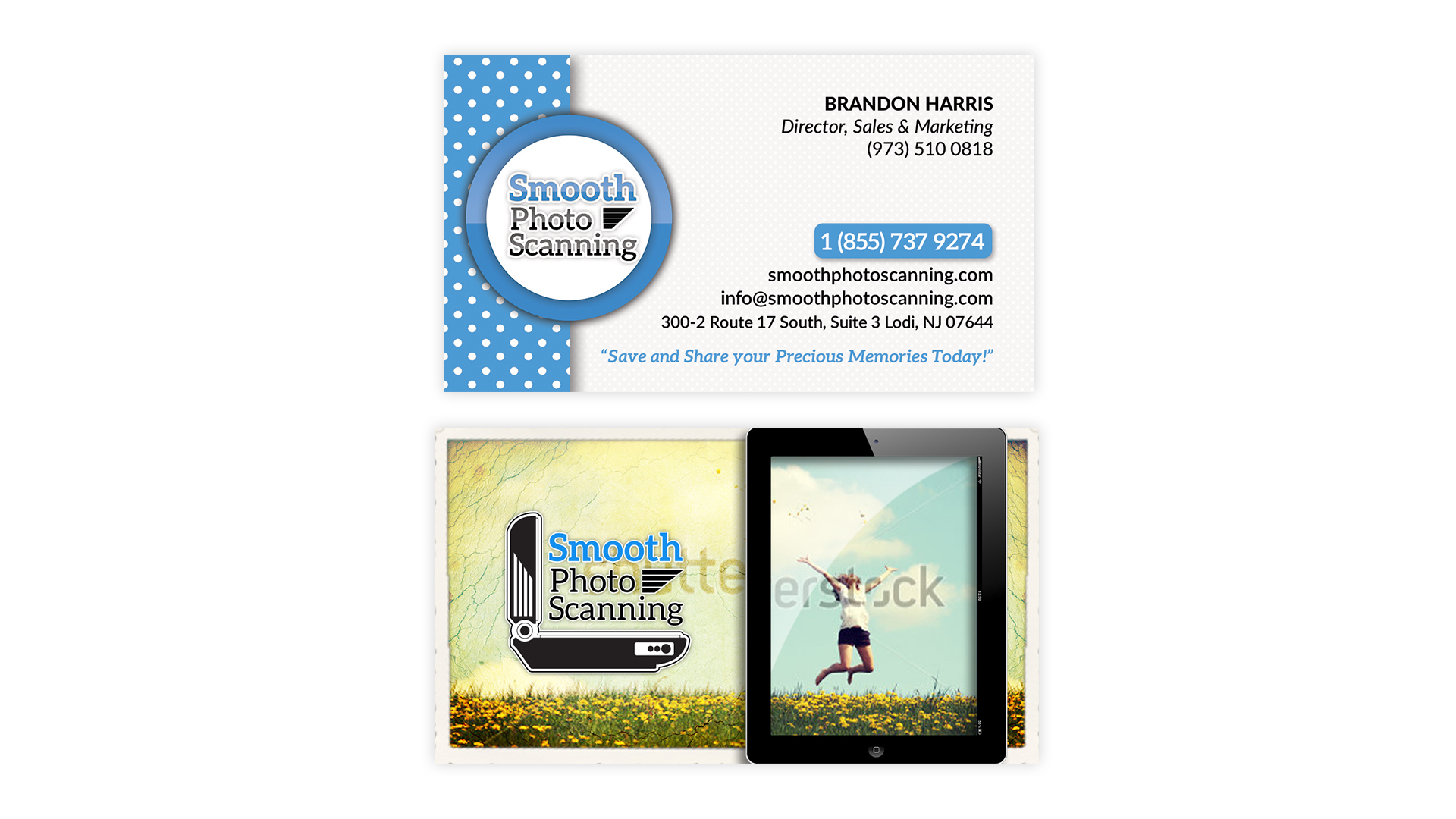
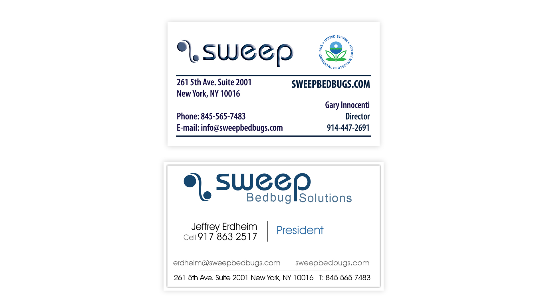
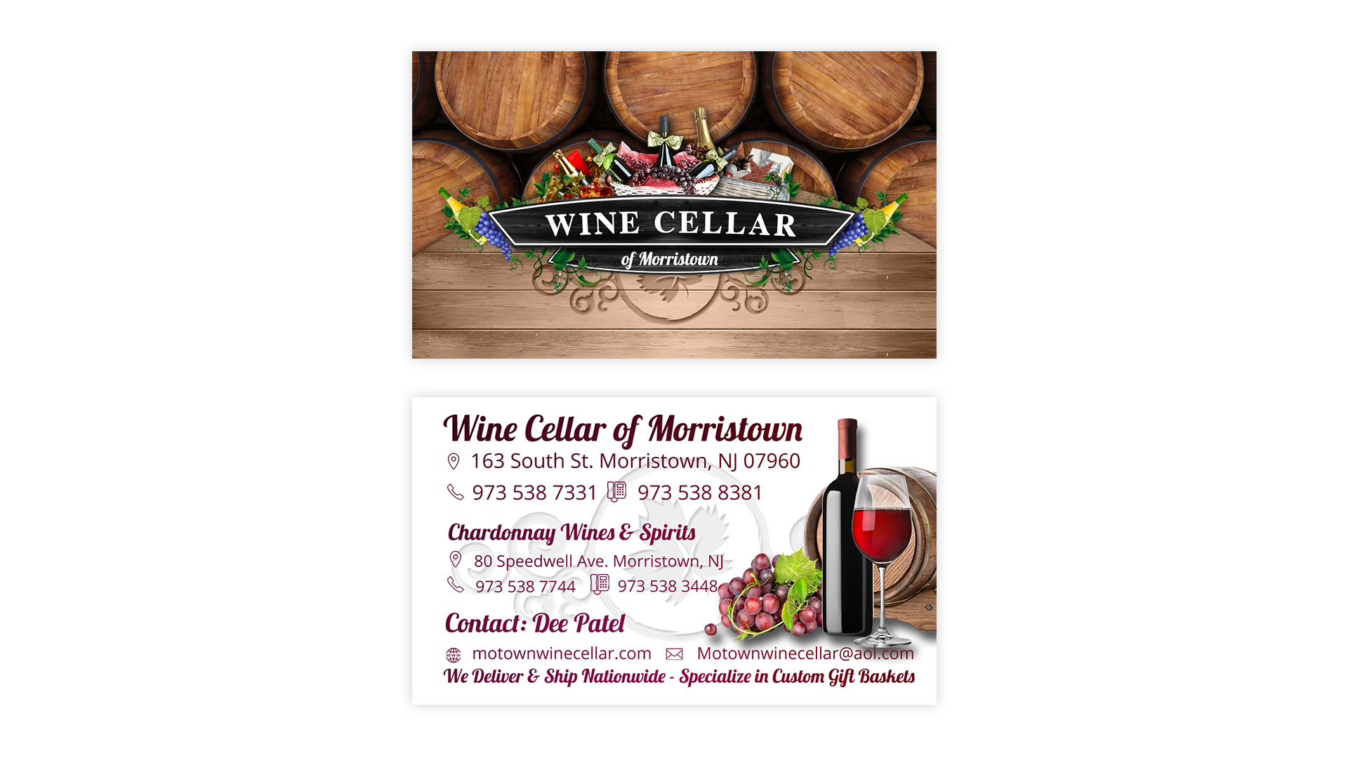
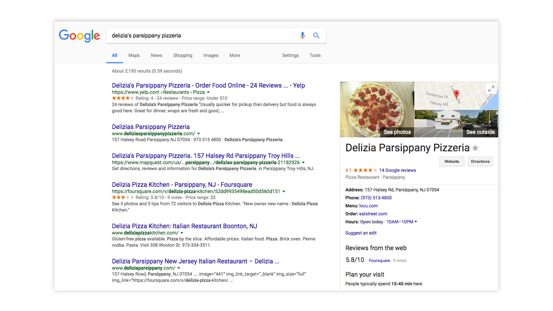
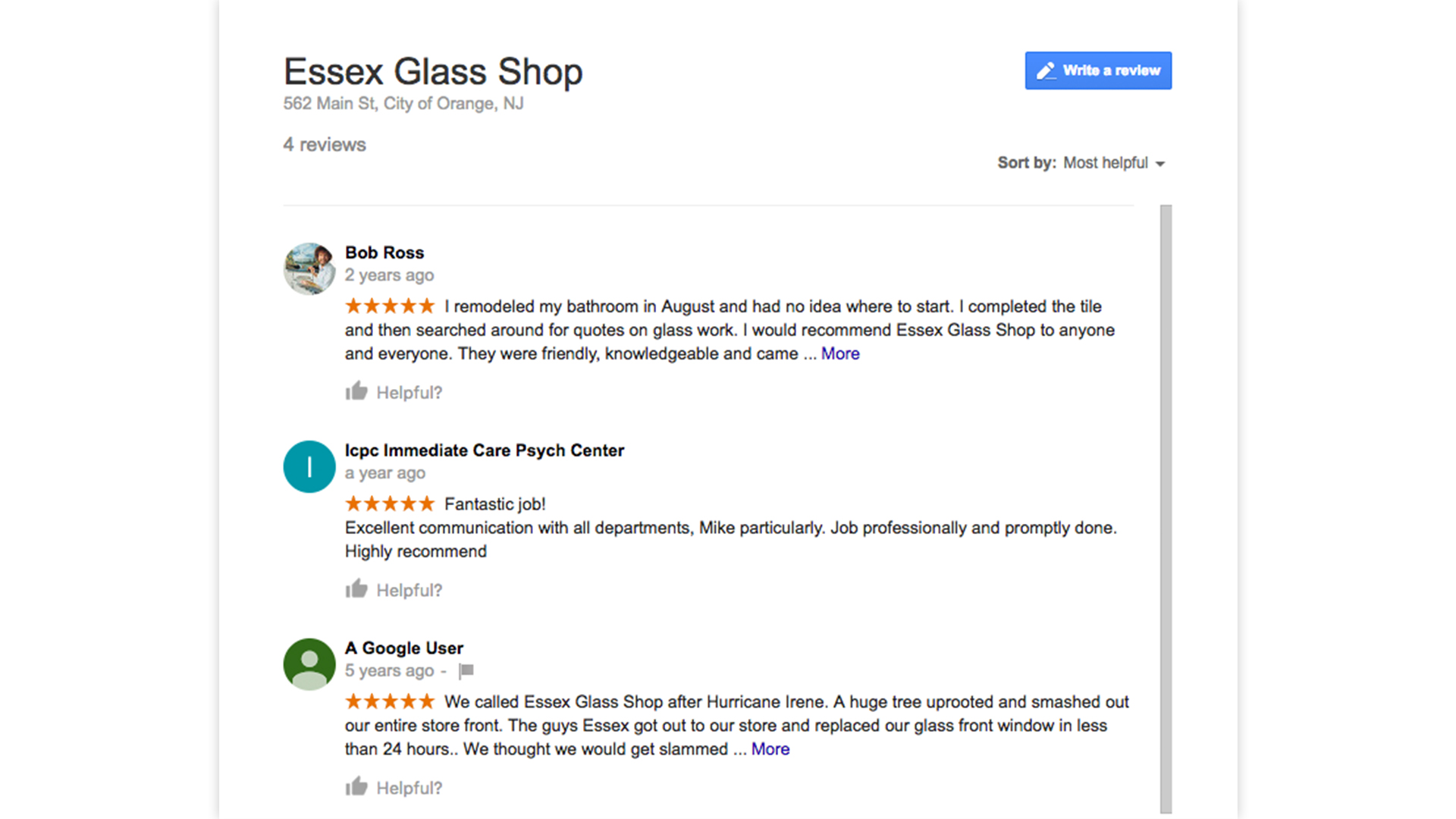
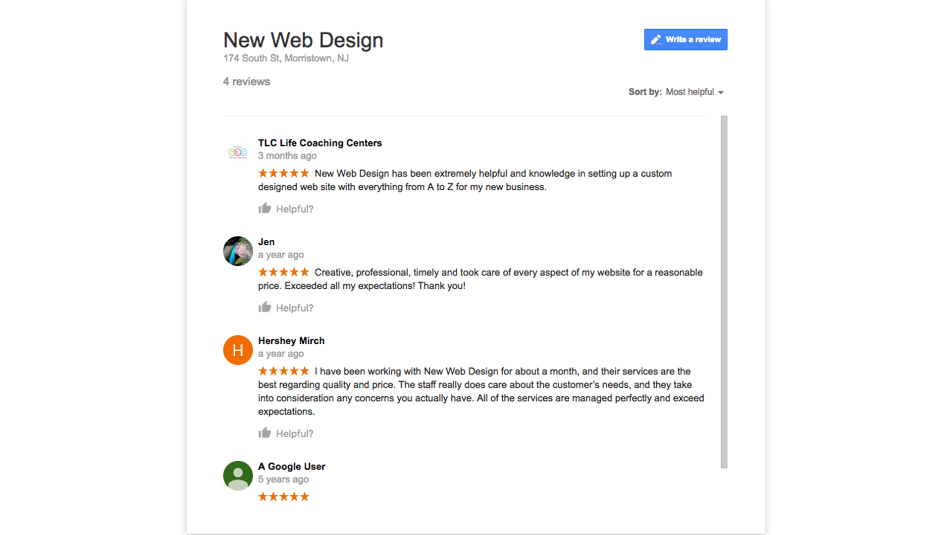
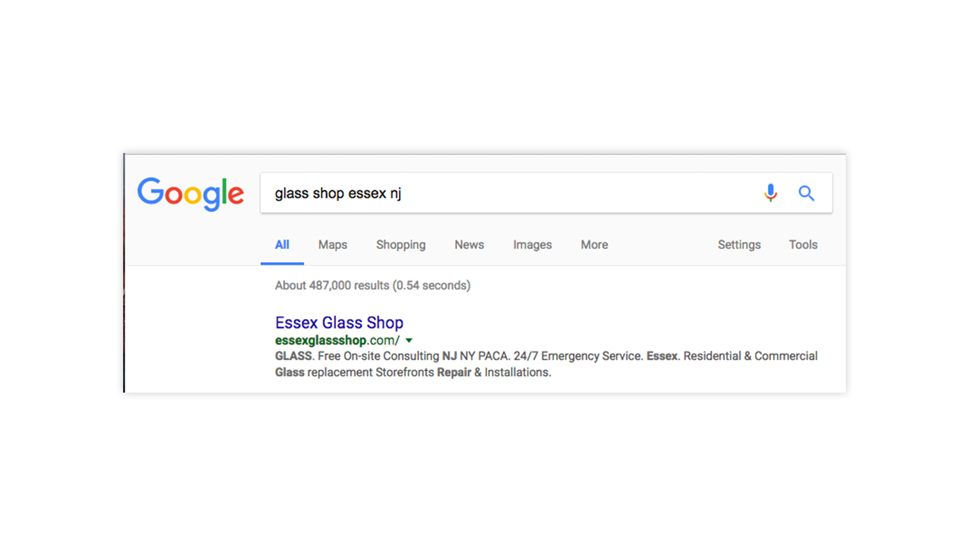
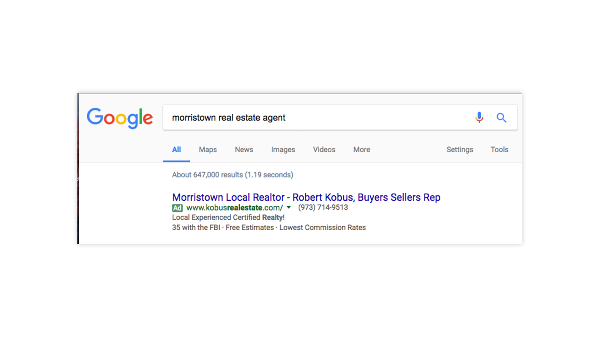
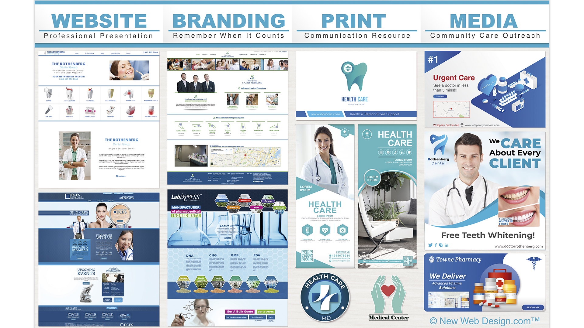
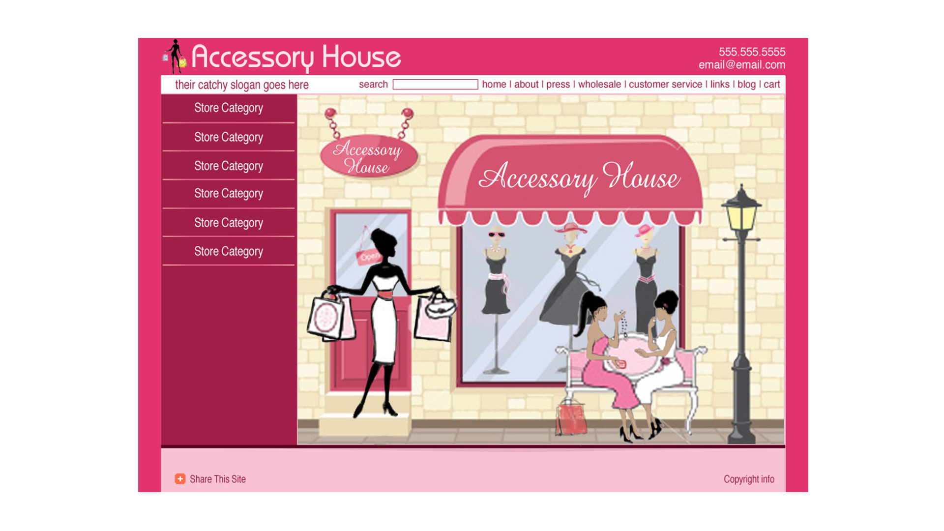
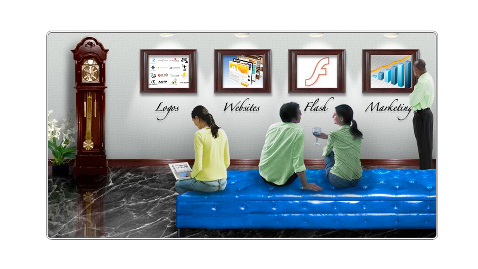
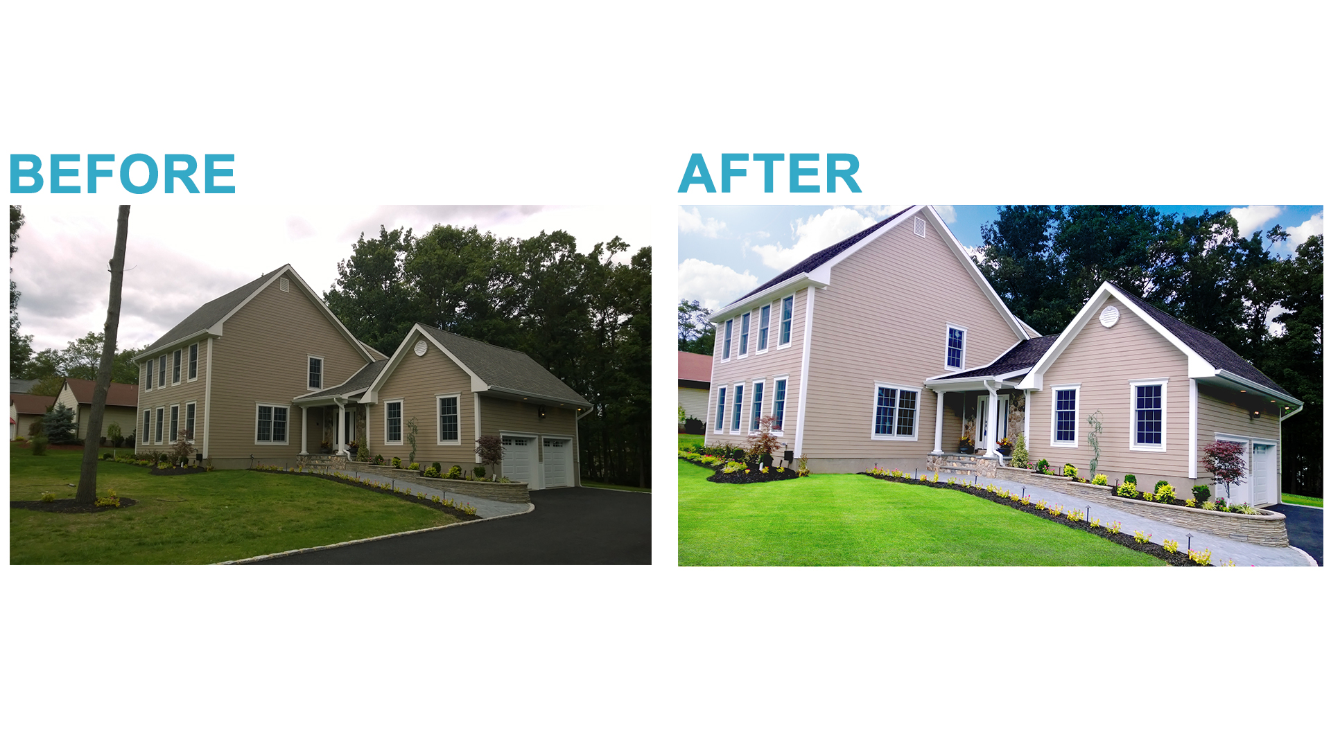
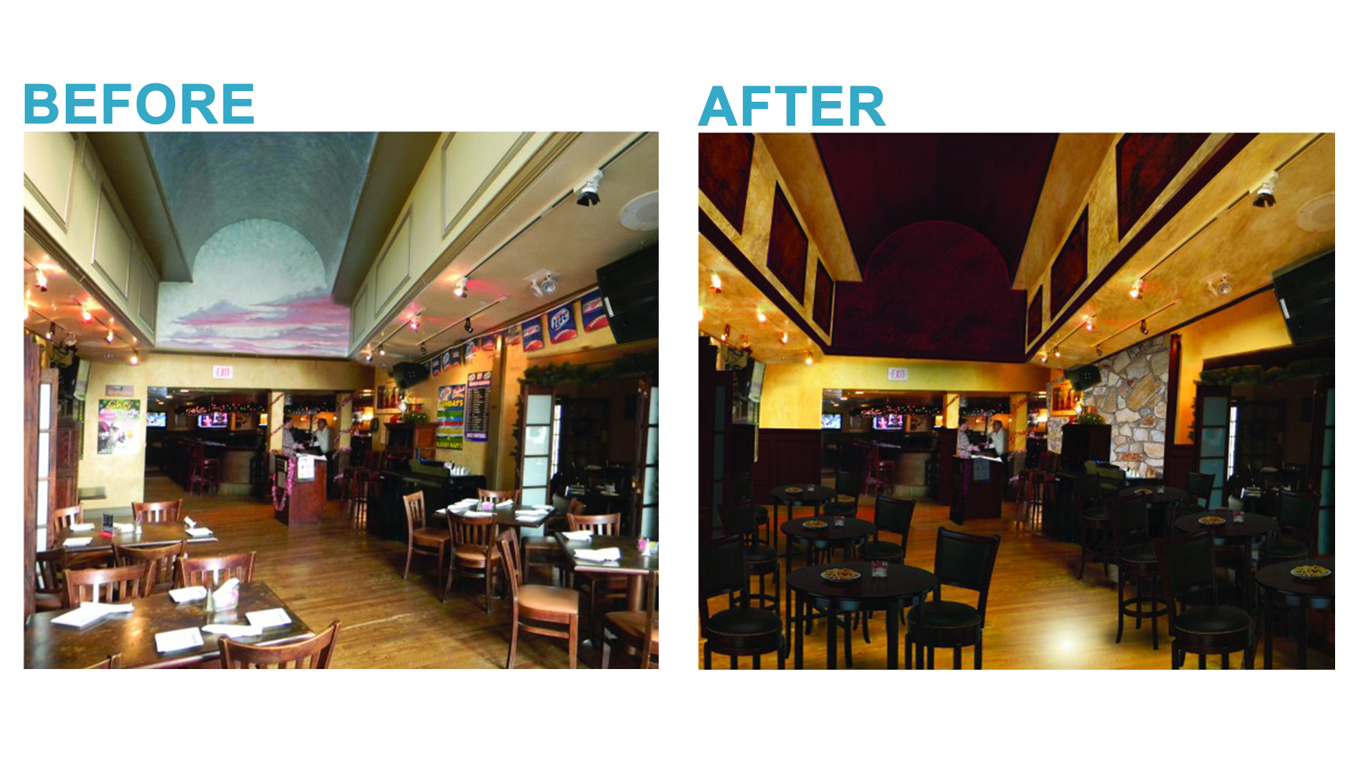
Please View Our COMPLETED WORK PORTFOLIO

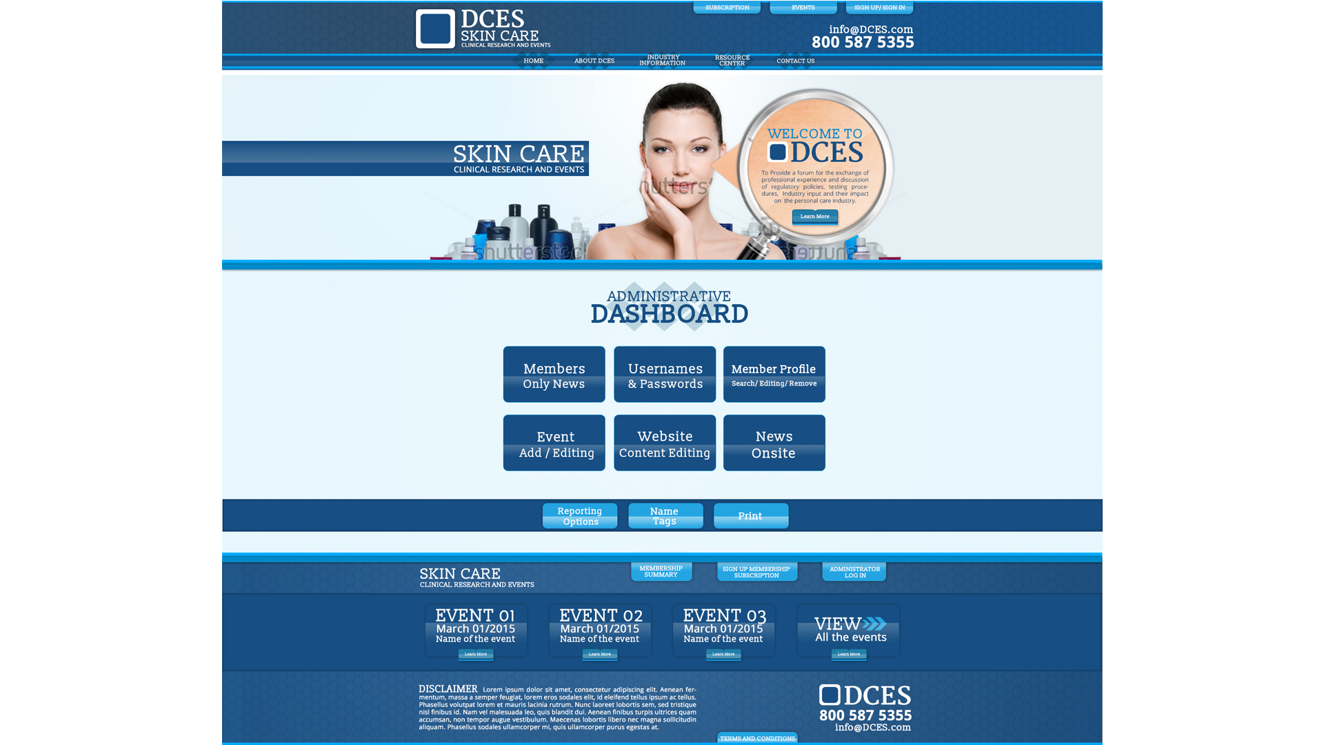
Mobile
Responsive
Benefits
Additional benefits of a mobile
responsive upgrade include:
- Faster Loading Mobile Site
- Easy to Read Text
- Extremely User-Friendly Interface for Tablets & Mobile Devices
- Tested on All Internet Browsers, Tablets & Mobile Devices
- Improved Search Engine Optimization Based on Google Search Ranking Algorithms
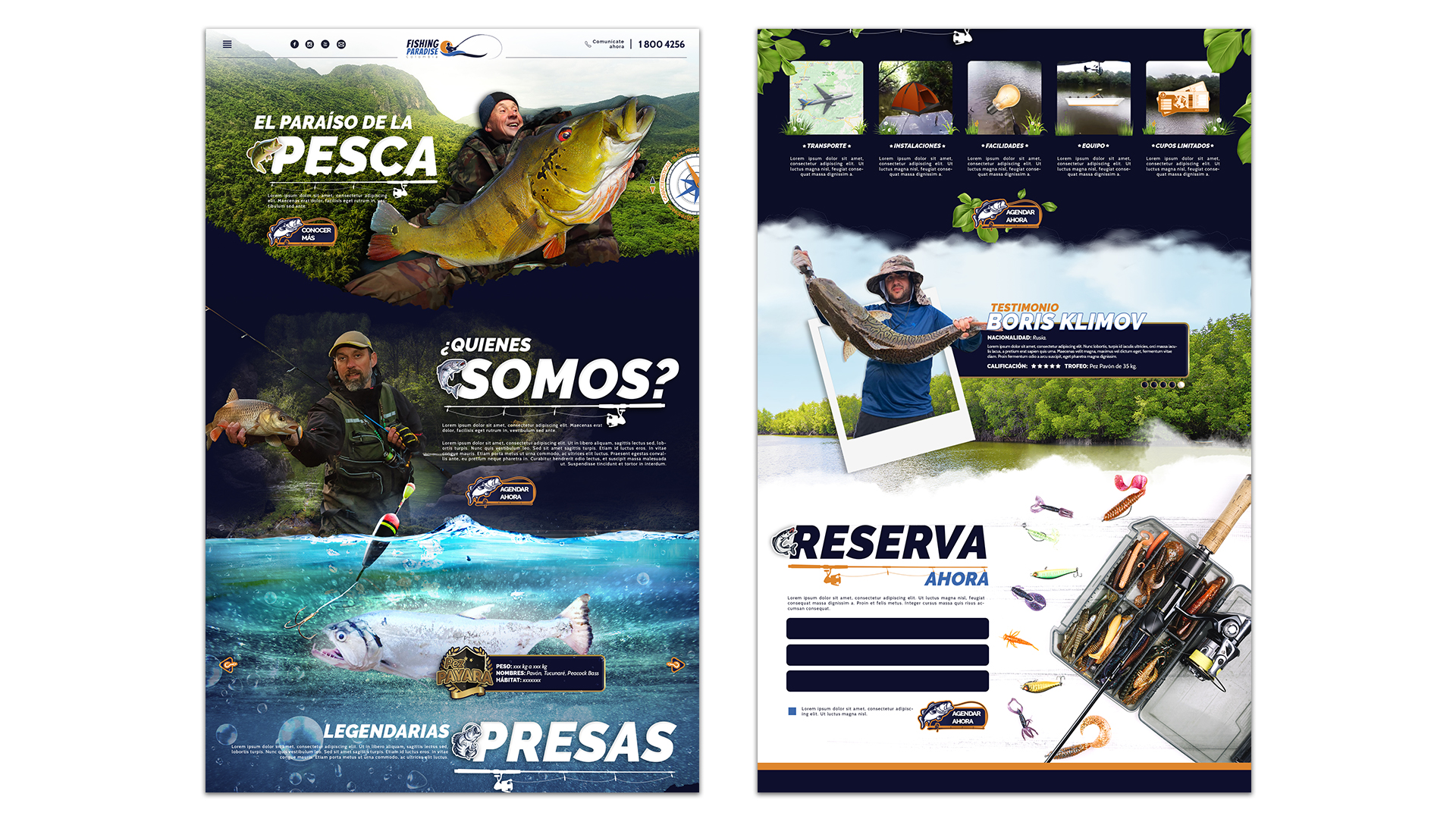
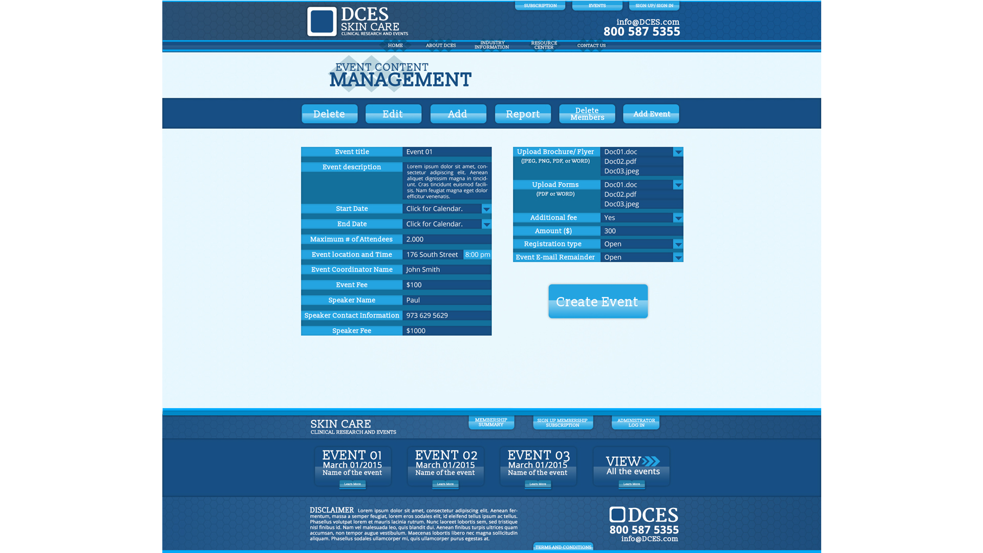
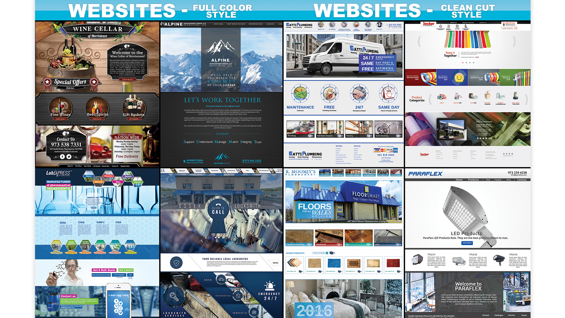
Mobile Responsive Website What Sets NWD Apart
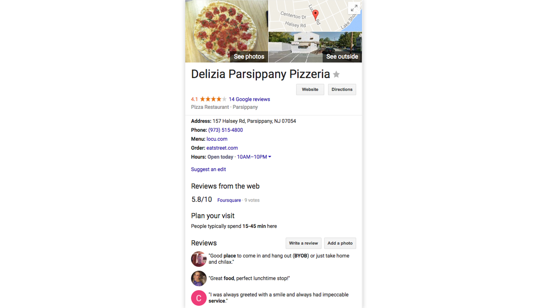
Please View Our COMPLETED WORK PORTFOLIO

What sets NWD apart
New Web Design has created the ultimate solution to mobile device marketing. Through our professional branding and custom- coding, combined with our industry experience, we have achieved the perfect mobile responsive formula. Most commonly, developers use website templates that are premade, simply switching out the photos and text boxes and filling them in with your content. They also sometimes use a pre-made root template code and just add a bit of branding on top of that framework. However, this will only cause a tremendous amount of cross browser breakage of the website as technology advances.
For example, if Internet Explorer 7 upgrades to Internet Explorer 8, the mobile responsive will most likely break because templates use so many shortcuts when coding. It will not be able to load quickly, or at all, depending on the service area and cell phone carrier, and it will have incorrect sizing and spacing. A professionally coded, mobile responsive site developed by New Web Design is the key to preventing these issues and preventing the loss of any potential clientele who visit your most commonly viewed presentation: your mobile website.
The way we rearrange the content for its intended screen size, along with clean-cut coding, ensures our websites load quickly and correctly regardless of service area, browser, or carrier. We ensure that the mobile website will be a professional experience, because it is the most commonly used screen format. We believe that never cutting corners is the only way to invest in a mobile website presentation.
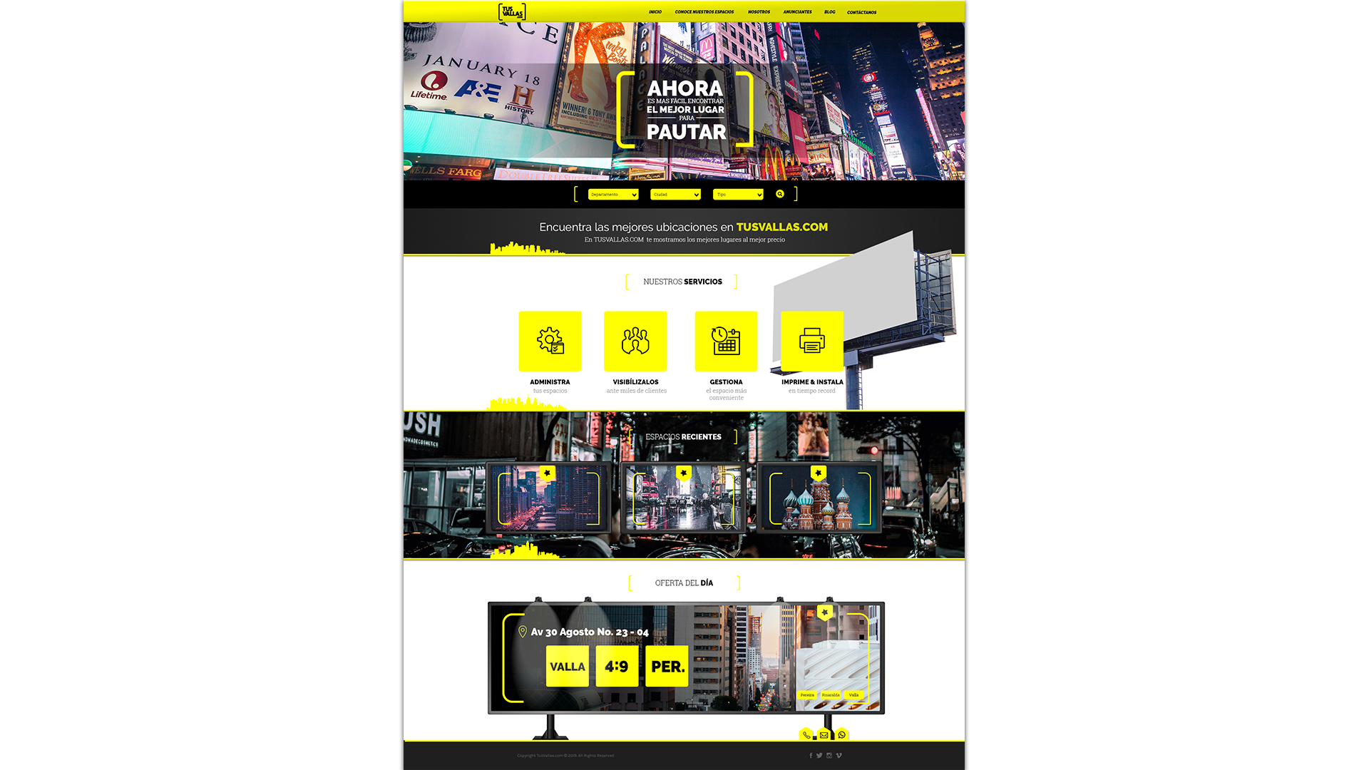
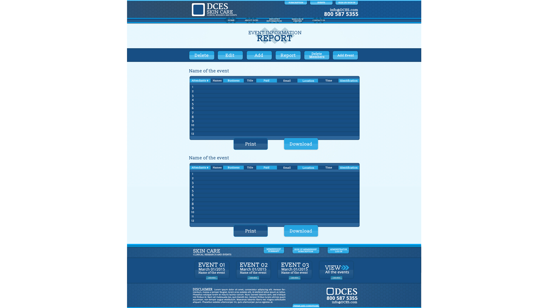
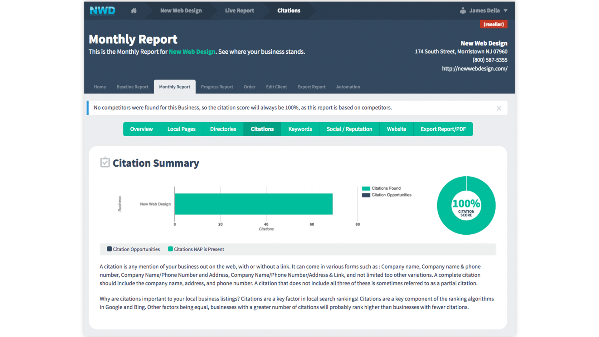
Mobile Responsive Website
Mobile Responsive Benefits
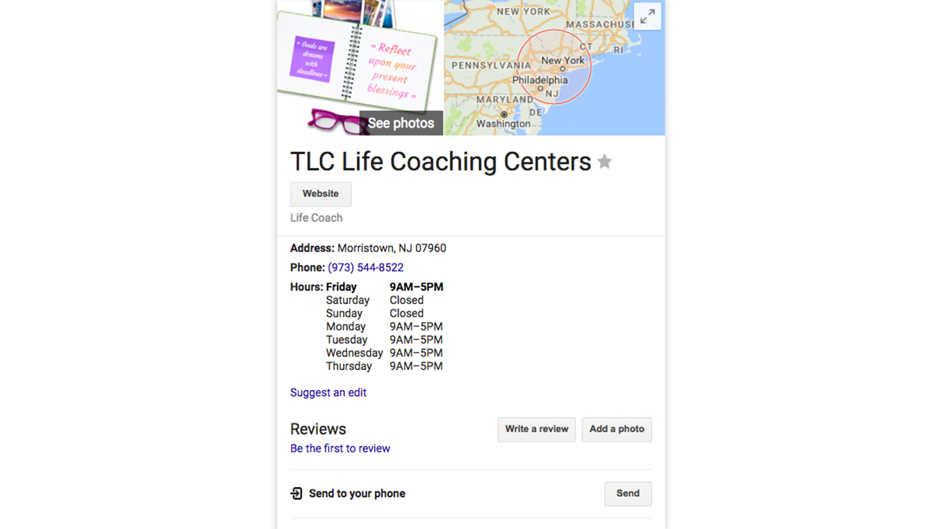
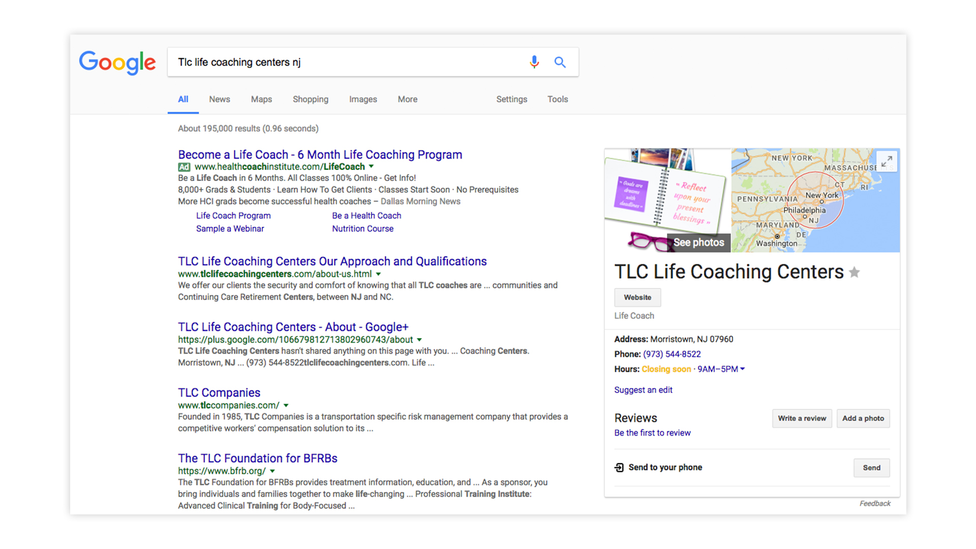
Please View Our COMPLETED WORK PORTFOLIO


